The Metric State Diagram widget renders a state transition diagram that illustrates how the values of a metric change across distinct states over a given time period.
For example, you can display when a metric exceeds a specific threshold.
You can also configure multiple conditions (Metric States), each with a different color.
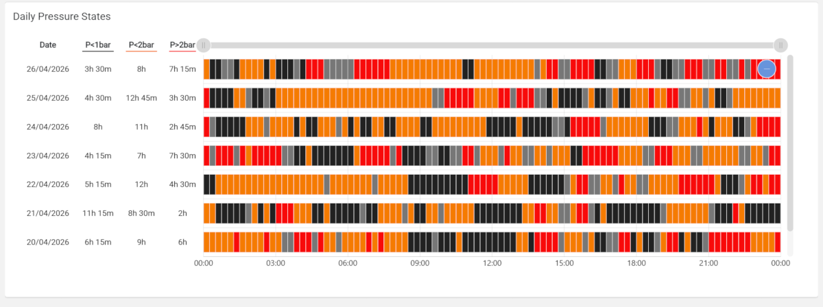
The diagram displays a row for each day in the input period (default last 7 days)
The diagram area is subdivided into two vertically aligned tables:
Summary Table: The table that displays the
Daterelated to the day in the period, and a column for any Metric State or Metric sub-elements.
The metric state columns are highlighted in the same way as the state-related cells.State Sequence: The table where the metric state sequence is highlighted for each day (row).
The State Sequence of each day can be continuous or aggregated (15 minutes or 1 hour).
Both the horizontal and vertical axes are scrollable, allowing you to view the graph on small screens even when a wide time range has been selected.
Widget Configuration
To configure the widget, you must:
Select the Metric you want to display.
Select the Timeframe,
Noneif you want a continuous sequence, elseMinutes 15orHours 1for aggregated.
If discrete, you must also select the Aggregation function (e.g., Average).Add one or more Metric State sub-elements, and for each of them, configure:
Label: The text you want to display as the table header or in the state-cell tooltip.
Within the label, you can use the${value}placeholder, which is automatically replaced with the condition value, even if dynamic (see Value Reference).Predicate and Value: The condition you want to verify for each metric’s value.
Value Variable: You can specify a page variable (e.g., Number Field) to dynamically compute states, based on user inputs [optional].
If defined, but no input is provided, the value is used instead.Severity: The severity (one of Neutral, Success, Warning, Critical) used to highlight each state-cell.
State Bar Color: The optional color, whether you want to override the default one associated with the severity.
Add one or more Metric sub-elements that you want to display in the Summary Table.
In case a Timeframe has been selected (15 mins or 1 hour), each state-cell is highlighted according to the latest evaluated condition, so be careful to define Metric States in the right order, especially when using greater-than or less-than predicates.
Template Syntax
Below you can find some examples of how to use the component within a template.
<div class="d-flex flex-wrap components-row">
	<metric-state-diagram-widget [title]="'Pressure State'" metricName="pressure_out" timeframe="MINUTES_15" periodRef="period" [offlineEnabled]="true" class="flex-fill">
		<metric-state label="P<1bar" predicate="lt" value="1" severity="NEUTRAL"></metric-state>
		<metric-state label="P<${value}bar" predicate="le" value="2" severity="WARNING"></metric-state>
		<metric-state label="P>${value}bar" predicate="gt" value="2" severity="CRITICAL"></metric-state>
		<metric name="temp_out" label="Temp." filter="singleDecimalFormat" unit="°C" aggregation="AVG"></metric>
	</metric-state-diagram-widget>
</div>
Component Reference
Here is a comprehensive list of all the elements and properties that can be used to configure the component.
Metric State Diagram <metric-state-diagram-widget>
Aggregation | The aggregation function used to calculate the value of each status cell. Name: aggregation Type: AGGREGATION | Optional Functions: MIN, MAX, AVG, DELTA Default Value: AVG
|
Description | Name: description Type: STRING | Optional
|
Metric | The metric whose value(s) must be loaded by the widget. Name: metricName Type: METRIC | Required
|
Show Summary Table | Name: showSummaryTable Type: BOOLEAN | Optional Default Value: true
|
Timeframe | The time interval used to divide the day fixed time slots. Name: timeframe Type: ENUM | Optional Values: NONE, MINUTES_15, HOURS_1 Default Value: NONE
|
Title | The title displayed on the top part of the widget box. Name: title Type: STRING | Optional
|
Value Filter | The filter used to transform metric values. Name: valueFilter Type: FILTER | Optional
|
Advanced | |
| The default status bar color. Name: stateBarColor Type: STRING | Optional
|
State Condition | |
| The condition predicate to be applied on metric values. Name: predicate Type: ENUM | Optional Values: lt, le, eq, ne, ge, gt
|
| The comparison value of the state condition. Name: value Type: STRING | Optional
|
Data | |
Default Loading Period | The default filtering period applied when entering the page. Name: defaultLoadingPeriod Type: PERIODS | Optional Default Value: LAST_7_DAYS
|
Offline Enabled | If selected, a gray cell or bar appears to indicate that the thing was offline. Name: offlineEnabled Type: BOOLEAN | Optional Default Value: false
|
Period Variable | The id of the page's variable providing the date range filtering period, for instance the id of a . Name: periodRef Type: STRING | Optional
|
Rendering | |
Availability | Configure availability based on active features on Digital Plan on Add-ons Name: hasFeature Type: FEATURE (multiple) | Optional
|
CSS Class | The name(s) of the CSS class used to customize the widget layout. Name: class Type: STRING | Optional
|
Visibility Condition | The expression that allows you to reduce the visibility of the element. Name: *ngIf Type: STRING | Optional
|
Sub Elements | |
The metrics displayed in the details section of the selected day. | |
A specific state to highlight for the metric. | |
Metric <metric>
Aggregation | The aggregation to be applied to the daily values of the metric. If missing, the last value of the day is loaded. Name: aggregation Type: ENUM | Optional Values: AVG, DELTA, MIN, MAX
|
Filter | The name of the filter used to transform and display values. Name: filter Type: FILTER | Optional
|
Label | The metric alternative label. Name: label Type: STRING | Optional
|
Name | The additional metric whose aggregated value should be displayed in the summary table. Name: name Type: METRIC | Required
|
Unit | The unit of measurement to be displayed along the value. Name: unit Type: STRING | Optional
|
Advanced | |
Visibility Condition | The expression that allows you to reduce the visibility of the element. Name: *ngIf Type: STRING | Optional
|
Metric State <metric-state>
Label | The label describing the state in the diagram. Name: label Type: STRING | Required
|
Predicate | The condition predicate to be applied to metric values. Name: predicate Type: ENUM | Required Values: lt, le, eq, ne, ge, gt
|
Severity | The severity of the state. Name: severity Type: ENUM | Required Values: NEUTRAL, SUCCESS, WARNING, CRITICAL
|
State Bar Color | The alternative hexadecimal color for the state. Name: stateBarColor Type: STRING | Optional
|
Value | The comparison value for checking the state. Name: value Type: STRING | Required
|
Value Variable | The id of the page's variable providing the dynamic value used to compute metric states, for instance the id of a . Name: valueRef Type: STRING | Optional
|
Full Syntax Example
<metric-state-diagram-widget
[title]="'Metric State Diagram'"
description="abc"
metricName="metricName"
valueFilter="dateFormat"
timeframe="NONE"
aggregation="DELTA"
[showSummaryTable]="false"
stateBarColor="#007BFF"
predicate="lt"
value="abc"
periodRef="abc"
defaultLoadingPeriod="LAST_30_DAYS"
[offlineEnabled]="true"
class="abc"
*ngIf="getUser().organizationId != null"
hasFeature="['feature_a', 'feature_b']">
<metric
name="metricName"
label="Temperature"
filter="fooBarFilter"
unit="°C"
aggregation="AVG"
*ngIf="getUser().organizationId != null"></metric>
<metric-state
label="abc"
predicate="lt"
value="abc"
valueRef="abc"
severity="NEUTRAL"
stateBarColor="#007BFF"></metric-state>
</metric-state-diagram-widget>