The widget that displays the current value of all thing metrics.
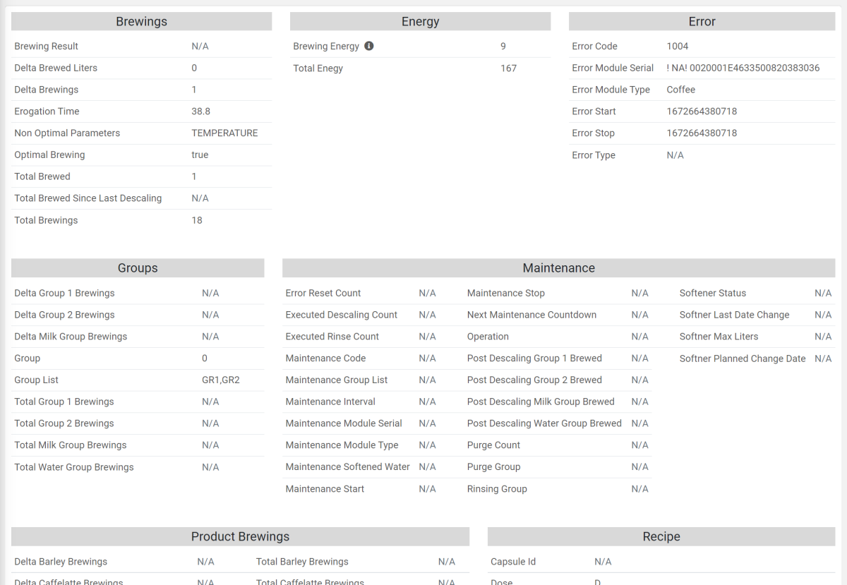
All the thing definition metrics are automatically displayed and grouped into different boxes by using the Group property defined on each metric.
The following information is displayed for each metric:
The localized Label or the Name as a fallback.
In case the label is too long, it is truncated, and a tooltip allows displaying the full label.The description, which can be visible as a tooltip on the information icon.
The last value, by using a default filter and unit of measurement.
The Quick History allowing to inspect the historical values of each metric, which can also be exported.
Template Syntax
Below you can find some examples of how to use the component within a template.
<metrics-data-widget class="flex-fill" [title]="'All Metrics Value'"></metrics-data-widget>
Component Reference
Here is a comprehensive list of all the elements and properties that can be used to configure the component.
Metrics Data <metrics-data-widget>
Export Enabled | The boolean flag indicating whether the data export is enabled. Name: config.exportEnabled Type: BOOLEAN | Optional Default Value: false
|
Groups Names | The comma separated list of group names used to filter metrics. Start with '!' to exclude groups. Name: config.groupNames Type: STRING | Optional
|
Max Columns per Group | The maximum number of columns used to spread the metrics of a single group. Name: config.maxColumnsPerGroup Type: INTEGER | Optional Default Value: 3
|
Title | The title displayed on the top part of the widget box. Name: title Type: STRING | Optional
|
Rendering | |
Availability | Configure availability based on active features on Digital Plan on Add-ons Name: hasFeature Type: FEATURE (multiple) | Optional
|
CSS Class | The name(s) of the CSS class used to customize the widget layout. Name: class Type: STRING | Optional
|
Visibility Condition | The expression that allows you to reduce the visibility of the element. Name: *ngIf Type: STRING | Optional
|
Full Syntax Example
<metrics-data-widget
    [title]="'Metrics Data'"
    [config]="{
        maxColumnsPerGroup: 123,
        exportEnabled: true,
        groupNames: 'abc'
    }"
    class="abc"
    *ngIf="getUser().organizationId != null"
    hasFeature="['feature_a', 'feature_b']">
</metrics-data-widget>