Displays a daily grid summarizing the events that occurred and corresponding metric updates.
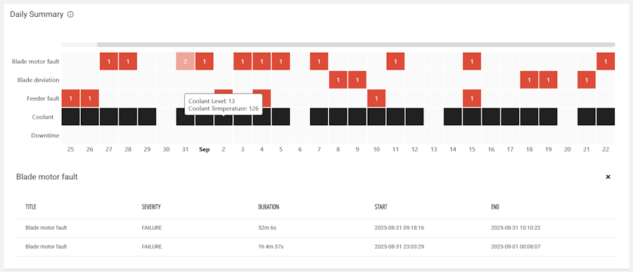
In this chart, the X axis represents the days (according to the selected period), while the rows are events and metric value updates.
Template Syntax
Below you can find some examples of how to use the component within a template.
<daily-summary-grid-widget [title]="'Daily Summary'" class="flex-fill" [config]="{showEventCount: true, showEventSeverity: true, sortByOccurrences: true, eventNames: 'E20,E21,E22'}">
        <metric name="downtime_time" [config]="{highlight: 'VALUE_SEVERITY'}"></metric>
        <metric name="coolant_level"></metric>
        <metric name="coolant_temperature" [config]="{highlight: 'VALUE_SEVERITY'}"></metric>
</daily-summary-grid-widget>
Component Reference
Here is a comprehensive list of all the elements and properties that can be used to configure the component.
Daily Summary Grid <daily-summary-grid-widget>
Description | The description of the widget. Name: description Type: STRING | Optional
|
Title | The title displayed on the top part of the widget box. Name: title Type: STRING | Optional
|
Data | |
Default Loading Period | The default filtering period applied when entering the page. Name: config.defaultPeriod Type: PERIODS | Optional Default Value: LAST_30_DAYS
|
Period Reference | Name: inputs.periodRef Type: STRING | Optional
|
Events | |
Event Names | The exact names of the events to display on the Y axis. If there are no occurrences for a given event, it will be discarded. Name: config.eventNames Type: STRING | Optional
|
Event Query | The query used to filter events. Name: config.eventQuery Type: QUERY | Optional Predicates: beginsWith, eq, neq, gt, gte, isEmpty, isNotEmpty, lt, lte, like, notLike
|
Event Query Reference | The id of the page's <search-field> used to filter events. Name: inputs.eventQueryRef Type: STRING | Optional
|
Show Event Count | The number of daily events is displayed in each cell of the grid. Name: config.showEventCount Type: BOOLEAN | Optional Default Value: false
|
Show Event Severity | The cell related to an event is colored according to the event severity. Name: config.showEventSeverity Type: BOOLEAN | Optional Default Value: false
|
Sort By Occurrences | If selected, events are sorted by frequency (in descending order), otherwise by name (in ascending order). Name: config.sortByOccurrences Type: BOOLEAN | Optional Default Value: false
|
Metrics | |
Metric Group Names | The exact names of the metric groups to display on the Y axis. Name: config.metricGroupNames Type: STRING | Optional
|
Show Changes Only | Name: config.showChangesOnly Type: BOOLEAN | Optional Default Value: false
|
Show Metric Highlight Count | The number of daily metric highlights is displayed in each cell of the grid. Name: config.showMetricHighlightCount Type: BOOLEAN | Optional Default Value: false
|
Rendering | |
Availability | Configure availability based on active features on Digital Plan on Add-ons Name: hasFeature Type: FEATURE (multiple) | Optional
|
CSS Class | The name(s) of the CSS class used to customize the widget layout. Name: class Type: STRING | Optional
|
Visibility Condition | The expression that allows you to reduce the visibility of the element. Name: *ngIf Type: STRING | Optional
|
Sub Elements | |
The metric whose current value must be displayed within the widget. | |
Metric <metric>
Filter | The name of the filter used to transform and display values. Name: filter Type: FILTER | Optional
|
Name | The metric whose value(s) must be loaded by the widget. Name: name Type: METRIC | Required
|
Unit | The unit of measurement to be displayed along the value. Name: unit Type: STRING | Optional
|
Display Options | |
Group | The name used to group similar metrics together. The widget will display a row for each group or metric without a group. Name: config.group Type: STRING | Optional
|
Highlight | Define what the widget should display for the metric. You can choose whether to highlight each time the metric value is changed (e.g. settings) or whether to highlight when the metric value is in WARNING or CRITICAL status. Name: config.highlight Type: ENUM | Optional Values: VALUE_CHANGE, VALUE_SEVERITY Default Value: VALUE_CHANGE
|
Full Syntax Example
<daily-summary-grid-widget
    [title]="'Daily Summary Grid'"
    description="abc"
    [config]="{
        showEventCount: true,
        showChangesOnly: true,
        eventQuery: [{property:'prop1', predicate: 'eq', value: 'foo'}, {property:'prop2', predicate: 'in', value: ['bar', 'baz']}],
        eventNames: 'abc',
        sortByOccurrences: true,
        defaultPeriod: 'LAST_30_DAYS',
        showEventSeverity: true,
        showMetricHighlightCount: true,
        metricGroupNames: 'abc'
    }"
    [inputs]="{
        periodRef: 'abc',
        eventQueryRef: 'abc'
    }"
    class="abc"
    *ngIf="abc"
    hasFeature="['feature_a', 'feature_b']">
    <metric
            name="metricName"
            filter="dateFormat"
            unit="abc"
            [config]="{
                group: 'abc',
                highlight: 'VALUE_CHANGE'
            }"></metric>
</daily-summary-grid-widget>