The Data Export widget is a tool designed to provide DPS users with a simple, flexible, and efficient way to extract product data.
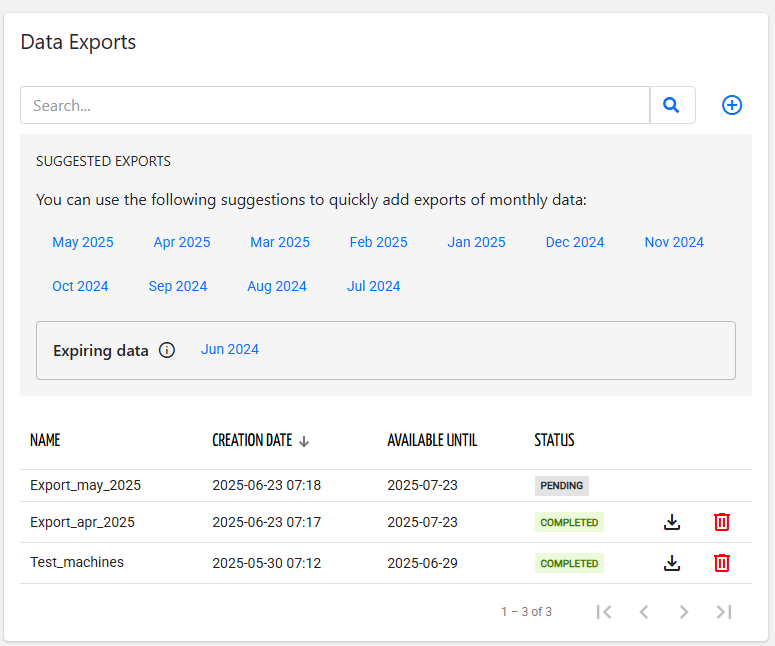
For customer users, the widget displays a box with the suggested data export, one for each past month.
By clicking on one of the suggested exports, a new data export with all data is scheduled for the selected month.
The export of data about to exit the data retention is highlighted (e.g., Jun 2024) so that the DPS user is reminded to download the data before permanent deletion.
.png?sv=2026-02-06&spr=https&st=2026-07-17T15%3A29%3A49Z&se=2026-07-17T15%3A41%3A49Z&sr=c&sp=r&sig=%2Fr7AUZHT2IlSimdg0aVvMZXg4bLqReZ1jdM5izPqXWk%3D)
In case the suggested export is not enough, by clicking the Add data export button, the widget switches to a view where the DPS user can configure which data to export.
.png?sv=2026-02-06&spr=https&st=2026-07-17T15%3A29%3A49Z&se=2026-07-17T15%3A41%3A49Z&sr=c&sp=r&sig=%2Fr7AUZHT2IlSimdg0aVvMZXg4bLqReZ1jdM5izPqXWk%3D)
In a Data Export, you can configure:
The name of the data export to be scheduled (prefilled according to the selected period).
Optionally, you can limit the things to be processed by selecting a customer, a location, and a thing.
If left blank, all things visible to the logged-in user are exported.The time period of data to be exported (e.g., Last Month).
The timestamp format to be used as the first column of each CSV generated (ISO or milliseconds).
Whether to include the metric unit in the header names of the resulting CSV file.
By default, all metrics (visible to the user) are exported for all things in the selected context.
Optionally, you can select the Metric Sets to export.
.png?sv=2026-02-06&spr=https&st=2026-07-17T15%3A29%3A49Z&se=2026-07-17T15%3A41%3A49Z&sr=c&sp=r&sig=%2Fr7AUZHT2IlSimdg0aVvMZXg4bLqReZ1jdM5izPqXWk%3D)
In case a specific subset of metrics must be exported, the Custom metric selection allows selecting the product models and the single metrics to be exported.
.png?sv=2026-02-06&spr=https&st=2026-07-17T15%3A29%3A49Z&se=2026-07-17T15%3A41%3A49Z&sr=c&sp=r&sig=%2Fr7AUZHT2IlSimdg0aVvMZXg4bLqReZ1jdM5izPqXWk%3D)
By pressing the Export button, a data export is scheduled, and within the widget, you can see the status of the data exports with a projection of the remaining time.
When finished, the ZIP archive containing a CSV file for each exported thing can be downloaded.
The CSV is composed of a column named TIMESTAMP (ascending) and a column for each exported metric.
TIMESTAMP,temperature,humidity,active,status
        1716971660000,22,67,true,HEATING
        1716971210000,21,55,false,STANDBY
The widget is aware of the context of the page, so if it is inserted into a customer details page, it will show only the data exports related to that customer.
Only a user who has the "Export Things Data" (EXPORT_DATA) permission, can see the widget.
In case the user is a Data Recipient, only the metrics belonging to the Raw Data metric set can be exported.
Template Syntax
Below you can find some examples of how to use the component within a template.
<data-export-widget [title]="'Data Export'"></data-export-widget>
Component Reference
Here is a comprehensive list of all the elements and properties that can be used to configure the component.
Data Export <data-export-widget>
Title | The title displayed on the top part of the widget box. Name: title Type: STRING | Optional
|
Rendering | |
Availability | Configure availability based on active features on Digital Plan on Add-ons Name: hasFeature Type: FEATURE (multiple) | Optional
|
CSS Class | The name(s) of the CSS class used to customize the widget layout. Name: class Type: STRING | Optional
|
Visibility Condition | The expression that allows you to reduce the visibility of the element. Name: *ngIf Type: STRING | Optional
|
Full Syntax Example
<data-export-widget
    [title]="'Data Export'"
    class="my-custom-class"
    *ngIf="getUser().organizationId != null"
    hasFeature="['feature_a', 'feature_b']"></data-export-widget>