This widget displays partial and total metric values in a concentric donuts grap
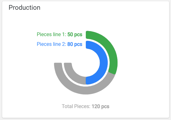
The widget requires the definition of at least two metrics, the last of which is always used as a total, while the previous ones are used as partials.
For each partial metric, a colored strip is displayed with a length as a percentage of the total value.
In case there are only two metrics (one partial and one total), the percentage can also be displayed in the middle of the diagram.
Template Syntax
Below you can find some examples of how to use the component within a template.
<solid-gauge-widget [title]="'Production'">
            <metric name="piecesline1" label="Pieces line 1"></metric>
            <metric name="piecesline2" label="Pieces line 1"></metric>
            <metric name="totalPieces" label="Total Pieces"></metric>
</solid-gauge-widget>
Component Reference
Here is a comprehensive list of all the elements and properties that can be used to configure the component.
Solid Gauge <solid-gauge-widget>
Show Percentage | The flag indicating whether to display the percentage respect to the total value. Name: config.showPercentage Type: BOOLEAN | Optional Default Value: true
|
Title | The title displayed on the top part of the widget box. Name: title Type: STRING | Optional
|
Total Color | The color used for the total label and the stripe background. Name: config.totalColor Type: STRING | Optional Default Value: #9C9C9C
|
Unit | The default unit of measurement if missing for the metric. Name: config.unit Type: STRING | Optional
|
Rendering | |
Availability | Configure availability based on active features on Digital Plan on Add-ons Name: hasFeature Type: FEATURE (multiple) | Optional
|
CSS Class | The name(s) of the CSS class used to customize the widget layout. Name: class Type: STRING | Optional
|
Visibility Condition | The expression that allows you to reduce the visibility of the element. Name: *ngIf Type: STRING | Optional
|
Sub Elements | |
The metric whose value must be displayed as gauge stripe. | |
Metric <metric>
Color | The color used for the partial label and the stripe foreground. Name: chartOptions.color Type: STRING | Optional
|
Filter | The name of the filter used to transform and display values. Name: filter Type: FILTER | Optional
|
Label | The metric alternative label. Name: label Type: STRING | Optional
|
Name | The metric whose value(s) must be loaded by the widget. Name: name Type: METRIC | Required
|
Unit | The unit of measurement to be displayed along the value. Name: unit Type: STRING | Optional
|
Advanced | |
Visibility Condition | The expression that allows you to reduce the visibility of the element. Name: *ngIf Type: STRING | Optional
|
Full Syntax Example
<solid-gauge-widget
[title]="'Solid Gauge'"
[config]="{
unit: '°C',
totalColor: '#AABBCC',
showPercentage: false
}"
class="my-custom-class"
*ngIf="getUser().organizationId != null"
hasFeature="['feature_a', 'feature_b']">
<metric
name="Temperature"
label="Temperature"
filter="fooBarFilter"
unit="°C"
*ngIf="getUser().organizationId != null"
[chartOptions]="{
color: '#007BFF'
}"></metric>
</solid-gauge-widget>