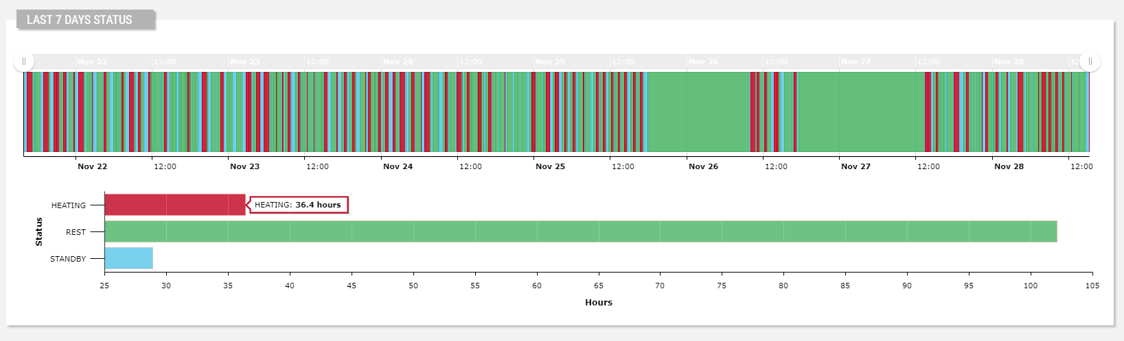
Displays the values of a status metric with the amount of time spent in each status for a given period.
The widget is subdivided into two charts:
The top one shows the status of the thing instant by instant within the selected period (default last 7 days).
The bottom one shows the total time the thing spent in each status, along with the relative percentage.
The bottom chart can be a Bar chart (default) or, optionally, a Pie chart, as below.
Each state is displayed using a specific color; by default, colors are already configured for the most commonly used states.
In addition, through the Color Manager, you can register more colors for your states.
Optionally, the bottom chart can be turned off by using the Show Aggregation Chart option.
Events
Along the status transitions, you can also show the events and work sessions that occurred in the same time period.
In the Events section of the property panel, you can define a query on the events to be loaded (e.g., Event Severity = FAILURE).
.png?sv=2026-02-06&spr=https&st=2026-07-17T15%3A58%3A07Z&se=2026-07-17T16%3A11%3A07Z&sr=c&sp=r&sig=3XkZxJoDyNfxQjwAZo3ynTTRa%2BFBqS%2BXQFbK6F0jPwg%3D "image(547).png")
For each found event, a marker is displayed under the x-axis, and by clicking on the marker, a tooltip displays the event details, and the chart area corresponding to the event duration is highlighted according to the event severity.
Template Syntax
Below you can find some examples of how to use the component within a template.
        <div class="d-flex flex-wrap components-row">

        <status-diagram-widget
        [inputs]="{'period': 'period'}"
        [config]="{'statuses': 'OFFLINE|STANDBY|WARMUP|READY|COOKING|FAILURE'}">

        <metric name="Status"></metric>

        </status-diagram-widget>

        </div>
Component Reference
Here is a comprehensive list of all the elements and properties that can be used to configure the component.
Status Diagram <status-diagram-widget>
Aggregation Chart Type | The type of the chart displaying the total time spent by status (Bar or Pie). Name: config.aggregationChartType Type: ENUM | Optional Values: BAR, PIE Default Value: BAR
|
Show Aggregation Chart | Flag indicating whether to show the aggregation chart. Name: config.showAggregatedChart Type: BOOLEAN | Optional Default Value: true
|
Title | The title displayed on the top part of the widget box. Name: title Type: STRING | Optional
|
Controls | |
Export Enabled | The boolean flag indicating whether the data export is enabled. Name: config.exportEnabled Type: BOOLEAN | Optional Default Value: true
|
Period Filter Enabled | The boolean flag indicating whether the embedded period filter is available. Name: config.filterEnabled Type: BOOLEAN | Optional Default Value: true
|
Preselected Statuses | The comma-separated list of states to be preselected. Name: config.preselectedStatuses Type: STRING | Optional
|
Status Selection Enabled | The flag indicating whether to enable the selection field to filter states. Name: config.statusSelectionEnabled Type: BOOLEAN | Optional Default Value: false
|
Data | |
Default Loading Period | The default filtering period applied when entering the page. Name: config.defaultPeriod Type: PERIODS | Optional Default Value: LAST_7_DAYS
|
| The <period-field>'s End Variable filtering data by end date. Name: endDateFieldRef Type: STRING | Optional
|
Period Variable | The id of the page's variable providing the date range filtering period, for instance the id of a <period-filter-field>. Name: inputs.period Type: STRING | Optional
|
| The <period-field>'s Start Variable filtering data by start date. Name: startDateFieldRef Type: STRING | Optional
|
Advanced | |
Include Connection Status | Indicates whether the connection status must be included in the status list. Name: config.loadConnectionStatus Type: BOOLEAN | Optional Default Value: true
|
Statuses | The comma separated list of all known statuses, if not specified only the retrieved metric values will be displayed (e.g. READY,WORKING). Name: config.statuses Type: STRING | Optional
|
Events | |
Events Query | The query used to load events. Name: config.eventQuery Type: QUERY | Optional Predicates: beginsWith, eq, neq, gt, gte, isEmpty, isNotEmpty, lt, lte, like, notLike
|
Show events | Flag indicating whether to enable events on charts. Name: config.showEventsOnChart Type: BOOLEAN | Optional Default Value: false
|
Rendering | |
Availability | Configure availability based on active features on Digital Plan on Add-ons Name: hasFeature Type: FEATURE (multiple) | Optional
|
CSS Class | The name(s) of the CSS class used to customize the widget layout. Name: class Type: STRING | Optional
|
Visibility Condition | The expression that allows you to reduce the visibility of the element. Name: *ngIf Type: STRING | Optional
|
Sub Elements | |
The metric providing the statuses to display into the widget. | |
Metric <metric>
Filter | The name of the filter used to transform and display values. Name: filter Type: FILTER | Optional
|
Label | The metric alternative label. Name: label Type: STRING | Optional
|
Name | The metric whose value(s) must be loaded by the widget. Name: name Type: METRIC | Required
|
Full Syntax Example
<status-diagram-widget
    [title]="'Status Diagram'"
    [config]="{
        statusSelectionEnabled: true,
        statuses: 'abc',
        exportEnabled: false,
        eventQuery: [{property:'prop1', predicate: 'eq', value: 'foo'}, {property:'prop2', predicate: 'in', value: ['bar', 'baz']}],
        preselectedStatuses: 'abc',
        filterEnabled: false,
        defaultPeriod: 'LAST_30_DAYS',
        aggregationChartType: 'BAR',
        loadConnectionStatus: false,
        showEventsOnChart: true,
        showAggregatedChart: false
    }"
    [inputs]="{
        period: 'period'
    }"
    startDateFieldRef="fromDate"
    endDateFieldRef="toDate"
    class="abc"
    *ngIf="getUser().organizationId != null"
    hasFeature="['feature_a', 'feature_b']">
    <metric
            name="Temperature"
            label="Temperature"
            filter="fooBarFilter"></metric>
</status-diagram-widget>