This widget displays a metrics values into a scatter chart. This widget displays XY points where X and Y are the values of the two input metrics and the value pairs are obtained by matching data points by timestamp.
You can also display lines between data points, and coloring the area between the line and the X or Y axis. Here is an example showing the progression of a drilling combining the Depth and RPM.
Template Syntax
Below you can find some examples of how to use the component within a template.
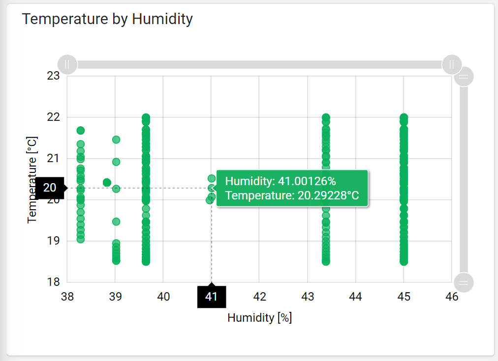
            <scatter-chart-widget [title]="'Temperature by Humidity'">
            <metric name="humidity"></metric>
            <metric name="temperature"></metric>
            </scatter-chart-widget>
Component Reference
Here is a comprehensive list of all the elements and properties that can be used to configure the component.
Scatter Chart <scatter-chart-widget>
Title | The title displayed on the top part of the widget box. Name: title Type: STRING | Optional
|
Controls | |
Export Enabled | The boolean flag indicating whether the data export is enabled. Name: config.exportEnabled Type: BOOLEAN | Optional Default Value: false
|
Export File Type | The export file type Name: config.exportFileType Type: ENUM | Optional Values: json, csv, xlsx Default Value: csv
|
Period Filter Enabled | The boolean flag indicating whether the embedded period filter is available. Name: config.filterEnabled Type: BOOLEAN | Optional Default Value: false
|
Scrollbar Enabled | The flag enabling the widget top scrollbar allowing the user to scroll and zoom data. Name: config.scrollbarEnabled Type: BOOLEAN | Optional Default Value: false
|
Data | |
Default Loading Period | The default filtering period applied when entering the page. Name: config.defaultPeriodValue Type: PERIODS | Optional Default Value: LAST_7_DAYS
|
Period Variable | The id of the page's variable providing the date range filtering period, for instance the id of a <period-filter-field>. Name: inputs.period Type: STRING | Optional
|
Advanced | |
Color | The color used to display the bullets and lines. Name: config.color Type: STRING | Optional Default Value: #08B05B
|
Show Bullets | Indicates whether to display data point bullets. Name: config.showBullets Type: BOOLEAN | Optional Default Value: true
|
Show Timestamps | Indicates whether to display the timestamps associated to data points. Name: config.showTimestamps Type: BOOLEAN | Optional Default Value: false
|
Rendering | |
Availability | Configure availability based on active features on Digital Plan on Add-ons Name: hasFeature Type: FEATURE (multiple) | Optional
|
CSS Class | The name(s) of the CSS class used to customize the widget layout. Name: class Type: STRING | Optional
|
Height | The widget desired height (default 480px). Name: config.height Type: STRING | Optional
|
Visibility Condition | The expression that allows you to reduce the visibility of the element. Name: *ngIf Type: STRING | Optional
|
Sub Elements | |
The X-axis (first) or Y-axis (second) metric whose values must be loaded by the widget. | |
Metric <metric>
Filter | The name of the filter used to transform and display values. Name: filter Type: FILTER | Optional
|
Label | The metric alternative label. Name: label Type: STRING | Optional
|
Name | The metric whose value(s) must be loaded by the widget. Name: name Type: METRIC | Required
|
Unit | The unit of measurement to be displayed along the value. Name: unit Type: STRING | Optional
|
Advanced | |
Visibility Condition | The expression that allows you to reduce the visibility of the element. Name: *ngIf Type: STRING | Optional
|
Full Syntax Example
<scatter-chart-widget
[title]="'Scatter Chart'"
[config]="{
exportEnabled: true,
height: '250px',
scrollbarEnabled: true,
showBullets: false,
color: '#007BFF',
filterEnabled: true,
exportFileType: 'json',
defaultPeriodValue: 'LAST_30_DAYS',
showTimestamps: true
}"
[inputs]="{
period: 'period'
}"
class="my-custom-class"
*ngIf="getUser().organizationId != null"
hasFeature="['feature_a', 'feature_b']">
<metric
name="Temperature"
label="Temperature"
filter="fooBarFilter"
unit="°C"
*ngIf="getUser().organizationId != null"></metric>
</scatter-chart-widget>