Displays a pie or donut chart with one slice for each loaded value.
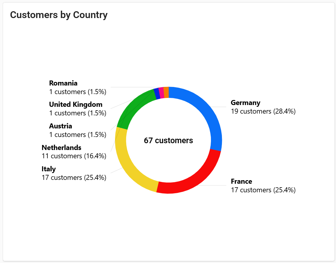
The Pie Chart shows how a total is split into parts, so DPS users can see at a glance which slice is the largest.
For instance, it can show in which countries most of the installed base is located, which event types occur most often, or how a machine's working time is divided across its operating states.
Each slice represents a value loaded from a metric or from a statistic, and its size is proportional to that value's share of the total.
Pie charts are easiest to read with a few slices. If the data is split into many categories, or you need to compare values over time, use the Bar Chart instead.
Metrics
Each Metric sub-element adds one slice to the chart, labeled with the metric name or with the custom Label, if defined.
Use metrics when the values are parts of the same whole and share the same unit, such as the hours spent by a machine in each operating state, or the energy consumed by each subpart.
Through the Aggregation property, you can choose how the metric values are aggregated (MIN, MAX, AVG, DELTA, SUM). Without aggregation, the Pie chart uses the latest available value of the metrics within the input period.
For instance, with counter metrics tracking the hours spent in each state, DELTA returns the hours accumulated over the period, so the chart shows how the working time was split across states.
Statistics
A Statistic computes values from the items of a Resource (for instance, things, alerts, events, or work sessions) by applying an Aggregation function, such as COUNT to count the items, or SUM to add up the values of a Property.
By setting Group By, results are split by the values of a property, and each group becomes a slice of the pie. For instance, counting things grouped by customer.country shows how the installed base is distributed across countries (one slice per country).
To narrow down the items included in the statistic, you can:
Define conditions in the Query property, for instance, to include only connected products.
For events and alerts, use Status to include those currently active (
ACTIVE), or those activated within the selected period (ACTIVATED).Limit the number of returned results through the Max Result Count option.
Grouping by Value Ranges
When Group By refers to a numeric property with min and max values, set Interval Count to divide that range into intervals, each displayed as a slice.
For instance, you can show how many things fall within each range of a numeric property.
Enable Include Empty Intervals to also display intervals with no results.
Data Period
Metric aggregations and statistics on time-based items, such as events activated within the period, are computed over a period.
When the page is opened, the chart loads the data of the Default Loading Period (the last 7 days, unless otherwise configured).
To let DPS users choose the period, add a Period Field to the same page and reference its ID in the Period Variable property.
Multiple Things Charting
The Pie Chart can also be placed within the Customer or Location details pages, or even in the overview page of an organization or partner user. In this case, statistics are computed on the items related to the page context. For instance, in a customer details page, you can display the active events of all the customer's products grouped by severity.
In addition to statistics, in a multi-thing context (e.g., the location details), you can display aggregated data of a thing metric (use the thing. prefix in the metric name). For each thing in the context, the pie chart displays a slice with the corresponding aggregated value of the metric.
Optionally, you can change the set of things, or statistic’s items, the pie chart is working on by coupling it with a Search Field available on the same page, referenced in the Query Variable property.
Chart Layout
By default, the chart is displayed as a donut, with the total in the center. Set Pie Layout to PIE to display a standard pie.
Each slice is labeled with its name and, depending on Displayed Value, with its value, its percentage of the total, or both.
Use Slice Label Position to place the labels outside the chart, horizontally or along the circle, or to hide them.
Use Legend Position to display a legend at the bottom or on the right of the chart.
Slices are sorted by decreasing value. Set Slice Sorting to BY_NAME_ASC to sort them alphabetically instead.
To format the displayed values, set a Unit (e.g., customers in the image above) and a Value Filter, which apply to all the values in the chart.
Data Export
Select Export Enabled to let DPS users export the data displayed in the chart.
Template Syntax
Below you can find some examples of how to use the component within a template.
Example 1: Displays how the installed base is distributed across countries.
<pie-chart-widget-v2 [title]="'Machines by Country'">
    <statistic resource="THING" aggregation="COUNT" groupBy="customer.country"></statistic>
</pie-chart-widget-v2>
Example 2: Displays the currently active events grouped by severity.
<pie-chart-widget-v2 [title]="'Events Distribution'">
    <statistic resource="EVENT" activationType="ACTIVE" aggregation="COUNT" groupBy="eventSeverity"></statistic>
</pie-chart-widget-v2>
Example 3: Displays how the working time was split across operating states, using counter metrics.
<pie-chart-widget-v2 [title]="'Time distribution by Status'" [inputs]="{period: 'page-period'}" [config]="{unit: 'Hours', filter: 'millisToHours'}">
    <metric name="Standby Time" label="Standby" aggregation="DELTA"></metric>
    <metric name="Warmup Time" label="Warmup" aggregation="DELTA"></metric>
    <metric name="Working Time" label="Working" aggregation="DELTA"></metric>
</pie-chart-widget-v2>
Example 4: Displays how the production was split across different machines, using the same metric.
<pie-chart-widget-v2 [title]="'Pieces by Machine'" [inputs]="{period: 'page-period'}">
    <metric name="thing.piece_count" aggregation="DELTA"></metric>
</pie-chart-widget-v2>
Example 5: Displays the installed base by country as a standard pie, showing only percentages, with slices sorted by name and a legend at the bottom.
<pie-chart-widget-v2 [title]="'Machines by Country'"
    [config]="{mode: 'PIE', displayedValue: 'PERCENTAGE', sort: 'BY_NAME_ASC', legendPosition: 'BOTTOM'}">
    <statistic resource="THING" aggregation="COUNT" groupBy="customer.country"></statistic>
</pie-chart-widget-v2>
Component Reference
Here is a comprehensive list of all the elements and properties that can be used to configure the component.
Pie Chart NEW <pie-chart-widget-v2>
Displayed Value | The information displayed for each slice: percentage, value, or both. Name: config.displayedValue Type: ENUM | Optional Values: PERCENTAGE_AND_VALUE, PERCENTAGE, VALUE Default Value: PERCENTAGE_AND_VALUE
|
Legend Position | The position of the legend in the widget. Name: config.legendPosition Type: ENUM | Optional Values: NONE, BOTTOM, RIGHT Default Value: NONE
|
Pie Layout | The chart layout: standard pie or donut. Name: config.mode Type: ENUM | Required Values: PIE, DONUT Default Value: DONUT
|
Show Total | If enabled, the total is displayed in the center of the donut. Name: config.showTotal Type: BOOLEAN | Optional Default Value: true
|
Slice Label Position | The position of the labels displayed next to each slice. Name: config.sliceLabelPosition Type: ENUM | Required Values: HORIZONTAL_OUTSIDE, CIRCULAR_OUTSIDE, NONE Default Value: HORIZONTAL_OUTSIDE
|
Slice Sorting | The criterion used to sort slices in the chart. Name: config.sort Type: ENUM | Optional Values: BY_NAME_ASC, BY_VALUE_DESC Default Value: BY_VALUE_DESC
|
Title | The title displayed at the top of the widget. Name: title Type: STRING | Optional
|
Unit | The unit of measurement displayed next to values. Name: config.unit Type: STRING | Optional
|
Value Filter | The filter used to format all values. Name: config.filter Type: FILTER | Optional
|
Data | |
Default Loading Period | The default period used to filter data when the page is opened. Name: config.defaultPeriod Type: PERIODS | Optional Default Value: LAST_7_DAYS
|
Period Variable | The ID of the page variable providing the filtering period (e.g. the ID of a <period-filter-field>). Name: inputs.period Type: STRING | Optional
|
Query Variable | The ID of the page variable providing the search criteria (e.g. the ID of a <things-filter-field>). Name: inputs.query Type: STRING | Optional
|
Rendering | |
Availability | The Digital Plan or Add-on features required to display the widget. Name: hasFeature Type: FEATURE (multiple) | Optional
|
CSS Class | The CSS class name(s) used to customize the widget layout. Name: class Type: STRING | Optional
|
Height | The height in pixels of the widget. Name: config.height Type: STRING | Optional Default Value: 480
|
Visibility Condition | The expression that determines whether the widget is displayed. Name: *ngIf Type: STRING | Optional
|
Controls | |
Export Enabled | The boolean flag indicating whether the data export is enabled. Name: config.exportEnabled Type: BOOLEAN | Optional Default Value: false
|
Sub Elements | |
Metric <metric>
Aggregation | The aggregation applied to the metric values. Name: aggregation Type: AGGREGATION | Optional Functions: MIN, MAX, AVG, DELTA, SUM
|
Filter | The filter used to transform the displayed values. Name: filter Type: FILTER | Optional
|
Label | The custom label displayed instead of the metric name. Name: label Type: STRING | Optional
|
Name | The metric whose value is used as the slice value. Name: name Type: METRIC | Required
|
Statistic <statistic>
Aggregation | The function used to aggregate the items. Name: aggregation Type: ENUM | Optional Values: AVG, COUNT, MAX, MIN, SUM, LAST
|
Averaged By | The count used to average the statistic results (e.g. average alert count per thing). Name: averagedBy Type: ENUM | Optional Values: thingCount
|
Filter | The filter used to transform the displayed values. Name: filter Type: FILTER | Optional
|
Group By | The property used to group results (e.g. customer.country). For time-based items, results can also be grouped by HOUR, DAY, MONTH, or YEAR. Name: groupBy Type: GROUP_BY | Optional
|
Include Empty Intervals | If enabled, intervals with no results are also displayed. Name: config.includeEmptyGroups Type: BOOLEAN | Optional Default Value: false
|
Interval Count | The number of intervals into which results are divided when grouping by a property with min and max values. Name: config.intervalCount Type: INTEGER | Optional
|
Label | The custom label displayed for the statistic. Name: label Type: STRING | Optional
|
Property | The item property whose values are aggregated. Name: property Type: PROPERTY | Optional
|
Resource | The resource whose items are used to calculate the statistic. Name: resource Type: ENUM | Required Values: ACTION, ALERT, EVENT, CUSTOMER, LOCATION, PARTNER, THING, USER, WORK_SESSION
|
Status | The events or alerts to include: those currently active, or those activated within the selected period. Name: activationType Type: ENUM | Optional Values: ACTIVE, ACTIVATED
|
Data | |
Max Result Count | The maximum number of results returned. If empty, all results are returned. Name: limit Type: INTEGER | Optional
|
Query | The conditions items must match to be included (e.g. [query]='[{'property': 'connectionStatus', 'predicate': 'eq', 'value': '1'}]'). Supported predicates: eq, beginsWith, like, notLike, isEmpty, isNotEmpty, gt, gte, lt, lte. Name: query Type: QUERY | Optional Predicates: beginsWith, eq, neq, gt, gte, isEmpty, isNotEmpty, lt, lte, like, notLike
|
Full Syntax Example
<pie-chart-widget-v2
    [title]="'abc'"
    [config]="{
        mode: 'PIE',
        sort: 'BY_NAME_ASC',
        exportEnabled: true,
        defaultPeriod: 'LAST_30_DAYS',
        filter: 'dateFormat',
        sliceLabelPosition: 'HORIZONTAL_OUTSIDE',
        unit: 'abc',
        displayedValue: 'PERCENTAGE_AND_VALUE',
        showTotal: false,
        legendPosition: 'NONE',
        height: 'abc'
    }"
    [inputs]="{
        period: 'abc',
        query: 'abc'
    }"
    class="abc"
    *ngIf="abc"
    hasFeature="['feature_a', 'feature_b']">
    <metric
            name="metricName"
            label="abc"
            filter="dateFormat"
            aggregation="SUM"></metric>
    <statistic
            label="abc"
            resource="ACTION"
            activationType="ACTIVE"
            aggregation="AVG"
            groupBy="prop1"
            [config]="{
                intervalCount: 123,
                includeEmptyGroups: true
            }"
            property="propName"
            averagedBy="thingCount"
            filter="dateFormat"
            query="[{property:'prop1', predicate: 'eq', value: 'foo'}, {property:'prop2', predicate: 'in', value: ['bar', 'baz']}]"
            limit="123"></statistic>
</pie-chart-widget-v2>