This page control provides a search field, which can be used as input by other page widgets.
Once placed in the template, you must specify the “Search Target“ on which the search will work (default THINGS).
The search field is well-suited to be placed within the control-bar template, allowing a shared search experience across pages operating on the same search target (e.g. THINGS, EVENTS).
By default, a key text field and the button to open the advanced search are displayed.
Optionally, you can change its configuration by adding the search-input sub-elements with these types:
KEY: adds the text input for searching by text key.ADVANCED: adds the button that opens the advanced search in a pop-up.PROPERTY: adds an in-line field that searches by a specific property.
The field type depends on the type of the bound property (e.g. check for Booleans, selection/radio for dictionary-based properties).CLEAR: adds the button that clears the search inputs.
You can add multiple search-input elements, and the order of them reflects how the search-field is displayed.
Selection Input
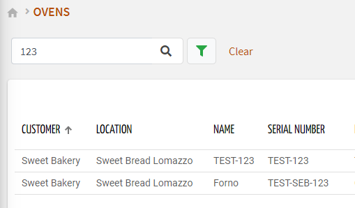
In case the search target is THINGS, you can also add the selection-input sub-element, allowing the DPS user to select a subset of things (already filtered according to the other search inputs).
Like a standard thing list, the columns of the selectable things list can be customized by defining the properties you want to display.
.png?sv=2026-02-06&spr=https&st=2026-07-17T12%3A20%3A50Z&se=2026-07-17T12%3A34%3A50Z&sr=c&sp=r&sig=LhLN%2B7Gd%2BPf%2BtOqoCU6RaEmEw9qW92nKwzPFkNjiapY%3D)
Binding with other Widgets
When one of the inputs is changed by the DPS user, the new search conditions are propagated to the other page widgets listening to search-field.
For a correct binding, the search-field must declare the “id”, and the same identifier must be set in the “Query Variable“ property of other page widgets.
<search-field id="query-1"></search-field>

        <table-widget queryFieldRef="query-1">...</table-widget>
        <bar-chart-widget-v2 [inputs]="{query: 'query-1'}">...</bar-chart-widget-v2>
According to the selected “Search Target”, the Search Field can be coupled with the following widgets:
Bar Chart (statistics are computed on the input objects)
Gauge (compute an aggregated value for the input objects)
Time Series Chart (a series is displayed for each metric and input thing)
Value (compute an aggregated value for the input objects)
Template Syntax
Below you can find some examples of how to use the component within a template.
            <search-field searchTarget="THINGS" id="query-1">
            <selection-input>
            <property name="name"></property>
            <property name="location"></property>
            </selection-input>
            <search-input type="PROPERTY" property="tags"></search-input>
            <search-input type="KEY"></search-input>
            <search-input type="ADVANCED"></search-input>
            <search-input type="CLEAR"></search-input>
            </search-field>
Component Reference
Here is a comprehensive list of all the elements and properties that can be used to configure the component.
Search Field <search-field>
Id | The id used by other page widgets to retrieve the query, and update the data in case the query is changed. Name: id Type: STRING | Required
|
Label | The field label. Name: label Type: STRING | Optional
|
Period Filter Enabled | The boolean flag indicating whether the embedded period filter is available. Name: periodFilterEnabled Type: BOOLEAN | Optional Default Value: true
|
Query | The array of conditions filtering out items. For instance: [query]='[{'property': 'connectionStatus', 'predicate': 'eq', 'value': '1'}]' Predicates: eq, beginsWith, like, notLike, isEmpty, isNotEmpty, gt, gte, lt, lte. Name: query Type: QUERY | Optional Predicates: beginsWith, eq, neq, gt, gte, isEmpty, isNotEmpty, lt, lte, like, notLike
|
Search Target | The objects to be researched. The advanced search UI depends on the selected target. Name: searchTarget Type: ENUM | Required Values: THINGS, LOCATIONS, CUSTOMERS, PARTNERS, ACTIONS, ACTIVE_ALERTS, HISTORICAL_ALERTS, ACTIVE_EVENTS, HISTORICAL_EVENTS, ACTIVE_WORK_SESSIONS, HISTORICAL_WORK_SESSIONS Default Value: THINGS
|
Rendering | |
Availability | Configure availability based on active features on Digital Plan on Add-ons Name: hasFeature Type: FEATURE (multiple) | Optional
|
CSS Class | The name(s) of the CSS class used to customize the widget layout. Name: class Type: STRING | Optional
|
Visibility Condition | The expression that allows you to reduce the visibility of the element. Name: *ngIf Type: STRING | Optional
|
Sub Elements | |
The sub-element used to customize the search UI. | |
The sub-element allowing to select specific things one-to-one. | |
Search Input <search-input>
Input Type | The type of input to be displayed as part of the search field. Name: type Type: ENUM | Required Values: ADVANCED, KEY, PROPERTY, CLEAR
|
Name | The property for which to show the search field inline. It can only be used for input of type PROPERTY. Name: property Type: PROPERTY | Required
|
Selection Input <selection-input>
Sub Elements | |
The property to be displayed as table column in the selection dialog. | |
Property <property>
Description | The property description. Name: description Type: STRING | Optional
|
Filter | The name of the filter used to transform and display values. Name: filter Type: FILTER | Optional
|
Label | The property alternative label. Name: label Type: STRING | Optional
|
Name | The property whose value must be loaded by the widget. Name: name Type: PROPERTY | Required
|
Advanced | |
Column CSS Class | The name(s) of the column CSS class used to customize the table column. Name: columnClass Type: COLUMN_CSS | Optional
|
Show Header | The flag indicated whether the header is visible. Name: showHeader Type: BOOLEAN | Optional Default Value: true
|
Visibility Condition | The expression that allows you to reduce the visibility of the element. Name: *ngIf Type: STRING | Optional
|
Full Syntax Example
<search-field
    id="abc"
    label="abc"
    searchTarget="THINGS"
    query="[{property:'prop1', predicate: 'eq', value: 'foo'}, {property:'prop2', predicate: 'in', value: ['bar', 'baz']}]"
    [periodFilterEnabled]="false"
    class="my-custom-class"
    *ngIf="getUser().organizationId != null"
    hasFeature="['feature_a', 'feature_b']">
    <search-input
            type="ADVANCED"
            property="serialNumber"></search-input>
    <selection-input>
            <property
                        name="serialNumber"
                        label="Temperature"
                        description="abc"
                        filter="fooBarFilter"
                        *ngIf="getUser().organizationId != null"
                        [showHeader]="false"
                        columnClass="my-column-custom-class"></property>
    </selection-input>
</search-field>