Displays a list of things grouped by a thing property.
This widget to work requires other than selecting the property used for grouping things, also defining the template used to render each group when expanded within the list by clicking on it.
Template Syntax
Below you can find some examples of how to use the component within a template.
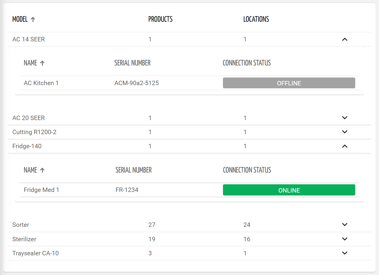
Thing list grouped by thing-definition name.
            <grouped-thing-list-widget groupingProperty="thingDefinition.name"
            template="things_group"
            groupLabel="Model"
            class="flex-fill">

            </grouped-thing-list-widget>
Templates referenced by the grouped-thing-list.
            <thing-list-widget-v2 [query]="${GROUP_QUERY}" class="flex-fill" [controlsEnabled]="true">

            <property name="name"></property>
            <property name="serialNumber"></property>
            <property name="connectionStatus" filter="connectionStatus"></property>

            </thing-list-widget-v2>
Component Reference
Here is a comprehensive list of all the elements and properties that can be used to configure the component.
Grouped Thing List <grouped-thing-list-widget>
Group Label | The optional label associated to the group name. Name: groupLabel Type: STRING | Optional
|
Grouping Property | The property used to group things. Name: groupingProperty Type: PROPERTY | Required
|
Template | The name of the template used to render the content of the group. Name: template Type: STRING | Required
|
Title | The title displayed on the top part of the widget box. Name: title Type: STRING | Optional
|
Rendering | |
Availability | Configure availability based on active features on Digital Plan on Add-ons Name: hasFeature Type: FEATURE (multiple) | Optional
|
CSS Class | The name(s) of the CSS class used to customize the widget layout. Name: class Type: STRING | Optional
|
Visibility Condition | The expression that allows you to reduce the visibility of the element. Name: *ngIf Type: STRING | Optional
|
Full Syntax Example
<grouped-thing-list-widget
    [title]="'Grouped Things'"
    groupingProperty="thingDefinition.name"
    groupLabel="Set"
    template="group_thing_list"
    class="my-custom-class"
    *ngIf="getUser().organizationId != null"
    hasFeature="['feature_a', 'feature_b']">
</grouped-thing-list-widget>