This widget displays a box with the last available value of a metric or a statistic.
For instance, you can display the current value of a temperature metric.
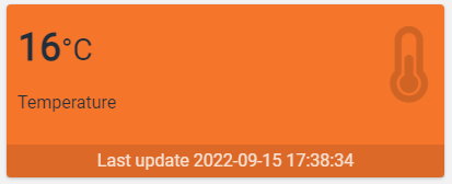
Within the box you can find, the value of the metric with its unit of measurement (if defined), the name of the metric, and the timestamp related to the loaded value.
Other than metrics, in a gauge, you can also display the value of a statistic, for instance, to display the number of alerts that occurred this month. Regardless of the data type (metric or statistic), the behavior of the gauge is the same.
Layouts
Within a gauge, you can change the background color, and icon, choosing between a Font Awesome icon or, a static icon published to an HTTP address.
In the alternative, you can change also the box layout, choosing between:
Small Box | Info Box |
Metric Data Aggregation
In addition to showing the current metric value, the gauge can aggregate values, also on multiple things and within a time period.
For instance, within a location details page, you can display the total number of pieces produced by the machine, under the location, for a certain period.
The supported aggregations are:
AVG: Displays the average value which can be relative in case a period has been defined or absolute considering all the available data. In the case of multiple things, the average is computed among all things.
DELTA: Displays the variation of a metric within a period. In the case of multiple things, the resulting deltas are summed up. In case the period is not defined, the delta is computed over all the available data.
DELTA_AVG_DAYS_1: Displays the average of the daily deltas in a period. In the case of multiple things, the daily deltas are summed up by day. In case the period is not defined, the average is computed over all the daily deltas.
MIN: Displays the minimum value which can be relative in case a period has been defined or absolute considering all the available data. In the case of multiple things, the minimum is computed among all things.
MAX: Displays the maximum value which can be relative in case a period has been defined or absolute considering all the available data. In the case of multiple things, the maximum is computed among all things.
Value Comparison
You can use the gauge to display the value increment with respect to the previous value.
In input to the gauge, it is possible to provide a dynamic period, by using a page period field, or a static period hardcoded into the template (e.g. THIS_MONTH). When the value increment is enabled, the gauge computes the value for the previous period and displays the increment.
The increment can be displayed as a percentage or as an absolute value. Moreover, within the same box, you can also display the value relative to the previous period.
The following gauge displays the consumption of energy during this month (DELTA over the Energy metric), the consumption of the previous month, the absolute increment, and the relative percentage.
Here is the same gauge with a different layout
The increment can be displayed differently depending on whether it is a negative or a positive thing.
Previous period calculation logic
Based on the input period, the gauge calculates the comparison period according to this logic.
If the input period is open at the end (not yet concluded), such as TODAY, THIS_MONTH, THIS_YEAR, the comparison period takes into account the end date, for instance:
Input Period: 01 September 2022 - 19 September 2022
Comparison Period: 01 August 2022 - 19 August 2022
If the period identifies a whole day, month or year, the comparison considers the previous day, month, or year. In all other cases, the previous period is the input period reversed in the past, for instance:
Input Period: 10 September 2022 - 20 September 2022
Comparison Period: 01 September 2022 - 10 September 2022
Template Syntax
Below you can find some examples of how to use the component within a template.
Example 1
Gauge displaying the current value of running hours.
            <gauge-widget iconName="fa-clock-o">
            <metric name="Running Hours" filter="millisToHours"></metric>
            </gauge-widget>
Example 2
Gauge displaying the number of pieces produced in a selected period from a set of things.
            <period-field></period-field>
            <things-filter-field id="machinesFilter"></things-filter-field>

            <gauge-widget aggregation="DELTA"
            periodRef="period"
            queryFieldRef="machinesFilter"
            showIncrement="RELATIVE">

            <metric name="thing.Total Pieces"></metric>

            </gauge-widget>
Component Reference
Here is a comprehensive list of all the elements and properties that can be used to configure the component.
Gauge <gauge-widget>
Aggregation | Indicates whether to render the last value or the aggregated value. Name: aggregation Type: ENUM | Optional Values: LAST_VALUE, AVG, DELTA, DELTA_AVG_DAYS_1, MIN, MAX Default Value: LAST_VALUE
|
Background Color Class | The class applied on the background, refer to the link:https://getbootstrap.com/docs/4.0/utilities/colors/#background-color[Bootstrap Colors] guide Name: backgroundColorClass Type: STRING | Optional
|
| The <period-field>'s End Variable filtering data by end date. Name: endDateFieldRef Type: STRING | Optional
|
Icon Name | The name of the link:https://fontawesome.com/v5/search[Font Awesome] icon. Name: iconName Type: STRING | Optional
|
Icon Url | The URL where the icon to display is located. Name: iconUrl Type: STRING | Optional
|
Increment Value Position | Indicates whether to place the increment value Name: incrementValuePosition Type: ENUM | Optional Values: RIGHT, BOTTOM Default Value: RIGHT
|
Layout | Indicates the rendering layout Name: layout Type: ENUM | Optional Values: INFO_BOX, SMALL_BOX Default Value: SMALL_BOX
|
Measure Unit Position | Indicates where to place the unit of measurement. Name: measureUnitPosition Type: ENUM | Optional Values: NONE, METRIC_NAME_RIGHT, METRIC_VALUE_RIGHT Default Value: METRIC_VALUE_RIGHT
|
Null Increase Class | The CSS class customizing how to render a null variation (e.g. text-gray) when the increment value si displayed. Name: nullIncreaseClass Type: STRING | Optional
|
Period | The default period to use when computing DELTA. Name: period Type: PERIODS | Optional
|
Period Variable | The id of the page's variable providing the date range filtering period, for instance the id of a <period-filter-field>. Name: periodRef Type: STRING | Optional
|
Query Variable | The id of the page's <things-filter-field> used for searching. Name: queryFieldRef Type: STRING | Optional
|
Show Increment | Indicates whether the increment value should be calculated from the previous time period. Name: showIncrement Type: ENUM | Optional Values: NONE, ABSOLUTE, PERCENTAGE, ABSOLUTE_AND_PERCENTAGE Default Value: NONE
|
Show Last Update | The flag indicating whether to show or hide the last update timestamp. Name: showLastUpdate Type: BOOLEAN | Optional Default Value: true
|
Show Previous Value | Indicates whether the previous value must be displayed on the right of the current one. Name: showPreviousValue Type: BOOLEAN | Optional Default Value: false
|
| The <period-field>'s Start Variable filtering data by start date. Name: startDateFieldRef Type: STRING | Optional
|
Title | The title displayed on the top part of the widget box. Name: title Type: STRING | Optional
|
Value Decrease Class | The CSS class customizing how to render a negative variation (e.g. text-red) when the increment value si displayed. Name: valueDecreaseClass Type: STRING | Optional
|
Value Increase Class | The CSS class customizing how to render a positive variation (e.g. text-green) when the increment value si displayed. Name: valueIncreaseClass Type: STRING | Optional
|
Rendering | |
Availability | Configure availability based on active features on Digital Plan on Add-ons Name: hasFeature Type: FEATURE (multiple) | Optional
|
CSS Class | The name(s) of the CSS class used to customize the widget layout. Name: class Type: STRING | Optional
|
Visibility Condition | The expression that allows you to reduce the visibility of the element. Name: *ngIf Type: STRING | Optional
|
Sub Elements | |
The metric whose current value must be displayed within the gauge box. | |
The statistic whose value must be displayed within the gauge box. | |
The widget part combining multiple properties and metrics. | |
Metric <metric>
Filter | The name of the filter used to transform and display values. Name: filter Type: FILTER | Optional
|
Label | The metric alternative label. Name: label Type: STRING | Optional
|
Name | The metric whose value(s) must be loaded by the widget. Name: name Type: METRIC | Required
|
Unit | The unit of measurement to be displayed along the value. Name: unit Type: STRING | Optional
|
Advanced | |
Visibility Condition | The expression that allows you to reduce the visibility of the element. Name: *ngIf Type: STRING | Optional
|
Statistic <statistic>
Aggregation | The function used to aggregate data. Name: aggregation Type: ENUM | Optional Values: AVG, COUNT, MAX, MIN, SUM
|
| The alert category used to filter the statistic results. Name: category Type: ENUM (multiple) | Optional Values: INFORMATION, ADVICE, ANOMALY, FAILURE, SAFETY
|
| The alert severity used to filter the statistic results. Name: severity Type: ENUM (multiple) | Optional Values: INFORMATIONAL, WARNING, CRITICAL, EMERGENCY
|
Alert Status | Define whether to include alerts that are still active, or have been activated in a period. Name: activationType Type: ENUM | Optional Values: ACTIVE, ACTIVATED
|
Averaged By | The count used to average the statistic results (e.g. Average alert count by thing). Name: averagedBy Type: ENUM | Optional Values: thingCount
|
| The <period-field>'s End Variable filtering data by end date. Name: endDateFieldRef Type: STRING | Optional
|
Group By | The property used to group results. For instance: customer.country. In the case where the underlying objects are temporally distributed you can also aggregate by HOUR, DAY, MONTH and YEAR. Name: groupBy Type: GROUP_BY | Optional
|
| The flag indicating whether to include or not the alerts with zero occurrences. Name: includeZeroValues Type: BOOLEAN | Optional Default Value: false
|
| The statistic whose results(s) must be loaded by the widget. Name: name Type: STATISTIC | Required
|
Property | The object property whose values must be aggregated. Name: property Type: PROPERTY | Optional
|
Resource | The resource from which to retrieve the items to be used to calculate the statistic. Name: resource Type: ENUM | Required Values: ACTION, ALERT, EVENT, CUSTOMER, LOCATION, PARTNER, THING, USER, WORK_SESSION Default Value:
|
Sorting | The sort direction used to order categories by value (default none). Name: sortDirection Type: ENUM | Optional Values: ASC, DESC
|
| The <period-field>'s Start Variable filtering data by start date. Name: startDateFieldRef Type: STRING | Optional
|
| The work-session monitored metric to sum. Name: sumMetric Type: STRING | Optional
|
| The name of the thing-definition used to filter the statistic results. Name: thingDefinition Type: STRING | Optional
|
Value Filter | The name of the filter used to transform and display values. Name: filter Type: FILTER | Optional
|
Data | |
Max Result Count | The number of maximum returned results (default all results are returned). Name: limit Type: INTEGER | Optional
|
| The id of the page's variable providing the date range filtering period, for instance the id of a <period-filter-field>. Name: periodRef Type: STRING | Optional
|
Query | The array of conditions filtering out items. For instance: [query]='[{'property': 'connectionStatus', 'predicate': 'eq', 'value': '1'}]' Predicates: eq, beginsWith, like, notLike, isEmpty, isNotEmpty, gt, gte, lt, lte. Name: query Type: QUERY | Optional Predicates: beginsWith, eq, neq, gt, gte, isEmpty, isNotEmpty, lt, lte, like, notLike
|
Composite Part <composite-part>
Description | The composite-part description. Name: description Type: STRING | Optional
|
Filter | The filter applied on the composite-part to transform or display its value. Name: filter Type: FILTER | Optional
|
Label | The label displayed by the widget. Name: label Type: STRING | Optional
|
Name | The composite-part name. Name: name Type: STRING | Optional
|
Advanced | |
Visibility Condition | The expression that allows you to reduce the visibility of the element. Name: *ngIf Type: STRING | Optional
|
Sub Elements | |
The metric whose value must be loaded within the composite-part. | |
The property whose value must be loaded within the composite-part. | |
Metric <metric>
Name | The metric whose value(s) must be loaded by the widget. Name: name Type: METRIC | Required
|
Property <property>
Name | The property whose value must be loaded by the widget. Name: name Type: PROPERTY | Required
|
Full Syntax Example
<gauge-widget
[title]="'Gauge'"
backgroundColorClass="#007BFF"
iconName="fa-thermometer"
iconUrl="abc"
measureUnitPosition="NONE"
layout="INFO_BOX"
[showPreviousValue]="true"
showIncrement="NONE"
[showLastUpdate]="false"
aggregation="LAST_VALUE"
period="LAST_30_DAYS"
incrementValuePosition="RIGHT"
valueIncreaseClass="abc"
nullIncreaseClass="abc"
valueDecreaseClass="abc"
periodRef="period"
queryFieldRef="query-1"
startDateFieldRef="fromDate"
endDateFieldRef="toDate"
class="my-custom-class"
*ngIf="getUser().organizationId != null"
hasFeature="['feature_a', 'feature_b']">
<metric
name="Temperature"
label="Temperature"
filter="fooBarFilter"
unit="°C"
*ngIf="getUser().organizationId != null"></metric>
<statistic
name="alertCount"
resource="ACTION"
activationType="ACTIVE"
aggregation="AVG"
groupBy="customer.name"
property="propName"
sortDirection="ASC"
averagedBy="thingCount"
filter="fooBarFilter"
severity="['INFORMATIONAL', 'WARNING']"
category="['INFORMATION', 'ADVICE']"
thingDefinition="abc"
startDateFieldRef="fromDate"
endDateFieldRef="toDate"
sumMetric="metrics.Pieces.DELTA"
[includeZeroValues]="true"
query="[{property:'prop1', predicate: 'eq', value: 'foo'}, {property:'prop2', predicate: 'in', value: ['bar', 'baz']}]"
limit="123"
periodRef="abc"></statistic>
<composite-part
name="abc"
label="abc"
description="abc"
filter="fooBarFilter"
*ngIf="getUser().organizationId != null">
<metric
name="Temperature"></metric>
<property
name="serialNumber"></property>
</composite-part>
</gauge-widget>