Provides a global export button on the page. Users can click the button and select the data to be exported.
This control should generally be placed in the page control bar template.
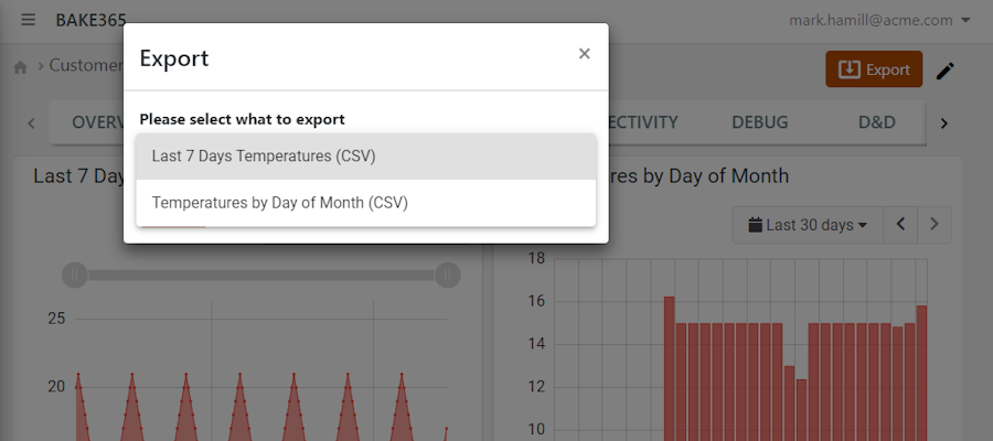
Referring to the previous image, the user, once the button is clicked, must select the dataset to be exported; in this case there are two widgets that can be exported.
If the export button is present on the page, all widgets will register their exports to it, instead of displaying the built-in export button.
Template Syntax
Below you can find some examples of how to use the component within a template.
            <div class="d-flex flex-wrap components-row justify-content-end">
            <export-button icon="export" label="Export"></export-button>
            </div>
Component Reference
Here is a comprehensive list of all the elements and properties that can be used to configure the component.
Export Button <export-button>
Icon | The icon displayed inside the export button. Name: icon Type: STRING | Optional
|
Label | The label displayed inside the export button. Name: label Type: STRING | Optional
|
Rendering | |
Availability | Configure availability based on active features on Digital Plan on Add-ons Name: hasFeature Type: FEATURE (multiple) | Optional
|
CSS Class | The name(s) of the CSS class used to customize the widget layout. Name: class Type: STRING | Optional
|
Visibility Condition | The expression that allows you to reduce the visibility of the element. Name: *ngIf Type: STRING | Optional
|
Full Syntax Example
<export-button
    label="abc"
    icon="fas fa-thermometer"
    class="my-custom-class"
    *ngIf="getUser().organizationId != null"
    hasFeature="['feature_a', 'feature_b']"></export-button>