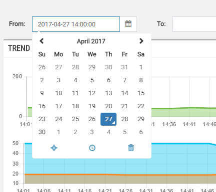
This field allows selecting a datetime for data filtering.
Template Syntax
Below you can find some examples of how to use the component within a template.
            <datetime-field name="from"
            label="From:"
            labelPosition="left|top"
            defaultValue="startToday">
            </datetime-field>
Component Reference
Here is a comprehensive list of all the elements and properties that can be used to configure the component.
Datetime Field <datetime-field>
Default Value | The default value to preselect when entering the page. Name: defaultValue Type: ENUM | Optional Values: now, startToday, endToday, startYesterday, endYesterday, startCurrentWeek, endCurrentWeek, startLastWeek, endLastWeek, startCurrentMonth, endCurrentMonth, startLastMonth, endLastMonth, startCurrentYear, endCurrentYear, startLastYear, endLastYear, 3HoursAgo, 6HoursAgo, 12HoursAgo, 24HoursAgo, 2DaysAgo, 7DaysAgo, 30DaysAgo
|
Label | The field label. Name: label Type: STRING | Optional
|
Label Position | The position where the label must be displayed (left [default], top, none). Name: labelPosition Type: ENUM | Optional Values: left, top, none
|
Name | The name of context variable holding the selected datetime. Name: name Type: STRING | Optional
|
Rendering | |
CSS Class | The name(s) of the CSS class used to customize the widget layout. Name: class Type: STRING | Optional
|
Visibility Condition | The expression that allows you to reduce the visibility of the element. Name: *ngIf Type: STRING | Optional
|
Full Syntax Example
<datetime-field
    name="abc"
    label="abc"
    labelPosition="left"
    defaultValue="now"
    class="my-custom-class"
    *ngIf="getUser().organizationId != null"></datetime-field>