This widget displays a dial with a slider the user can move to change a parameter value.
When the slider is moved on the dial, the selected value is immediately sent to the remote product by updating the referenced configuration parameter.
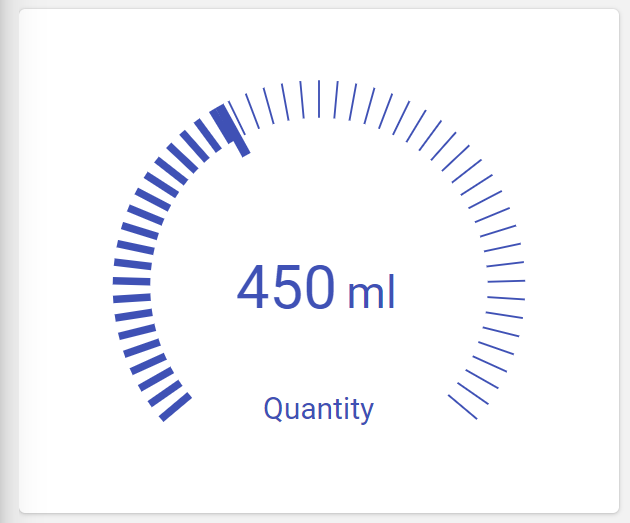
This widget provides two different layouts you can use.
DASHED
.png?sv=2026-02-06&spr=https&st=2026-07-17T15%3A27%3A56Z&se=2026-07-17T15%3A38%3A56Z&sr=c&sp=r&sig=%2F2suQXnME0QIO1ZW7ChDJ7%2BeRM22rM7NpMVVi%2BdyvhQ%3D "image(527).png")
SOLID
.png?sv=2026-02-06&spr=https&st=2026-07-17T15%3A27%3A56Z&se=2026-07-17T15%3A38%3A56Z&sr=c&sp=r&sig=%2F2suQXnME0QIO1ZW7ChDJ7%2BeRM22rM7NpMVVi%2BdyvhQ%3D "image(528).png")
Component Reference
Here is a comprehensive list of all the elements and properties that can be used to configure the component.
Knob <knob-widget>
Color | The color used to render the widget elements. Name: config.color Type: STRING | Optional Default Value: #3F51B5
|
Default Value | The default value to use when displaying the widget. Name: config.defaultValue Type: INTEGER | Optional
|
Layout | The dial layout, which can be: DASHED with a squared slider, SOLID with a circular slider. Name: config.layout Type: ENUM | Optional Values: DASHED, SOLID Default Value: DASHED
|
Parameter | The configuration parameter whose value must be set. Name: config.parameter Type: CONFIGURATION_PARAMETER | Required
|
Ratain Last Value | The flag indicating whether the last value should be retained between navigations. Name: config.retainLastValue Type: BOOLEAN | Optional Default Value: false
|
Ticks | The number of ticks within the DASHED dial. Name: config.ticks Type: INTEGER | Optional Default Value: 50
|
Title | The title displayed on the top part of the widget box. Name: title Type: STRING | Optional
|
Unit | The alternative unit of measurement to be displayed next to the value. Name: config.unit Type: STRING | Optional
|
Rendering | |
Availability | Configure availability based on active features on Digital Plan on Add-ons Name: hasFeature Type: FEATURE (multiple) | Optional
|
CSS Class | The name(s) of the CSS class used to customize the widget layout. Name: class Type: STRING | Optional
|
Height | The height of the widget (e.g. 250px). Name: config.height Type: STRING | Optional Default Value: 300px
|
Visibility Condition | The expression that allows you to reduce the visibility of the element. Name: *ngIf Type: STRING | Optional
|
Full Syntax Example
<knob-widget
    [title]="'Knob'"
    [config]="{
        color: '#007BFF',
        unit: 'abc',
        parameter: 'paramName',
        retainLastValue: true,
        ticks: 123,
        defaultValue: 123,
        layout: 'DASHED',
        height: '250px'
    }"
    class="my-custom-class"
    *ngIf="getUser().organizationId != null"
    hasFeature="['feature_a', 'feature_b']"></knob-widget>