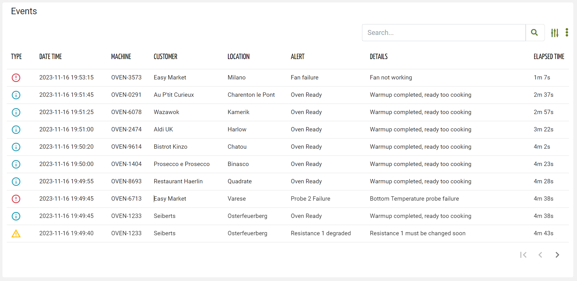
Displays a list of all noteworthy events that have occurred or that are still active.
When placed in a page, you must choose whether to show events that are finished and therefore historical or show events that are still active.
The widget requires the READ_EVENT user’s permission, and it is aware of the page context and so can load events over multiple customers, locations, and machines.
Active or Historical Events
By setting the “Event Status” widget property, you can select whether active or historical events must be displayed.
If the “Event Status” property is left blank, the widget will allow DPS users to switch between active and historical events.
Details Navigation
Clicking on a row opens the event details pop-up. Optionally, the event details can be opened in a full page (see Details Mode option).
The header of the event details popup contains the event name, description, and a breadcrumb that provides the context of the event, and whose tokens can be clicked to quickly jump to related objects (e.g. Customer, Location, Thing).
The event details body is generated through a template, which by default reports the event's main information (e.g. timeline, technical description), but in the alternative, you can redefine the template within the event definition page.
On the event list rows, you can also click directly on specific information to jump to the event-related objects:
Customer Name / Code → Customer details page
Location name → Location details page
Thing Name / Serial Number → Thing details page
In all other cases, the event details pop-up/page is opened.
Search for Events
On the top right part of the widget, a search control bar allows filtering events by a text key.
.png?sv=2022-11-02&spr=https&st=2025-09-24T10%3A04%3A37Z&se=2025-09-24T10%3A21%3A37Z&sr=c&sp=r&sig=bxvTswLtS7VAovEfykE7M%2B9ffdYharj36YNEsoDTUbQ%3D?sv=2026-02-06&spr=https&st=2026-07-20T04%3A53%3A03Z&se=2026-07-20T05%3A10%3A03Z&sr=c&sp=r&sig=Rn5%2F5QtNS54mYWNMGowNxJD8xC1hwvzGPNQmHa9acEw%3D)
Optionally, by pressing the Advanced Search icon, a dedicated panel allows the DPS user to specify multiple conditions based on properties.
.png?sv=2026-02-06&spr=https&st=2026-07-20T04%3A53%3A03Z&se=2026-07-20T05%3A10%3A03Z&sr=c&sp=r&sig=Rn5%2F5QtNS54mYWNMGowNxJD8xC1hwvzGPNQmHa9acEw%3D)
The provided inputs are preserved during navigation, also across pages in case the same widget “Id” is used.
Optionally, by using the “Query“ property, a set of conditions for pre-filtering events can be defined in the template (e.g. failures only).
In the template, you can specify the “Search Fields“ used to filter events by text key.
In case the “Query Variable“ property has been defined (the list is filtered from a Search Field placed in the page), the search control bar is automatically hidden and thus not visible to the user.
The advanced search allows filtering events by:
Text Key: text that is searched in the name, title, and description of each event.
Customer: a customer can be selected, in the case of a user belonging to an organization or partner.
Severity: the severity of the event, one of Failure, Major Anomaly, Minor Anomaly, and Operation.
Period: the time period used to filter events by start timestamp.
Thing Definition or Product Model: one or more thing definitions or product models.
Type: type of event, choosing one or more definitions.
By clicking the Export button, all events that meet the search criteria can be downloaded as a CSV file.
User Reported Events
DPS users can manually report events by clicking on the 3-dots icon and the “Report Event” action.
A pop-up requests the user to select the event to register, and optionally provide some additional notes for technicians.
Template Syntax
Below you can find some examples of how to use the component within a template.
        <event-list-widget [pageSize]="10" [title]="'Events'">

        <property name="eventSeverity" label="Type" filter="eventSeverity"></property>

        <property name="date" [label]="'Date Time'"></property>
        <property name="thing.serialNumber" label="Thing"></property>

        <property [name]="'customer.name'" [label]="'Customer'" *ngIf="getUser()?.organizationId || getUser()?.partnerId"></property>
        <property [name]="'location.name'" [label]="'Location'"></property>

        <property name="title" [label]="'Alert'"></property>
        <property name="description" [label]="'Details'"></property>
        <property name="duration" [label]="'Elapsed Time'"></property>

        </event-list-widget>
Component Reference
Here is a comprehensive list of all the elements and properties that can be used to configure the component.
Event List <event-list-widget>
| The expected behaviour when a row is clicked. Name: clickOnRowBehaviour Type: ENUM | Optional Values: OPEN_DETAILS, OPEN_CONTEXT_OBJECT
|
Controls Enabled | The boolean flag indicating whether controls (e.g. Search, Export) are enabled on the widget. Name: controlsEnabled Type: BOOLEAN | Optional Default Value: true
|
Details Mode | The way the alert details is opened if in a POPUP, in a dedicated PAGE or NONE to disable details. Name: detailsMode Type: ENUM | Optional Values: POPUP, PAGE, NONE Default Value: POPUP
|
Empty Message | The blank message to be displayed in the widget in case no item was found. To manage translations, you can define a label and use the key as the value of the property. Name: emptyMessage Type: STRING | Optional
|
Event Status | The status of the event to display. Name: status Type: ENUM | Optional Values: ACTIVE, CLOSED
|
Export Enabled | The boolean flag indicating whether the data export is enabled. Name: exportEnabled Type: BOOLEAN | Optional Default Value: true
|
Include Sub Things Events | The flag indicating whether sub-things events must be included when this widget is placed in a thing dashboard. Name: includeSubThingsEvents Type: BOOLEAN | Optional Default Value: false
|
Initial Sorting | The array of property names and criteria to use for sorting (e.g. ['name','asc','serialNumber','desc']). Name: sort Type: SORT_PROPERTIES | Optional
|
Page Size | The number of items to load on each page. Name: pageSize Type: INTEGER | Optional Default Value: 50
|
Period Variable | The id of the page's variable providing the date range filtering period, for instance the id of a <period-filter-field>. Name: periodRef Type: STRING | Optional
|
Query | The array of conditions filtering out items. For instance: [query]='[{'property': 'connectionStatus', 'predicate': 'eq', 'value': '1'}]' Predicates: eq, beginsWith, like, notLike, isEmpty, isNotEmpty, gt, gte, lt, lte. Name: query Type: QUERY | Optional Predicates: beginsWith, eq, neq, gt, gte, isEmpty, isNotEmpty, lt, lte, like, notLike
|
Query Variable | The id of the page's <search-field> used to filter events. Name: queryFieldRef Type: STRING | Optional
|
Title | The title displayed on the top part of the widget box. Name: title Type: STRING | Optional
|
Advanced | |
Id | The id of the widget. Name: id Type: STRING | Optional
|
Rendering | |
Availability | Configure availability based on active features on Digital Plan on Add-ons Name: hasFeature Type: FEATURE (multiple) | Optional
|
CSS Class | The name(s) of the CSS class used to customize the widget layout. Name: class Type: STRING | Optional
|
Visibility Condition | The expression that allows you to reduce the visibility of the element. Name: *ngIf Type: STRING | Optional
|
Sub Elements | |
The property whose value must be displayed for each event row. | |
The composite part whose value must be displayed within the event row. | |
Property <property>
Description | The property description. Name: description Type: STRING | Optional
|
| The boolean flag indicating whether the property value should be included only in the export and not visible within the page. Name: exportOnly Type: BOOLEAN | Optional Default Value: false
|
Filter | The name of the filter used to transform and display values. Name: filter Type: FILTER | Optional
|
Label | The property alternative label. Name: label Type: STRING | Optional
|
Name | The property whose value must be loaded by the widget. Name: name Type: PROPERTY | Required
|
Advanced | |
Column CSS Class | The name(s) of the column CSS class used to customize the table column. Name: columnClass Type: COLUMN_CSS | Optional
|
Display Mode | The way the column is displayed. Name: displayMode Type: ENUM | Optional Values: VISIBLE, INITIALLY_HIDDEN, ALWAYS_HIDDEN Default Value: VISIBLE
|
Include in Export | The boolean flag indicating whether the property value should be included in the export even when not visible within the page. Name: includeInExport Type: BOOLEAN | Optional Default Value: false
|
Show Header | The flag indicated whether the header is visible. Name: showHeader Type: BOOLEAN | Optional Default Value: true
|
Visibility Condition | The expression that allows you to reduce the visibility of the element. Name: *ngIf Type: STRING | Optional
|
Composite Part <composite-part>
Description | The composite-part description. Name: description Type: STRING | Optional
|
Filter | The filter applied on the composite-part to transform or display its value. Name: filter Type: FILTER | Optional
|
Label | The label displayed by the widget. Name: label Type: STRING | Optional
|
Name | The composite-part name. Name: name Type: STRING | Optional
|
Advanced | |
Column CSS Class | The name(s) of the column CSS class used to customize the table column. Name: columnClass Type: COLUMN_CSS | Optional
|
Display Mode | The way the column is displayed. Name: displayMode Type: ENUM | Optional Values: VISIBLE, INITIALLY_HIDDEN, ALWAYS_HIDDEN Default Value: VISIBLE
|
Show Header | The flag indicated whether the header is visible. Name: showHeader Type: BOOLEAN | Optional Default Value: true
|
Visibility Condition | The expression that allows you to reduce the visibility of the element. Name: *ngIf Type: STRING | Optional
|
Sub Elements | |
The property whose value must be loaded within the composite-part. | |
Property <property>
Name | The property whose value must be loaded by the widget. Name: name Type: PROPERTY | Required
|
Full Syntax Example
<event-list-widget
    [title]="'Events'"
    status="ACTIVE"
    [controlsEnabled]="false"
    [exportEnabled]="false"
    detailsMode="POPUP"
    clickOnRowBehaviour="OPEN_DETAILS"
    [includeSubThingsEvents]="true"
    pageSize="100"
    sort="['name','asc','serialNumber','desc']"
    query="[{property:'prop1', predicate: 'eq', value: 'foo'}, {property:'prop2', predicate: 'in', value: ['bar', 'baz']}]"
    queryFieldRef="query-1"
    emptyMessage="No customer found"
    periodRef="abc"
    id="abc"
    class="my-custom-class"
    *ngIf="getUser().organizationId != null"
    hasFeature="['feature_a', 'feature_b']">
    <property
            name="serialNumber"
            label="Temperature"
            description="abc"
            filter="fooBarFilter"
            *ngIf="getUser().organizationId != null"
            [exportOnly]="true"
            [showHeader]="false"
            columnClass="my-column-custom-class"
            displayMode="VISIBLE"
            [includeInExport]="true"></property>
    <composite-part
            name="abc"
            label="abc"
            description="abc"
            filter="fooBarFilter"
            *ngIf="getUser().organizationId != null"
            [showHeader]="false"
            columnClass="my-column-custom-class"
            displayMode="VISIBLE">
            <property
                        name="serialNumber"></property>
    </composite-part>
</event-list-widget>