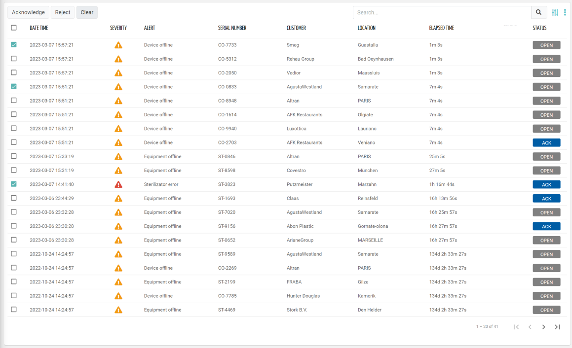
Displays the list of alerts currently active considering the navigation context.
Details Navigation
Clicking on a row opens the event details popup. Optionally the alert details can be opened in a full page (see Details Mode option).
The header of the alert details popup contains the alert name, description, and a breadcrumb that provides the context of the alert, and whose tokens can be clicked to quickly jump to related objects (e.g. Customer, Location, Thing).
The alert details body is generated through a template which by default reports the event main information (e.g. timeline, technical description), but in the alternative you can redefine the template within the event definition page.
On the alert list rows, you can also click directly on specific information to jump to the alert related objects:
Customer Name / Code → Customer details page
Location name → Location details page
Thing Name / Serial Number → Thing details page
In all other case the alert details popup/page is opened.
Template Syntax
Below you can find some examples of how to use the component within a template.
        <active-alert-list-widget-v2 [pageSize]="20">

        <property name="severity" [showHeader]="false" filter="severityIcon"></property>

        <property name="date" [label]="'Date Time'"></property>
        <property name="thing.serialNumber" label="Thing"></property>

        <property [name]="'customer.name'" [label]="'Customer'" *ngIf="getUser()?.organizationId || getUser()?.partnerId"></property>
        <property [name]="'location.name'" [label]="'Location'"></property>

        <property name="title" [label]="'Alert'"></property>
        <property name="description" [label]="'Details'"></property>
        <property name="duration" [label]="'Elapsed Time'"></property>

        <composite-part name="Status" filter="alertStatus">
        <property name="acknowledgedTime"></property>
        </composite-part>

        </active-alert-list-widget-v2>
Component Reference
Here is a comprehensive list of all the elements and properties that can be used to configure the component.
Active Alert List <active-alert-list-widget-v2>
Actions Enabled | The boolean flag indicating whether actions (e.g. Add button) are enabled on the widget. Name: enableActions Type: BOOLEAN | Optional Default Value: true
|
Controls Enabled | The boolean flag indicating whether controls (e.g. Search, Export) are enabled on the widget. Name: controlsEnabled Type: BOOLEAN | Optional Default Value: true
|
Export Enabled | The boolean flag indicating whether the data export is enabled. Name: exportEnabled Type: BOOLEAN | Optional Default Value: true
|
Title | The title displayed on the top part of the widget box. Name: title Type: STRING | Optional
|
Data | |
Include Sub Things Alerts | The flag indicating whether sub-things alerts must be included when this widget is placed in a thing dashboard. Name: includeSubThingsAlerts Type: BOOLEAN | Optional Default Value: false
|
Initial Sorting | The array of property names and criteria to use for sorting (e.g. ['name','asc','serialNumber','desc']). Name: sort Type: SORT_PROPERTIES | Optional
|
Page Size | The number of items to load on each page. Name: pageSize Type: INTEGER | Optional Default Value: 50
|
Period Variable | The id of the page's variable providing the date range filtering period, for instance the id of a <period-filter-field>. Name: periodRef Type: STRING | Optional
|
Query | The array of conditions filtering out items. For instance: [query]='[{'property': 'connectionStatus', 'predicate': 'eq', 'value': '1'}]' Predicates: eq, beginsWith, like, notLike, isEmpty, isNotEmpty, gt, gte, lt, lte. Name: query Type: QUERY | Optional Predicates: beginsWith, eq, neq, gt, gte, isEmpty, isNotEmpty, lt, lte, like, notLike
|
Query Variable | The id of the page's <things-filter-field> used for searching. Name: queryFieldRef Type: STRING | Optional
|
Advanced | |
| The expected behaviour when a row is clicked. Name: clickOnRowBehaviour Type: ENUM | Optional Values: OPEN_DETAILS, OPEN_CONTEXT_OBJECT
|
Details Mode | The way the details page is opened when the details icon is clicked. If non the details icon is not present. Name: detailsMode Type: ENUM | Optional Values: PAGE, POPUP, NONE Default Value: POPUP
|
Empty Message | The blank message to be displayed in the widget in case no item was found. To manage translations, you can define a label and use the key as the value of the property. Name: emptyMessage Type: STRING | Optional
|
Rendering | |
Availability | Configure availability based on active features on Digital Plan on Add-ons Name: hasFeature Type: FEATURE (multiple) | Optional
|
CSS Class | The name(s) of the CSS class used to customize the widget layout. Name: class Type: STRING | Optional
|
Layout Mode | Alerts can be displayed in a standard TABLE or in a LIST of cards. Name: mode Type: ENUM | Optional Values: TABLE, LIST Default Value: TABLE
|
Visibility Condition | The expression that allows you to reduce the visibility of the element. Name: *ngIf Type: STRING | Optional
|
Sub Elements | |
The property whose value must be displayed within the alert detail row or box. | |
The composite part whose value must be displayed within the alert detail row or box. | |
Property <property>
Description | The property description. Name: description Type: STRING | Optional
|
| The boolean flag indicating whether the property value should be included only in the export and not visible within the page. Name: exportOnly Type: BOOLEAN | Optional Default Value: false
|
Filter | The name of the filter used to transform and display values. Name: filter Type: FILTER | Optional
|
Label | The property alternative label. Name: label Type: STRING | Optional
|
Name | The property whose value must be loaded by the widget. Name: name Type: PROPERTY | Required
|
Advanced | |
Column CSS Class | The name(s) of the column CSS class used to customize the table column. Name: columnClass Type: COLUMN_CSS | Optional
|
Show Header | The flag indicated whether the header is visible. Name: showHeader Type: BOOLEAN | Optional Default Value: true
|
Visibility Condition | The expression that allows you to reduce the visibility of the element. Name: *ngIf Type: STRING | Optional
|
Composite Part <composite-part>
Description | The composite-part description. Name: description Type: STRING | Optional
|
Filter | The filter applied on the composite-part to transform or display its value. Name: filter Type: FILTER | Optional
|
Label | The label displayed by the widget. Name: label Type: STRING | Optional
|
Name | The composite-part name. Name: name Type: STRING | Optional
|
Advanced | |
Column CSS Class | The name(s) of the column CSS class used to customize the table column. Name: columnClass Type: COLUMN_CSS | Optional
|
Show Header | The flag indicated whether the header is visible. Name: showHeader Type: BOOLEAN | Optional Default Value: true
|
Visibility Condition | The expression that allows you to reduce the visibility of the element. Name: *ngIf Type: STRING | Optional
|
Sub Elements | |
The property whose value must be loaded within the composite-part. | |
Property <property>
Name | The property whose value must be loaded by the widget. Name: name Type: PROPERTY | Required
|
Full Syntax Example
<active-alert-list-widget-v2
    [title]="'Active Alerts'"
    [exportEnabled]="false"
    [controlsEnabled]="false"
    [enableActions]="false"
    sort="['prop1','asc','prop2','desc']"
    periodRef="abc"
    queryFieldRef="abc"
    query="[{property:'prop1', predicate: 'eq', value: 'foo'}, {property:'prop2', predicate: 'in', value: ['bar', 'baz']}]"
    pageSize="123"
    [includeSubThingsAlerts]="true"
    emptyMessage="abc"
    clickOnRowBehaviour="OPEN_DETAILS"
    detailsMode="PAGE"
    mode="TABLE"
    class="my-custom-class"
    *ngIf="getUser().organizationId != null"
    hasFeature="['feature_a', 'feature_b']">
    <property
            name="serialNumber"
            label="Temperature"
            description="abc"
            filter="fooBarFilter"
            *ngIf="getUser().organizationId != null"
            [exportOnly]="true"
            [showHeader]="false"
            columnClass="my-column-custom-class"></property>
    <composite-part
            name="abc"
            label="abc"
            description="abc"
            filter="fooBarFilter"
            *ngIf="getUser().organizationId != null"
            [showHeader]="false"
            columnClass="my-column-custom-class">
            <property
                        name="serialNumber"></property>
    </composite-part>
</active-alert-list-widget-v2>