This widget displays XY points where X and Y are the values of the two input metrics, and the value pairs are obtained by matching data series by timestamp.
The widget, by default, uses the first defined metric as X values and the second one as Y values.
Additional metrics can be added, but in this case, a custom Data Transformer must be defined; this will use the additional metrics to calculate the new X and Y values. Here is an example of a Data Transformer that uses a third metric to transform the new X values.
exports.xyDataTranformer = function () {
    function XYDataTranformer() {}
    XYDataTranformer.prototype.transform = function (data, args) {
        // console.log(data);
        // console.log(args);
        for (let i in data) {
            data[i].rpm = data[i].rpm * data[i].ratio;
        }
        return data;
    };
    return XYDataTranformer;
}();
You can also display a stream chart by defining on the X or Y metrics the Paired Data Field, which can be the name of another metric or the name of the data field generated by the custom data transformer (e.g., width2).
Constant Lines
A constant line is a line marker that extends over the chart at a fixed X or Y value, giving the user information about, for instance, the minimum/maximum or median value.
On the chart, you can add one or more Constant Lines, which are described by:
Label: The text displayed on the chart near the line.
Color: The color of the line.
Orientation: Whether the line should be on the X-axis or the Y-axis.
Value: The fixed value (also used as a fallback).
Property: The thing property to be used as a constant value.
Metrics: The metric whose value (also aggregated) must be used as a constant value.

Template Syntax
Below you can find some examples of how to use the component within a template.
<!-- example with simple points -->
<xy-chart-widget [title]="'Temperature by Humidity'">
<metric name="humidity"></metric>
<metric name="temperature"></metric>
</xy-chart-widget>
<!-- example with filled lines -->
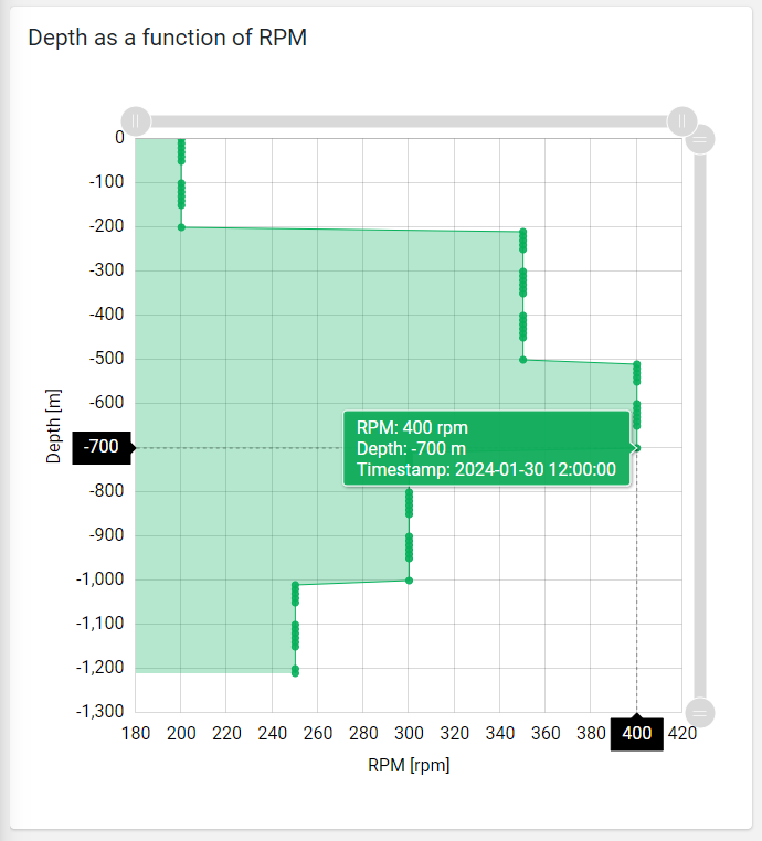
<xy-chart-widget [config]="{showLines: true, baseAxis: 'Y', showTimestamps: true, height: '640px'}">
<metric name="rpm" unit="rpm"></metric>
<metric name="depth" unit="m"></metric>
</xy-chart-widget>
<!-- example with data transformer -->
<xy-chart-widget [title]="'Depth as a function of Width'" [config]="{dataTransformer: 'xyDataTranformer', showBullets: false, showLines: true, baseAxis: 'Y', showTimestamps: true}" [inputs]="{period: 'period'}">
<metric name="width" unit="cm" [config]="{pairedField: 'width2'}"></metric>
<metric name="depth" unit="m"></metric>
</xy-chart-widget>
Component Reference
Here is a comprehensive list of all the elements and properties that can be used to configure the component.
XY Chart <xy-chart-widget>
Title | The title displayed on the top part of the widget box. Name: title Type: STRING | Optional
|
Controls | |
Export Enabled | The boolean flag indicating whether the data export is enabled. Name: config.exportEnabled Type: BOOLEAN | Optional Default Value: false
|
Export File Type | The export file type Name: config.exportFileType Type: ENUM | Optional Values: json, csv, xlsx Default Value: csv
|
Period Filter Enabled | The boolean flag indicating whether the embedded period filter is available. Name: config.filterEnabled Type: BOOLEAN | Optional Default Value: false
|
Scrollbar Enabled | The flag enabling the widget top scrollbar allowing the user to scroll and zoom data. Name: config.scrollbarEnabled Type: BOOLEAN | Optional Default Value: false
|
Data | |
Data Transformer | Name: config.dataTransformer Type: FILTER | Optional
|
Default Loading Period | The default filtering period applied when entering the page. Name: config.defaultPeriodValue Type: PERIODS | Optional Default Value: LAST_7_DAYS
|
Period Variable | The id of the page's variable providing the date range filtering period, for instance the id of a <period-filter-field>. Name: inputs.period Type: STRING | Optional
|
Advanced | |
Base Axis | The base axis used to fill the chart area between the line and the axis itself. If not specified, only lines are displayed. Name: config.baseAxis Type: ENUM | Optional Values: X, Y
|
Color | The color used to display the bullets and lines. Name: config.color Type: STRING | Optional Default Value: #08B05B
|
Fill Opacity | The opacity (0 to 1) used to fill the chart area. Name: config.fillOpacity Type: STRING | Optional Default Value: 0.3
|
Line Width | Define the XY line width in pixels Name: config.lineWidth Type: INTEGER | Optional Default Value: 1
|
Move Points Enabled | The flag enabling point dragging to change the X values (WRITE_METRIC_VALUES permission required). Name: config.movePointsEnabled Type: BOOLEAN | Optional Default Value: false
|
Show Bullets | Indicates whether to display data point bullets. Name: config.showBullets Type: BOOLEAN | Optional Default Value: true
|
Show Lines | Indicates whether to display lines between data point. Name: config.showLines Type: BOOLEAN | Optional Default Value: false
|
Show Timestamps | Indicates whether to display data point matching pair timestamps. Name: config.showTimestamps Type: BOOLEAN | Optional Default Value: false
|
Smoothed Line | The flag enabling smoothed line. Name: config.smoothedLine Type: BOOLEAN | Optional Default Value: false
|
X-Axis Centered on Zero | Force the x-axis so that it is symmetrical with respect to zero Name: config.xAxisCentered Type: BOOLEAN | Optional Default Value: false
|
Y-Axis Centered on Zero | Force the y-axis so that it is symmetrical with respect to zero Name: config.yAxisCentered Type: BOOLEAN | Optional Default Value: false
|
Rendering | |
Availability | Configure availability based on active features on Digital Plan on Add-ons Name: hasFeature Type: FEATURE (multiple) | Optional
|
Collapse / Expand | The flag indicating whether the widget is collaspible. Name: collapsible Type: BOOLEAN | Optional Default Value: false
|
CSS Class | The name(s) of the CSS class used to customize the widget layout. Name: class Type: STRING | Optional
|
Height | The widget desired height (default 480px). Name: config.height Type: STRING | Optional
|
Min Width | The minimum width of the widget (e.g. 640px). Name: config.minWidth Type: STRING | Optional
|
Visibility Condition | The expression that allows you to reduce the visibility of the element. Name: *ngIf Type: STRING | Optional
|
Sub Elements | |
The X-axis (first) or Y-axis (second) metric whose values must be loaded by the widget. | |
Metric <metric>
Filter | The name of the filter used to transform and display values. Name: filter Type: FILTER | Optional
|
Label | The metric alternative label. Name: label Type: STRING | Optional
|
Name | The metric whose value(s) must be loaded by the widget. Name: name Type: METRIC | Required
|
Unit | The unit of measurement to be displayed along the value. Name: unit Type: STRING | Optional
|
Advanced | |
Max | The maximum measure scale value. Name: config.max Type: INTEGER | Optional
|
Min | The minimum measure scale value. Name: config.min Type: INTEGER | Optional
|
Paired Field | Indicate the name of the metric to be paired when displaying a stream chart. If you are using a Data Transformer, you can indicate the name of the additional field you are generating. Name: config.pairedField Type: STRING | Optional
|
Visibility Condition | The expression that allows you to reduce the visibility of the element. Name: *ngIf Type: STRING | Optional
|
Full Syntax Example
<xy-chart-widget
[title]="'XY Chart'"
[config]="{
xAxisCentered: true,
exportEnabled: true,
fillOpacity: 'abc',
scrollbarEnabled: true,
yAxisCentered: true,
showLines: true,
filterEnabled: true,
exportFileType: 'json',
showTimestamps: true,
baseAxis: 'X',
lineWidth: 123,
movePointsEnabled: true,
minWidth: '640px',
height: '250px',
showBullets: false,
dataTransformer: 'dateFormat',
color: '#007BFF',
defaultPeriodValue: 'LAST_30_DAYS',
smoothedLine: true
}"
[inputs]="{
period: 'period'
}"
[collapsible]="true"
class="my-custom-class"
*ngIf="getUser().organizationId != null"
hasFeature="['feature_a', 'feature_b']">
<metric
name="Temperature"
label="Temperature"
filter="fooBarFilter"
unit="°C"
*ngIf="getUser().organizationId != null"
[config]="{
max: 123,
pairedField: 'maxTemperature',
min: 123
}"></metric>
</xy-chart-widget>