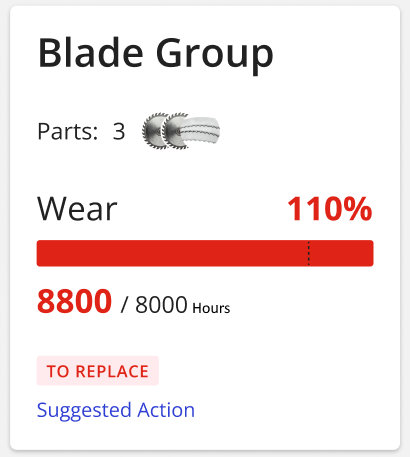
Displays the status of one or more components subject to wear and tear.
This widget must be placed in a Thing Definition template, and requires selecting a Wear Metric.
The widget displays:
the name of the component subject to wear as title (e.g. Blade Group).
the installed spare-parts if defined.
the current reached level of wear.
the reached usage (e.g. 8800 hours).
the maximum tolerated usage (standard usage + tolerance)
the status which can be GOOD or TO REPLACE
the suggested action, the user must follow to restore the worn part.
In case the status is GOOD, the widget displays the number of remaining days before the component(s) must be replaced.
Optionally you can display multiple wear metric in the same box.
By clinking on the Details link, a popup displays the single wear status.
In case the status is TO REPLACE, clicking on the Suggested Action link allows the user to view the action detail popup, which includes the due date of the action, the technical description on what to do, and, in case spare parts have been configured, the suggested purchase as well.
By clicking Mark as Done, the widget prompts the user to confirm that the action has indeed been performed and that the replacement parts have been purchased and replaced.
VALUE-ADDED DIGITAL SERVICES,SMART AFTER SALES & ADVANCED SERVICES,SMART SPARE PARTS & CONSUMABLES
Template Syntax
Below you can find some examples of how to use the component within a template.
        <!-- Single wear metric -->
        <wear-status-widget [title]="'Blade Wear'">
        <metric name="blade_wear"></metric>
        </wear-status-widget>

        <!-- Multiple wear metrics -->
        <wear-status-widget [title]="'Machine Wear'">
        <metric name="blade_wear"></metric>
        <metric name="oil_filter_wear"></metric>
        <metric name="blade_guide_wear"></metric>
        </wear-status-widget>
Component Reference
Here is a comprehensive list of all the elements and properties that can be used to configure the component.
Wear Status <wear-status-widget>
Title | The title displayed on the top part of the widget box. Name: title Type: STRING | Optional
|
Rendering | |
Availability | Configure availability based on active features on Digital Plan on Add-ons Name: hasFeature Type: FEATURE (multiple) | Optional
|
CSS Class | The name(s) of the CSS class used to customize the widget layout. Name: class Type: STRING | Optional
|
Visibility Condition | The expression that allows you to reduce the visibility of the element. Name: *ngIf Type: STRING | Optional
|
Sub Elements | |
The wear metric whose status must be displayed. | |
Metric <metric>
Filter | The name of the filter used to transform and display values. Name: filter Type: FILTER | Optional
|
Label | The metric alternative label. Name: label Type: STRING | Optional
|
Name | The metric whose value(s) must be loaded by the widget. Name: name Type: METRIC | Required
|
Unit | The unit of measurement to be displayed along the value. Name: unit Type: STRING | Optional
|
Advanced | |
Visibility Condition | The expression that allows you to reduce the visibility of the element. Name: *ngIf Type: STRING | Optional
|
Full Syntax Example
<wear-status-widget
[title]="'Wear Status'"
class="my-custom-class"
*ngIf="getUser().organizationId != null"
hasFeature="['feature_a', 'feature_b']">
<metric
name="Temperature"
label="Temperature"
filter="fooBarFilter"
unit="°C"
*ngIf="getUser().organizationId != null"></metric>
</wear-status-widget>
