Displays the value of a metric in a box, highlighting the severity and the increase from the previous value.
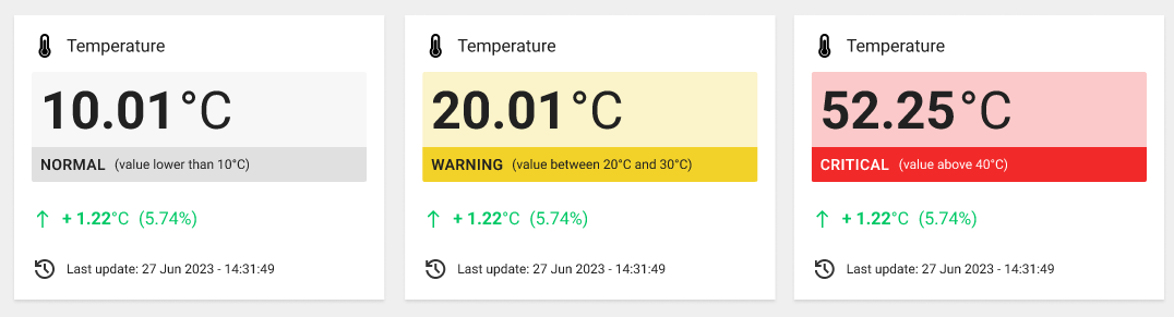
The widget is subdivided into the following sections, each one providing different information.
HEADER: provide the information about the displayed data, including an icon, the title and a description (optional).
MAIN VALUE: the main value to be displayed, which can be provided by a metric or statistic, even aggregated across multiple things (max 500), locations, and customers. The value can be colored according to the severity of the dictionary item or threshold.
DETAILS BAR: describes the quality of the value and, if present, at what threshold it lies
PREVIOUS VALUE: the value, which can be the previous value or, in the case of aggregation, the value calculated using the previous period (e.g. This Month VS Last Month).
You can decide whether to display the absolute value or the increment, which can be colored according to whether it is positive or negative.LAST UPDATE: the timestamp related to the last update of the main value.
Below are some examples with different configurations.
For more details about how to define a dictionary and thresholds, you can refer to the following articles:
Property: define dictionary and thresholds for properties.
Metric: define dictionary and thresholds for metric.
Multiple Things Aggregation
This widget can also be placed within the Location or Customer details pages, and display a value that is aggregated on the underlying things and locations.
Other than metrics, you can also display statistical values that are automatically computed for the page context (e.g., count of completed work sessions).
For instance, suppose you have a metric providing the number of pieces produced every hour, you can display the total sum of pieces produced by all the things in the context and over a specific period of time.
Optionally, you can change the set of things the widget is working on by coupling it with:
a Period Field available on the same page.
a Search Field available on the same page.
Template Syntax
Below you can find some examples of how to use the component within a template.
Example 1
Displays the current value of running hours.
            <value-widget>
            <metric name="Running Hours" filter="millisToHours"></metric>
            </value-widget>
Example 2
Displays the number of pieces produced in a selected period from a set of things.
            <period-field></period-field>
            <search-field id="machinesFilter" context="THINGS"></search-field>

            <value-widget aggregation="DELTA"
            periodRef="period"
            queryFieldRef="machinesFilter"
            showIncrement="RELATIVE">

            <metric name="thing.Total Pieces"></metric>

            </value-widget>
Component Reference
Here is a comprehensive list of all the elements and properties that can be used to configure the component.
Value <value-widget>
Description | The description of the widget. Name: description Type: STRING | Optional
|
Show Title | Indicates whether the title is visible. Name: showTitle Type: BOOLEAN | Optional Default Value: true
|
Title | The title displayed on the top part of the widget box. Name: title Type: STRING | Optional
|
Data | |
Aggregation | The aggregation applied on the underlying data. Name: aggregation Type: ENUM | Optional Values: LAST_VALUE, SUM, MIN, MAX, AVG, DELTA Default Value: LAST_VALUE
|
Period | The default period to use when computing aggregated value. Name: period Type: PERIODS | Optional
|
Period Variable | The id of the page's variable providing the date range filtering period, for instance the id of a <period-filter-field>. Name: periodRef Type: STRING | Optional
|
Query Variable | The id of the page's <things-filter-field> used for searching. Name: queryRef Type: STRING | Optional
|
Content | |
Icon | The link:https://fonts.google.com/icons?selected=Material+Icons[Google Fonts] icon name to be displayed within the widget. Name: icon Type: STRING | Optional
|
Increment Style | Indicates whether an increase in value compared to the previous period should be displayed as positive or negative. Name: incrementStyle Type: ENUM | Optional Values: POSITIVE, NEGATIVE Default Value: POSITIVE
|
Show Colors | Indicates whether the widget must be colored according to the severity of the value, else it is black and white. Name: showColors Type: BOOLEAN | Optional Default Value: true
|
Show Details Bar | It displays a colored bar that provides additional information about the value and its severity. Name: showDetailsBar Type: BOOLEAN | Optional Default Value: true
|
Show Increment | Indicates whether and how to show the value calculated over the previous period. Name: showIncrement Type: ENUM | Optional Values: NONE, ABSOLUTE, PERCENTAGE, ABSOLUTE_AND_PERCENTAGE, PERCENTAGE_ABSOLUTE Default Value: NONE
|
Show Last Update | Indicates whether to show or hide the last update timestamp. Name: showLastUpdate Type: BOOLEAN | Optional Default Value: false
|
Show Previous Value | Indicates whether the severity should be used to highlight the value. Name: showPreviousValue Type: BOOLEAN | Optional Default Value: false
|
Value Mode | The mode used to display the value. Name: valueMode Type: ENUM | Optional Values: ICON_AND_VALUE, ICON_AND_LABEL, VALUE, LABEL, ICON, NONE Default Value: ICON_AND_VALUE
|
Expandable Details | |
Details Button Icon | The Angular Material icon displayed inside the details button. Name: expandableDetails.expandIcon Type: STRING | Optional
|
Mode | The way the details is opened. Name: expandableDetails.mode Type: ENUM | Optional Values: EMBEDDED, POPUP Default Value: POPUP
|
Popup Title | The title displayed on the top part of the popup. Name: expandableDetails.popupTitle Type: STRING | Optional
|
Template | The name of the template to display. Name: expandableDetails.template Type: STRING | Optional
|
Rendering | |
Availability | Configure availability based on active features on Digital Plan on Add-ons Name: hasFeature Type: FEATURE (multiple) | Optional
|
CSS Class | The name(s) of the CSS class used to customize the widget layout. Name: class Type: STRING | Optional
|
Visibility Condition | The expression that allows you to reduce the visibility of the element. Name: *ngIf Type: STRING | Optional
|
Sub Elements | |
The metric whose current value must be displayed within the widget. | |
The statistic whose current value must be displayed within the widget. | |
The property whose current value must be displayed within the widget. | |
Make the widget clickable by defining an address to browse. | |
Metric <metric>
Filter | The name of the filter used to transform and display values. Name: filter Type: FILTER | Optional
|
Name | The metric whose value(s) must be loaded by the widget. Name: name Type: METRIC | Required
|
Unit | The unit of measurement to be displayed along the value. Name: unit Type: STRING | Optional
|
Statistic <statistic>
Aggregation | The function used to aggregate data. Name: aggregation Type: ENUM | Optional Values: AVG, COUNT, MAX, MIN, SUM, LAST
|
Averaged By | The count used to average the statistic results (e.g. Average alert count by thing). Name: averagedBy Type: ENUM | Optional Values: thingCount
|
Filter | The name of the filter used to transform and display values. Name: filter Type: FILTER | Optional
|
Label | The alternative label displayed by the widget. Name: label Type: STRING | Optional
|
Property | The object property whose values must be aggregated. Name: property Type: PROPERTY | Optional
|
Resource | The resource from which to retrieve the items to be used to calculate the statistic. Name: resource Type: ENUM | Required Values: ACTION, ALERT, EVENT, CUSTOMER, LOCATION, PARTNER, THING, USER, WORK_SESSION Default Value:
|
Status | Define whether to include events/alerts that are still active, or have been activated in a period. Name: activationType Type: ENUM | Optional Values: ACTIVE, ACTIVATED
|
Unit | The unit of measurement to be displayed along the value. Name: unit Type: STRING | Optional
|
Data | |
Query | The array of conditions filtering out items. For instance: [query]='[{'property': 'connectionStatus', 'predicate': 'eq', 'value': '1'}]' Predicates: eq, beginsWith, like, notLike, isEmpty, isNotEmpty, gt, gte, lt, lte. Name: query Type: QUERY | Optional Predicates: beginsWith, eq, neq, gt, gte, isEmpty, isNotEmpty, lt, lte, like, notLike
|
Property <property>
Filter | The name of the filter used to transform and display values. Name: filter Type: FILTER | Optional
|
Name | The property whose value must be loaded by the widget. Name: name Type: PROPERTY | Required
|
Unit | The unit of measurement to be displayed along the value. Name: unit Type: STRING | Optional
|
Link <link-element>
URL | The URL to browse, '/..' for application relative URL, 'https://....' for external URLs, else it is considered relative to the current page. Name: url Type: STRING | Required
|
Rendering | |
Visibility Condition | The expression that allows you to reduce the visibility of the link. Name: *ngIf Type: STRING | Optional
|
Full Syntax Example
<value-widget
[showTitle]="false"
[title]="'Value'"
description="abc"
aggregation="LAST_VALUE"
period="LAST_30_DAYS"
periodRef="period"
queryRef="query-1"
valueMode="ICON_AND_VALUE"
icon="thermostat"
[showColors]="false"
[showDetailsBar]="false"
[showPreviousValue]="true"
showIncrement="NONE"
incrementStyle="POSITIVE"
[showLastUpdate]="true"
[expandableDetails]="{
mode: 'EMBEDDED',
expandIcon: 'abc',
template: 'abc',
popupTitle: 'abc'
}"
class="my-custom-class"
*ngIf="getUser().organizationId != null"
hasFeature="['feature_a', 'feature_b']">
<metric
name="Temperature"
filter="fooBarFilter"
unit="°C"></metric>
<statistic
label="Temperature"
resource="ACTION"
activationType="ACTIVE"
aggregation="AVG"
property="propName"
averagedBy="thingCount"
filter="fooBarFilter"
unit="°C"
query="[{property:'prop1', predicate: 'eq', value: 'foo'}, {property:'prop2', predicate: 'in', value: ['bar', 'baz']}]"></statistic>
<property
name="serialNumber"
filter="fooBarFilter"
unit="°C"></property>
<link-element
url="abc"
*ngIf="getUser().organizationId != null"></link-element>
</value-widget>