This widget loads metric data for a period of time and displays points through lines, columns, or step charts.
RAW Data Downsampling
As the pixels on the screen are limited, a common approach to display thousands of data points is to overlap or aggregate (e.g., AVG by HOURS) them, which may lead to a loss of information (e.g., spikes are flattened).
In addition, many points may cause browser slowdowns or even cause the page to be blocked. In case the number of datapoints to be displayed is greater than a threshold (default is 2000), the Time Series uses the LTTB (Largest Triangle Three Buckets) data visualization technique designed to efficiently represent large datasets over time by reducing the number of data points while preserving the overall trends and shapes of the data.
For each bucket, the LTTB algorithm extracts the most significant data point while preserving real timestamps.
.png?sv=2026-02-06&spr=https&st=2026-07-14T03%3A22%3A15Z&se=2026-07-14T03%3A49%3A15Z&sr=c&sp=r&sig=S4FCF6tNCHPhWgD0sTkP5ha3oXvUQr7d8tWCf4YMMKQ%3D "image(593).png")
The algorithm is automatically applied to all metrics loaded without a specific aggregation, and in all cases where the number of retrieved data points is greater than a threshold.
In case there are more displayed metrics, the max datapoint count threshold is divided by the number of metrics (e.g., 5 metrics → 2000/5 = 400 data points per metric).
When the graph is zoomed in or the scroller is moved or resized, the selected area is automatically expanded to display more data points, preserving memory and browser performance.
Data Retrieval and Aggregation
You can specify the aggregation function to be used on all loaded metrics; you can select among MIN, MAX, AVG, SUM, or DELTA.
Optionally, you can redefine on each metric a different aggregation. If unspecified on both levels, the default one is RAW (no aggregation).
MIN
Returns the minimum value computed in each time frame.
MAX
Returns the maximum value computed in each time frame.
AVG
Returns the average value computed in each time frame.
SUM
Returns the sum value computed in each time frame. Pay attention that all values are summed, so if applied to a counter metric, you will get unexpected results.
DELTA
Returns the value variation computed in each time frame, considering the last value of the time frame and the last value of the previous time frame.
If, within the timeframe, no values are stored in the database, the aggregated value is null.
By using the DELTA aggregation, you can display the variation of a metric in each time frame; for instance, the following chart loads the same metric twice (e.g., Energy), one using the DELTA aggregation and one using the MAX aggregation. So the first sub-chart displays the daily consumption, while the second one displays the total consumption.
Aggregation Timeframes
Other than the aggregation function, there is also the timeframe defining the time aggregation unit (e.g., 1 Hour, 12 Hours, 1 Day, 1 Month).
For each aggregation function, you can use one of the following timeframes:
AUTO
MINUTES_5
MINUTES_10
MINUTES_15
MINUTES_30
HOURS_1
HOURS_6
HOURS_12
DAYS_1
WEEKS_1
MONTHS_1
YEARS_1
The default applied timeframe is AUTO, which means the widget requests data from the backend with aggregation based on a dynamic time frame (e.g., 1H, 6H, 12H, 1D...) depending on the requested period.
Zooming
Once the data has been loaded, to keep browser performance smooth, the widget displays a maximum of 2000 graphic points (Max Displayed Data Points).
If you reduce the scroll bar or select an area of the graph, more data points may appear, and this depends on the Max Displayed Data Points limit (default 2000).
In this case, two icons appear on the right: the first allows you to reset the zoom level, while the second button reloads the data from the backend, focusing on the selected time window.
Optionally, you can enable the Timeframe and Aggregation selectors to change the aggregation and reload the data, preserving the selected period.
The aggregation selected through the Aggregation selector affects only the metrics without an explicitly configured aggregation. For instance, a metric may always use AVG_DAYS_1.
Axis Management
For each metric, you can define the Y-axis title and whether to use the LEFT or RIGHT one.
For example, you can have a left and a right Y-axis with different scales.
Alternatively, you can select the Stacked Charts option; this will cause the widget to display one sub-chart for each metric. Metrics with the same Y-axis title are grouped together on the same sub-chart.
Chart Types
Each metric can be displayed with a different chart type by choosing among:
Line: data points are directly interconnected through a line.
Column: for each data point, a column is displayed.
Step: compared to the Line, which connects data points with direct lines, creating an appearance of gradual change in data points, it sharply visualizes the changes between data points through steps.
Multiple Things Charting
The Time Series Chart can also be placed within the Location or Custom details, and display the metric of the location or of the underlying things, by displaying one series per thing.
On each metric, you can also specify whether the series must be stacked in order to see the totals among multiple metrics.
For instance, suppose you have a metric providing the number of pieces produced every hour; you can stack the columns as follows.
The alternative to displaying the same metric for each thing is to choose the Collapsed rendering, which will show a single chart, whose values are given by the Value Grouping function (SUM, MAX, AVG) applied to the values between multiple things with the same timestamp.
Optionally, you can change the set of things the chart is working on by coupling it with a Search Field available on the same page.
Constant Lines
A constant line is a line marker that extends over the chart at a fixed Y value, giving the user information about, for instance, the minimum/maximum or median value.
Metric Min / Max
You can display the minimum and maximum value of a metric by enabling the Show Min Value Line or the Show Max Value Line options on a single metric element.
Chart Line
Alternatively, to display a constant line on the chart regardless of the metrics, you can add a Chart Line element and choose whether the value comes from a property in the object context or is a fixed static value.
You can also specify the label to be displayed on the line and the color.
Events
Along with the data points of displayed metrics, you can also show the events that occurred in the same time period.
In the Events section of the property panel, you can define a query on the events to be loaded (e.g., Event Severity = FAILURE).
For each found event, a marker is displayed under the x-axis, and by clicking on the marker, a tooltip displays the event details, and the chart area corresponding to the event duration is highlighted according to the event severity.
Work Sessions
Along with the data points of displayed metrics, you can also show the work sessions run in the same time period.
In the Events section of the property panel, you can define a query on the work sessions to be loaded.
.png?sv=2026-02-06&spr=https&st=2026-07-14T03%3A22%3A15Z&se=2026-07-14T03%3A49%3A15Z&sr=c&sp=r&sig=S4FCF6tNCHPhWgD0sTkP5ha3oXvUQr7d8tWCf4YMMKQ%3D "image(594).png")
For each found work session, a marker is displayed under the x-axis, and by clicking on the marker, a tooltip displays the work session details, and the chart area corresponding to the work session duration is highlighted in green.
Offline highlighting
In case the thing was offline during the selected period, dashed areas are displayed to inform the user that the product was offline and, therefore, data is missing or unreliable.
.png?sv=2026-02-06&spr=https&st=2026-07-14T03%3A22%3A15Z&se=2026-07-14T03%3A49%3A15Z&sr=c&sp=r&sig=S4FCF6tNCHPhWgD0sTkP5ha3oXvUQr7d8tWCf4YMMKQ%3D "image(588).png")
This feature can be enabled or disabled by using the Show Offline Periods option.
If the series uses bullets, in the offline area, the bullets are displayed without the line and background; otherwise, a dotted line is displayed.
Limits
The load of metric data over multiple things works on a maximum of 500 things or sub-things.
The display of events, work sessions, and offline periods makes use of chart areas and images, which could slow down the page if there are too many of them.
For instance, when loading for long periods, which may include thousands of events.
Template Syntax
Below you can find some examples of how to use the component within a template.
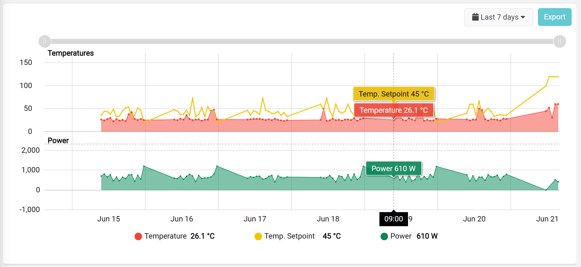
Example 1
Time Series Chart displaying three metrics grouped into different sub-charts (Temperatures and Power).
 <time-series-chart-widget class="flex-fill"
        [config]="{exportEnabled: true, filterEnabled: true, scrollbarEnabled: true, aggregationType: 'AVG', defaultPeriod: 'LAST_7_DAYS', legendPosition: 'center', stacked: true}">

        <metric name="Temperature" filter="singleDecimalFormat" [chartOptions]="{yAxisTitle: 'Temperatures'}"></metric>
        <metric name="TempSetpoint" [chartOptions]="{yAxisTitle: 'Temperatures'}"></metric>
        <metric name="Power" filter="integerFormat" [chartOptions]="{yAxisTitle: 'Power', yAxisPosition: 'STACKED'}"></metric>

</time-series-chart-widget>
Example 2
Time Series Chart into a location dashboard that displays a temperature chart for each underlying thing having such a metric.
<time-series-chart-widget class="flex-fill"
        [config]="{exportEnabled: true, filterEnabled: true, scrollbarEnabled: true, aggregationType: 'AVG', defaultPeriod: 'LAST_7_DAYS', legendPosition: 'center'}">

        <metric name="thing.Temperature" filter="singleDecimalFormat"></metric>

</time-series-chart-widget>
Component Reference
Here is a comprehensive list of all the elements and properties that can be used to configure the component.
Time Series Chart <time-series-chart-widget>
Title | The title displayed on the top part of the widget box. Name: title Type: STRING | Optional
|
Controls | |
Aggregation Selector Enabled | If enabled, the user can select the aggregation function between RAW, MIN, MAX, AVG (default), and DELTA. Name: config.aggregationsEnabled Type: BOOLEAN | Optional Default Value: false
|
Enabled Periods | The list of periods which can be selected from the embedded period filter. Name: config.enabledPeriods Type: PERIODS (multiple) | Optional
|
Export Enabled | The boolean flag indicating whether the data export is enabled. Name: config.exportEnabled Type: BOOLEAN | Optional Default Value: true
|
Period Filter Enabled | The boolean flag indicating whether the embedded period filter is available. Name: config.filterEnabled Type: BOOLEAN | Optional Default Value: true
|
Scrollbar Enabled | The flag enabling the widget top scrollbar allowing the user to scroll and zoom data. Name: config.scrollbarEnabled Type: BOOLEAN | Optional Default Value: true
|
Timeframe Selector Enabled | If enabled, the user can select the aggregation timeframe between 1 HOUR, 1 DAY, 1 MONTH. If not enabled, the timeframe is automatic according to the selected period. Name: config.timeframesEnabled Type: BOOLEAN | Optional Default Value: false
|
Data | |
Default Aggregation | The default aggregation used for all metrics. Name: config.aggregationType Type: ENUM | Optional Values: AVG, DELTA, MIN, MAX, SUM Default Value:
|
Default Loading Period | The default filtering period applied when entering the page. Name: config.defaultPeriod Type: PERIODS | Optional Default Value: LAST_7_DAYS
|
| The <period-field>'s End Variable filtering data by end date. Name: inputs.endDate Type: STRING | Optional
|
Period Variable | The id of the page's variable providing the date range filtering period, for instance the id of a <period-filter-field>. Name: inputs.period Type: STRING | Optional
|
Query Variable | The id of the page's <things-filter-field> used for searching. Name: inputs.query Type: STRING | Optional
|
| The <period-field>'s Start Variable filtering data by start date. Name: inputs.startDate Type: STRING | Optional
|
Events | |
Events Query | The query used to load events. Name: config.eventQuery Type: QUERY | Optional Predicates: beginsWith, eq, neq, gt, gte, isEmpty, isNotEmpty, lt, lte, like, notLike
|
Show Events | Flag indicating whether to enable events on chart. Name: config.showEventsOnChart Type: BOOLEAN | Optional Default Value: false
|
Show Work Sessions | Flag indicating whether to enable work sessions on charts. Name: config.showWorkSessionsOnChart Type: BOOLEAN | Optional Default Value: false
|
Work Sessions Query | The query used to load work sessions. Name: config.workSessionQuery Type: QUERY | Optional Predicates: beginsWith, eq, neq, gt, gte, isEmpty, isNotEmpty, lt, lte, like, notLike
|
Legend | |
Legend Marker | The marker displayed for each element in the legend. CIRCLE: displays a colored circle. SQUARE: displays a colored square. Name: config.legendMarker Type: ENUM | Optional Values: CIRCLE, SQUARE Default Value: CIRCLE
|
Legend Position | The position of the legend in the chart. Name: config.legendPosition Type: ENUM | Optional Values: none, left, center, right Default Value: left
|
Max Column Count | The maximum number of columns used by the legend. Name: config.legendColumns Type: INTEGER | Optional
|
Advanced | |
Grid Background Color | The color used as grid background, default white. Name: config.bgColor Type: STRING | Optional
|
Label Provider | The filter providing labels for the chart metrics. Name: config.labelProvider Type: FILTER | Optional
|
Max Displayed Data Points | The maximum number of data points the widget can display among all metrics (a higher value affects browser performance). Name: config.maxDatapointCount Type: INTEGER | Optional Default Value: 2000
|
| Indicates the maximum number of data points to be displayed for the selected date range, after which the widget starts grouping data points by using the Value Grouping function specified on the metric. Name: config.groupCount Type: INTEGER | Optional Default Value: 500
|
Scale Mode | Name: config.scaleMode Type: ENUM | Optional Values: linear, logarithmic Default Value: linear
|
Show Offline Periods | Displays on the chart when the thing was offline. Name: config.offlineEnabled Type: BOOLEAN | Optional Default Value: true
|
Stacked Charts | The flag enabling stacked charts grouping metrics having the same Y-Axis Title. Name: config.stacked Type: BOOLEAN | Optional Default Value: false
|
The file type to export. | The type of the file to generate when exporting data. Name: config.exportFileType Type: ENUM | Optional Values: csv, xlsx Default Value: csv
|
Tooltip Date Format | String indicating the date format of the tooltip that appears when moving over the chart. Name: config.tooltipDateFormat Type: STRING | Optional
|
Tooltip Enabled | Flag indicating whether to enable the tooltip that appears when moving over the chart. Name: config.tooltipEnabled Type: BOOLEAN | Optional Default Value: true
|
Trim Date Axis | If selected, the date axis range is trimmed according to the available data. Name: config.trimDateAxis Type: BOOLEAN | Optional Default Value: true
|
Y-Axis Trimmed | Flag indicating whether the Y-axis should be trimmed according to the minimum and maximum value of the loaded data. Name: config.yAxisTrimmed Type: BOOLEAN | Optional Default Value: false
|
Rendering | |
Availability | Configure availability based on active features on Digital Plan on Add-ons Name: hasFeature Type: FEATURE (multiple) | Optional
|
Collapse / Expand | The flag indicating whether the widget is collaspible. Name: collapsible Type: BOOLEAN | Optional Default Value: false
|
CSS Class | The name(s) of the CSS class used to customize the widget layout. Name: class Type: STRING | Optional
|
Height | The height of the widget (e.g. 250px). Name: config.height Type: STRING | Optional
|
Visibility Condition | The expression that allows you to reduce the visibility of the element. Name: *ngIf Type: STRING | Optional
|
Sub Elements | |
The metric whose values must be displayed within the chart. | |
The constant dashed line displayed on the graph data. | |
Metric <metric>
Aggregation | The aggregation to apply on the metric values. Name: aggregation Type: AGGREGATION | Optional Functions: RAW, AVG, DELTA, MIN, MAX, SUM Timeframes: MINUTES_5, MINUTES_10, MINUTES_30, HOURS_1, HOURS_6, HOURS_12, DAYS_1, MONTHS_1, YEARS_1
|
Filter | The name of the filter used to transform and display values. Name: filter Type: FILTER | Optional
|
Label | The metric alternative label. Name: label Type: STRING | Optional
|
Name | The metric whose value(s) must be loaded by the widget. Name: name Type: METRIC | Required
|
Rendering | The way the series is displayed in the graph. OVERLAID: all graphs are displayed in the same vertical space; column charts are displayed by grouping columns of different series, allowing them to be compared at the same date. STACKED: all graphs are arranged vertically, one on top of the other. It is useful for displaying total values. COLLAPSED: can be used only for child things, to display a single metric instead of one metric per thing. The values of the collapsed metrics are calculated using the Grouping Values function. Name: chartOptions.rendering Type: ENUM | Optional Values: OVERLAID, STACKED, COLLAPSED Default Value: OVERLAID
|
Unit | The unit of measurement to be displayed along the value. Name: unit Type: STRING | Optional
|
Value Grouping | The function to be applied to group values into the same timeframe in case of collapsed rendering or char zoom in/out. Name: chartOptions.valueGrouping Type: ENUM | Optional Values: SUM, MAX, AVG Default Value: MAX
|
Chart Style | |
Bullet Size | The bullet size in pixels. Name: chartOptions.bulletSize Type: INTEGER | Optional Default Value: 2
|
Bullet Type | Define the type of the bullets displayes along the line. Name: chartOptions.bulletType Type: ENUM | Optional Values: none, circle, square, diamond, up, down Default Value: circle
|
Chart Type | Defines how to display the metric values, wheter to use columns, lines or step lines. Name: chartOptions.chartType Type: ENUM | Optional Values: line, column, step Default Value: line
|
Color | The color used to render the chart for this metric. Name: chartOptions.color Type: STRING | Optional
|
Column Width Percentage | The percentage of horizontal space occupied by each bar in case of column chart type. Name: chartOptions.columnWidth Type: INTEGER | Optional Default Value: 90
|
Dashing | The line dashing style (e.g. '5' or '5,3'). Name: chartOptions.dashing Type: STRING | Optional
|
Fill Opacity | The opacity (0 to 1) used to fill the chart area below the line or inside the columns. Name: chartOptions.fillOpacity Type: INTEGER | Optional
|
Line Width | The width in pixel of the line. Name: chartOptions.lineWidth Type: INTEGER | Optional Default Value: 1
|
Smoothed Line | The flag enabling smoothed line. Name: chartOptions.smoothedLine Type: BOOLEAN | Optional Default Value: false
|
Y-Axis | |
Y-Axis Position | The position of the y-axis associated with the metric; within the same chart there can be a maximum of two y-axes, one on the left and one on the right. It is not possible to use subcharts and with Stacked Charts enabled. Name: chartOptions.yAxisPosition Type: ENUM | Optional Values: LEFT, RIGHT Default Value: LEFT
|
Y-Axis Title | The title displayed aside the Y-axis, when Y-Axis position is STACKED, similar metrics are grouped into sub charts (e.g. Temperatures, Power). Name: chartOptions.yAxisTitle Type: STRING | Optional
|
Ranges | |
Show Max Value Line | The flag to turn on the red dashed line associated to the metric maximum value. The maximum value is the metric default minimum value if defined, else is computed among the loaded data. Name: chartOptions.showMaxLine Type: BOOLEAN | Optional Default Value: false
|
Show Min Value Line | The flag to turn on the blue dashed line associated to the metric minimum value. The minimum value is the metric default minimum value if defined, else is computed among the loaded data. Name: chartOptions.showMinLine Type: BOOLEAN | Optional Default Value: false
|
Y-Axis Max | The value to be used as maximum value in the Y-Axis scale. Name: chartOptions.yAxisMax Type: INTEGER | Optional
|
Y-Axis Min | The value to be used as minimum value in the Y-Axis scale. Name: chartOptions.yAxisMin Type: INTEGER | Optional
|
Advanced | |
Format Big Numbers | If true, big numbers are displayed using suffixes (e.g 1K, 1M, 1B). Name: chartOptions.formatBigNumbers Type: BOOLEAN | Optional Default Value: false
|
Initially Turned Off | The flag to turn off the metric when the graph is opened. If selected, the metric data is not loaded until you click on the metric in the legend. Name: chartOptions.hidden Type: BOOLEAN | Optional Default Value: false
|
Move Point Enabled | The flag enabling point vertical dragging to change the value. Name: chartOptions.movePointEnabled Type: BOOLEAN | Optional Default Value: false
|
Show Boundary Datapoints | The flag to include values before and after the selected period in the chart. This option is valid only for Line and Step charts. Name: chartOptions.showBoundaryDatapoints Type: BOOLEAN | Optional Default Value: false
|
Visibility Condition | The expression that allows you to reduce the visibility of the element. Name: *ngIf Type: STRING | Optional
|
Chart Line <property>
Color | The color used to render the line in the chart. Name: config.color Type: STRING | Optional Default Value: #3448DF
|
Label | The label displayed at above the line in the graph. Name: label Type: STRING | Optional
|
Label Alignment | Name: config.labelAlignment Type: ENUM | Optional Values: LEFT, RIGHT Default Value: LEFT
|
Value | The default Y value of the line. Name: config.value Type: INTEGER | Optional
|
Value Property | The property used to retrieve the constant Y value of the line. Name: name Type: PROPERTY | Required
|
Y-Axis Title | In case of multiple Y-axis, you must specify the title of Y-axis where to display this line. Name: config.yAxisTitle Type: STRING | Optional
|
Full Syntax Example
<time-series-chart-widget
[title]="'Time Series Chart'"
[config]="{
offlineEnabled: false,
filterEnabled: false,
defaultPeriod: 'LAST_30_DAYS',
yAxisTrimmed: true,
tooltipEnabled: false,
workSessionQuery: [{property:'prop1', predicate: 'eq', value: 'foo'}, {property:'prop2', predicate: 'in', value: ['bar', 'baz']}],
bgColor: '#007BFF',
height: '250px',
labelProvider: 'dateFormat',
maxDatapointCount: 123,
tooltipDateFormat: 'yyyy-MM-dd',
showEventsOnChart: true,
eventQuery: [{property:'prop1', predicate: 'eq', value: 'foo'}, {property:'prop2', predicate: 'in', value: ['bar', 'baz']}],
aggregationsEnabled: true,
showWorkSessionsOnChart: true,
legendMarker: 'CIRCLE',
aggregationType: 'AVG',
legendColumns: 123,
scrollbarEnabled: false,
exportEnabled: false,
legendPosition: 'none',
trimDateAxis: false,
exportFileType: 'csv',
timeframesEnabled: true,
stacked: true,
groupCount: 123,
enabledPeriods: ['TODAY', 'YESTERDAY'],
scaleMode: 'linear'
}"
[inputs]="{
startDate: 'fromDate',
endDate: 'toDate',
period: 'period',
query: 'query-1'
}"
class="my-custom-class"
[collapsible]="true"
*ngIf="getUser().organizationId != null"
hasFeature="['feature_a', 'feature_b']">
<metric
name="Temperature"
label="Temperature"
filter="fooBarFilter"
unit="°C"
aggregation="SUM_HOURS_1"
[chartOptions]="{
yAxisPosition: 'LEFT',
color: '#007BFF',
chartType: 'line',
yAxisMin: 0,
hidden: true,
smoothedLine: true,
rendering: 'OVERLAID',
fillOpacity: 123,
columnWidth: 50,
showMaxLine: true,
lineWidth: 123,
bulletSize: 123,
yAxisMax: 100,
valueGrouping: 'SUM',
formatBigNumbers: true,
showBoundaryDatapoints: true,
dashing: '5,5',
movePointEnabled: true,
yAxisTitle: 'Temperatures',
showMinLine: true,
bulletType: 'none'
}"
*ngIf="getUser().organizationId != null"></metric>
<property
label="Temperature"
name="serialNumber"
[config]="{
value: 123,
yAxisTitle: 'Temperatures',
color: '#007BFF',
labelAlignment: 'LEFT'
}"></property>
</time-series-chart-widget>