This widget displays the list of things visible to the user and that are relative to the navigation context.
The list supports pagination, and items can be searched and sorted based on properties.
The list shows one column for each property or composite part defined in the template.
Optionally, you can add metrics, but they are computed for the current page only, so it is not possible to sort or search by their values.
Each value can be displayed through filters (e.g Badge for the Status column).
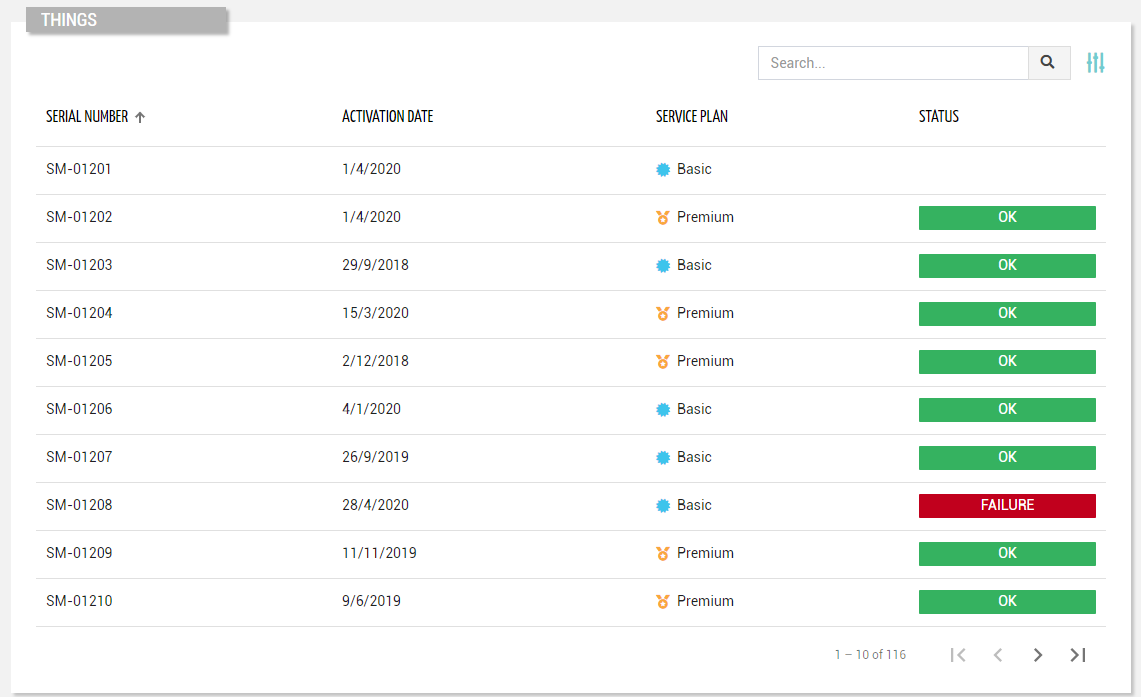
Below the list, you can interact with the pagination control (default 20 items at a time).
This is automatically hidden if there are fewer items than the number of items to be loaded per page (configurable with the “Page Size” option).
Entering the page, the list is sorted by the first column ascending, but optionally, you can refine it through the “Initial Sorting“ widget property.
This widget requires the READ_THING user’s permission.
Search for Things
On the top right part of the widget, a search control bar allows filtering things by a text key.
.png?sv=2026-02-06&spr=https&st=2026-07-20T04%3A52%3A20Z&se=2026-07-20T05%3A11%3A20Z&sr=c&sp=r&sig=NfVQC1XQmuShvY61w9Yt1eSkWrf0aDmJNCsxf9oiZt8%3D)
Optionally, by pressing the Advanced Search icon, a dedicated panel allows the DPS user to specify multiple conditions based on properties.
.png?sv=2026-02-06&spr=https&st=2026-07-20T04%3A52%3A20Z&se=2026-07-20T05%3A11%3A20Z&sr=c&sp=r&sig=NfVQC1XQmuShvY61w9Yt1eSkWrf0aDmJNCsxf9oiZt8%3D)
The provided inputs are preserved during navigation, also across pages in case the same widget “Id” is used.
Optionally, by using the “Query“ property, a set of conditions for pre-filtering items can be defined in the template.
In the template, you can specify the “Search Fields“ used to filter things by text key.
In case the “Query Variable“ property has been defined (the list is filtered from a Search Field placed in the page), the search control bar is automatically hidden and thus not visible to the user.
Bulk Operations
By enabling the widget property "Bulk Controls", the widget allows selecting multiple things and performing bulk operations, including:
Manage Tags: The DPS user can select/deselect and edit tags to be associated with the selected things.
Execute Command: The DPS user can select a command (with bulk support) and execute it on the selected things.
In case the selection includes several models, for each of them, the DPS user can select a specific command.Update Firmware: The DPS user can select a firmware (with bulk update) and apply it to the selected things.
Apply Recipe: The DPS user can select a recipe and apply it to the selected things.
Delete: The DPS can delete the selected things upon a string confirmation (Write DELETE to delete).
.png?sv=2026-02-06&spr=https&st=2026-07-20T04%3A52%3A20Z&se=2026-07-20T05%3A11%3A20Z&sr=c&sp=r&sig=NfVQC1XQmuShvY61w9Yt1eSkWrf0aDmJNCsxf9oiZt8%3D)
The selection is retained even when changing to a different list page.
The number of selected items and the button to select all things, if necessary, will be displayed at the top of the widget when at least one thing is selected.
In the case of a remote update (e.g. command execution, firmware update), it is also possible to select whether to execute the update immediately or schedule it for a specific time.
.png?sv=2026-02-06&spr=https&st=2026-07-20T04%3A52%3A20Z&se=2026-07-20T05%3A11%3A20Z&sr=c&sp=r&sig=NfVQC1XQmuShvY61w9Yt1eSkWrf0aDmJNCsxf9oiZt8%3D)
Create a new Thing
If the widget is placed in the Location details page and the widget option “Actions Enabled“ is selected, by pressing the “Add Thing“ button, the DPS user can manually create a new thing under the current location.
This requires the WRITE_THING user’s permission.
.png?sv=2026-02-06&spr=https&st=2026-07-20T04%3A52%3A20Z&se=2026-07-20T05%3A11%3A20Z&sr=c&sp=r&sig=NfVQC1XQmuShvY61w9Yt1eSkWrf0aDmJNCsxf9oiZt8%3D)
Template Syntax
Below you can find some examples of how to use the component within a template.
Example 1
Thing list displaying simple properties.
            <thing-list-widget-v2 [title]="'Things'">
            <property name="serialNumber"></property>
            <property name="properties.activationDate" filter="millisToDate"></property>
            <property name="serviceLevel" filter="serviceLevel"></property>
            <property name="properties.status" filter="statusBadge"></property>
            </thing-list-widget-v2>
Example 2
List of things with complex properties and initial sorting.
            <thing-list-widget-v2 [pageSize]="10"
            [sort]="['serialNumber','DESC','properties.activationDate','ASC']">

            <property [name]="'serialNumber'"></property>
            <property [name]="'properties.activationDate'"></property>

            <composite-part [label]="'Composite Column'" [filter]="'compositeValueFilter'" [sortingCriteria]="'properties.v1,DESC|properties.v2,DESC'" >
            <property [name]="'properties.v1'"></property>
            <property [name]="'properties.v2'"></property>
            </composite-part>

            </thing-list-widget-v2>
Component Reference
Here is a comprehensive list of all the elements and properties that can be used to configure the component.
Thing List <thing-list-widget-v2>
Actions Enabled | The boolean flag indicating whether actions (e.g. Add button) are enabled on the widget. Name: enableActions Type: BOOLEAN | Optional Default Value: true
|
Advanced Search Always Open | If selected the advanced search is always open when entering the page, an cannot be closed. Name: advancedSearchAlwaysOpen Type: BOOLEAN | Optional Default Value: false
|
Block Column Span | The number of columns on which to span the properties displayed in each list block (default 1). Name: blockColumns Type: INTEGER | Optional Default Value: 1
|
Bulk Controls Enabled | The boolean flag indicating whether bulk selection and buttons (e.g. Tagging, Firmware Update) are enabled on the widget. Name: bulkControlsEnabled Type: BOOLEAN | Optional Default Value: false
|
Controls Enabled | The boolean flag indicating whether controls (e.g. Search, Export) are enabled on the widget. Name: controlsEnabled Type: BOOLEAN | Optional Default Value: true
|
Details Path | The optional path that identifies the details page to be opened when a row is clicked. Name: detailsPath Type: STRING | Optional
|
Empty Message | The blank message to be displayed in the widget in case no item was found. To manage translations, you can define a label and use the key as the value of the property. Name: emptyMessage Type: STRING | Optional
|
Title | The title displayed on the top part of the widget box. Name: title Type: STRING | Optional
|
Data | |
Include Assigned | The boolean flag (true, false) indicating whether the list must include also ASSIGNED things. Name: includeAssigned Type: BOOLEAN | Optional Default Value: true
|
Include Unassigned | The boolean flag indicating whether the list must include also UNASSIGNED things. Name: includeUnassigned Type: BOOLEAN | Optional Default Value: false
|
Initial Sorting | The array of property names and criteria to use for sorting (e.g. ['name','asc','serialNumber','desc']). Name: sort Type: SORT_PROPERTIES | Optional
|
Page Size | The number of items to load on each page. Name: pageSize Type: INTEGER | Optional Default Value: 50
|
Query | The array of conditions filtering out items. For instance: [query]='[{'property': 'connectionStatus', 'predicate': 'eq', 'value': '1'}]' Predicates: eq, beginsWith, like, notLike, isEmpty, isNotEmpty, gt, gte, lt, lte. Name: query Type: QUERY | Optional Predicates: beginsWith, eq, neq, gt, gte, isEmpty, isNotEmpty, lt, lte, like, notLike
|
Query Variable | The id of the page's <things-filter-field> used for searching. Name: queryFieldRef Type: STRING | Optional
|
Advanced | |
Details Mode | The way the thing details is opened if in a dedicated PAGE or NONE to disable details. Name: detailsMode Type: ENUM | Optional Values: PAGE, NONE Default Value: PAGE
|
Expandable Composite Things | Enable expandable accordion for sub things. Name: expandableCompositeThings Type: BOOLEAN | Optional Default Value: false
|
Id | The id of the widget. Name: id Type: STRING | Optional
|
Search Fields | The array of fields used to filter out the objects when searching by a generic key. For instance: [searchFields]='['name', 'serialNumber', 'customer.name', 'customer.code']' Name: searchFields Type: PROPERTY (multiple) | Optional
|
Show Root Things Only | Forces loading of root things only. Name: showRootThings Type: BOOLEAN | Optional Default Value: false
|
Rendering | |
Availability | Configure availability based on active features on Digital Plan on Add-ons Name: hasFeature Type: FEATURE (multiple) | Optional
|
CSS Class | The name(s) of the CSS class used to customize the widget layout. Name: class Type: STRING | Optional
|
Visibility Condition | The expression that allows you to reduce the visibility of the element. Name: *ngIf Type: STRING | Optional
|
Sub Elements | |
The metric whose label and current value must be rendered as a widget row. | |
The property whose label and current value must be rendered as a widget row. | |
The widget part combining multiple properties and metrics. | |
Metric <metric>
Filter | The name of the filter used to transform and display values. Name: filter Type: FILTER | Optional
|
Label | The metric alternative label. Name: label Type: STRING | Optional
|
Name | The metric whose value(s) must be loaded by the widget. Name: name Type: METRIC | Required
|
Unit | The unit of measurement to be displayed along the value. Name: unit Type: STRING | Optional
|
Advanced | |
Column CSS Class | The name(s) of the column CSS class used to customize the table column. Name: columnClass Type: COLUMN_CSS | Optional
|
Display Mode | The way the column is displayed. Name: displayMode Type: ENUM | Optional Values: VISIBLE, INITIALLY_HIDDEN, ALWAYS_HIDDEN Default Value: VISIBLE
|
Show Header | The flag indicated whether the header is visible. Name: showHeader Type: BOOLEAN | Optional Default Value: true
|
Visibility Condition | The expression that allows you to reduce the visibility of the element. Name: *ngIf Type: STRING | Optional
|
Property <property>
Description | The property description. Name: description Type: STRING | Optional
|
Filter | The name of the filter used to transform and display values. Name: filter Type: FILTER | Optional
|
Label | The property alternative label. Name: label Type: STRING | Optional
|
Name | The property whose value must be loaded by the widget. Name: name Type: PROPERTY | Required
|
Advanced | |
Column CSS Class | The name(s) of the column CSS class used to customize the table column. Name: columnClass Type: COLUMN_CSS | Optional
|
Details Page Path | The optional path that identifies the details page to be opened when a column value is clicked. Name: detailsPath Type: STRING | Optional
|
Display Mode | The way the column is displayed. Name: displayMode Type: ENUM | Optional Values: VISIBLE, INITIALLY_HIDDEN, ALWAYS_HIDDEN Default Value: VISIBLE
|
Include in Export | The boolean flag indicating whether the property value should be included in the export even when not visible within the page. Name: includeInExport Type: BOOLEAN | Optional Default Value: false
|
Show Header | The flag indicated whether the header is visible. Name: showHeader Type: BOOLEAN | Optional Default Value: true
|
Visibility Condition | The expression that allows you to reduce the visibility of the element. Name: *ngIf Type: STRING | Optional
|
Composite Part <composite-part>
Description | The composite-part description. Name: description Type: STRING | Optional
|
Filter | The filter applied on the composite-part to transform or display its value. Name: filter Type: FILTER | Optional
|
Label | The label displayed by the widget. Name: label Type: STRING | Optional
|
Name | The composite-part name. Name: name Type: STRING | Optional
|
Sorting Criteria | The comma seprated list of property names and criteria to use for sorting the list column associated to this composite-part (e.g. properties.p1,ASC,properties.p2,DESC). Name: sortingCriteria Type: STRING | Optional
|
Advanced | |
Column CSS Class | The name(s) of the column CSS class used to customize the table column. Name: columnClass Type: COLUMN_CSS | Optional
|
Details Page Path | The optional path that identifies the details page to be opened when a column value is clicked. Name: detailsPath Type: STRING | Optional
|
Display Mode | The way the column is displayed. Name: displayMode Type: ENUM | Optional Values: VISIBLE, INITIALLY_HIDDEN, ALWAYS_HIDDEN Default Value: VISIBLE
|
Show Header | The flag indicated whether the header is visible. Name: showHeader Type: BOOLEAN | Optional Default Value: true
|
Visibility Condition | The expression that allows you to reduce the visibility of the element. Name: *ngIf Type: STRING | Optional
|
Sub Elements | |
The metric whose value must be loaded within the composite-part. | |
The property whose value must be loaded within the composite-part. | |
Metric <metric>
Name | The metric whose value(s) must be loaded by the widget. Name: name Type: METRIC | Required
|
Property <property>
Name | The property whose value must be loaded by the widget. Name: name Type: PROPERTY | Required
|
Full Syntax Example
<thing-list-widget-v2
[title]="'Things'"
[enableActions]="false"
[controlsEnabled]="false"
[bulkControlsEnabled]="true"
[advancedSearchAlwaysOpen]="true"
blockColumns="2"
emptyMessage="No customer found"
detailsPath="abc"
sort="['name','asc','serialNumber','desc']"
pageSize="100"
query="[{property:'prop1', predicate: 'eq', value: 'foo'}, {property:'prop2', predicate: 'in', value: ['bar', 'baz']}]"
queryFieldRef="query-1"
[includeUnassigned]="true"
[includeAssigned]="false"
id="abc"
searchFields="['prop1', 'prop2']"
[showRootThings]="true"
[expandableCompositeThings]="true"
detailsMode="PAGE"
class="abc"
*ngIf="getUser().organizationId != null"
hasFeature="['feature_a', 'feature_b']">
<metric
name="Temperature"
label="Temperature"
unit="°C"
filter="fooBarFilter"
*ngIf="getUser().organizationId != null"
[showHeader]="false"
columnClass="my-column-custom-class"
displayMode="VISIBLE"></metric>
<property
name="serialNumber"
label="Temperature"
description="abc"
filter="fooBarFilter"
*ngIf="getUser().organizationId != null"
[showHeader]="false"
columnClass="my-column-custom-class"
displayMode="VISIBLE"
[includeInExport]="true"
detailsPath="abc"></property>
<composite-part
name="abc"
label="abc"
description="abc"
filter="fooBarFilter"
sortingCriteria="properties.p1,ASC,properties.p2,DESC"
*ngIf="getUser().organizationId != null"
[showHeader]="false"
columnClass="my-column-custom-class"
displayMode="VISIBLE"
detailsPath="abc">
<metric
name="Temperature"></metric>
<property
name="serialNumber"></property>
</composite-part>
</thing-list-widget-v2>