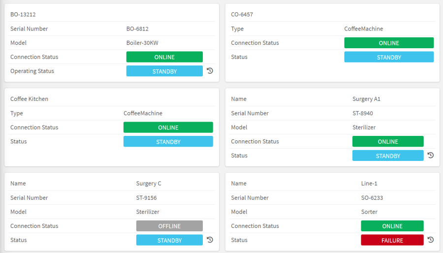
Displays a grid where each block is filled by a thing-definition specific template.
Template Syntax
Below you can find some examples of how to use the component within a template.
<thing-grid-widget template="small-details" elementClass="grid-element-container m-2"></thing-grid-widget>
Component Reference
Here is a comprehensive list of all the elements and properties that can be used to configure the component.
Thing Grid <thing-grid-widget>
Click On Block | The flag enabling the click on single block to open its details page. Name: clickOnBlockEnabled Type: BOOLEAN | Optional
|
Hide When Empty | The flag indicating whether the widget is hidden when empty. Name: hideWhenEmpty Type: BOOLEAN | Optional
|
Id | The id used by other page widgets to listening on the things selection through the 'queryFieldRef' input. Name: id Type: STRING | Optional
|
Initial Sorting | The array of property names and criteria to use for sorting (e.g. ['name','asc','serialNumber','desc']). Name: sort Type: SORT_PROPERTIES | Optional
|
Multiple Section Enabled | The flag indicating whether more than one thing can be selected; if so, an id must also be specified (e.g., selected-things-1). Name: multipleSelection Type: BOOLEAN | Optional
|
Template | The name of the thing-definition template to display for each thing. Name: template Type: STRING | Required
|
Title | The title displayed on the top part of the widget box. Name: title Type: STRING | Optional
|
Advanced | |
Container CSS Class | The CSS class applied to grid container element (default is 'd-flex align-items-stretch flex-wrap'). Name: containerClass Type: STRING | Optional
|
Element CSS Class | The CSS class applied to each grid element (default is 'm-2 flex-grow-1'). Name: elementClass Type: STRING | Optional
|
Rendering | |
Availability | Configure availability based on active features on Digital Plan on Add-ons Name: hasFeature Type: FEATURE (multiple) | Optional
|
CSS Class | The name(s) of the CSS class used to customize the widget layout. Name: class Type: STRING | Optional
|
Visibility Condition | The expression that allows you to reduce the visibility of the element. Name: *ngIf Type: STRING | Optional
|
Full Syntax Example
<thing-grid-widget
    [title]="'Thing Grid'"
    template="abc"
    sort="['name','asc','serialNumber','desc']"
    [clickOnBlockEnabled]="true"
    [hideWhenEmpty]="true"
    [multipleSelection]="true"
    id="abc"
    containerClass="abc"
    elementClass="abc"
    class="my-custom-class"
    *ngIf="getUser().organizationId != null"
    hasFeature="['feature_a', 'feature_b']"></thing-grid-widget>