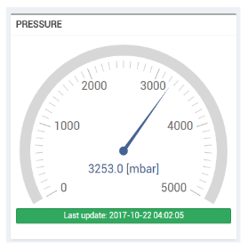
This widget allows displaying the last available value of a metric using a manometer like a gauge.
Template Syntax
Below you can find some examples of how to use the component within a template.
            <radial-gauge-widget title="Pressure" min="0" max="5000">
            <metric name="Pressure"></metric>
            </radial-gauge-widget>
Component Reference
Here is a comprehensive list of all the elements and properties that can be used to configure the component.
Radial Gauge <radial-gauge-widget>
Default Value | The default value to display when the metric value is not available. Name: defaultValue Type: STRING | Optional
|
Max | The maximum measure scale value. Name: max Type: FLOAT | Optional
|
Min | The minimum measure scale value. Name: min Type: FLOAT | Optional
|
Ranges | The set of value ranges (e.g. [10,50,70]). Name: ranges Type: JSON | Optional
|
Title | The title displayed on the top part of the widget box. Name: title Type: STRING | Optional
|
Rendering | |
Availability | Configure availability based on active features on Digital Plan on Add-ons Name: hasFeature Type: FEATURE (multiple) | Optional
|
CSS Class | The name(s) of the CSS class used to customize the widget layout. Name: class Type: STRING | Optional
|
Height | The height of the widget (e.g. 250px). Name: height Type: STRING | Optional
|
Visibility Condition | The expression that allows you to reduce the visibility of the element. Name: *ngIf Type: STRING | Optional
|
Sub Elements | |
The metric whose current value must be displayed within the gauge. | |
Metric <metric>
Filter | The name of the filter used to transform and display values. Name: filter Type: FILTER | Optional
|
Label | The metric alternative label. Name: label Type: STRING | Optional
|
Name | The metric whose value(s) must be loaded by the widget. Name: name Type: METRIC | Required
|
Unit | The unit of measurement to be displayed along the value. Name: unit Type: STRING | Optional
|
Advanced | |
Visibility Condition | The expression that allows you to reduce the visibility of the element. Name: *ngIf Type: STRING | Optional
|
Full Syntax Example
<radial-gauge-widget
[title]="'Radial Gauge'"
min="1.234"
max="1.234"
height="250px"
ranges="{p1: true, p2: 123, p3: 'abc'}"
defaultValue="abc"
class="my-custom-class"
*ngIf="getUser().organizationId != null"
hasFeature="['feature_a', 'feature_b']">
<metric
name="Temperature"
label="Temperature"
filter="fooBarFilter"
unit="°C"
*ngIf="getUser().organizationId != null"></metric>
</radial-gauge-widget>
