It renders a percentage value as a progress bar with different colors according to thresholds.
This filter is parametric, so you can define how the progress bar should be displayed directly in the template.
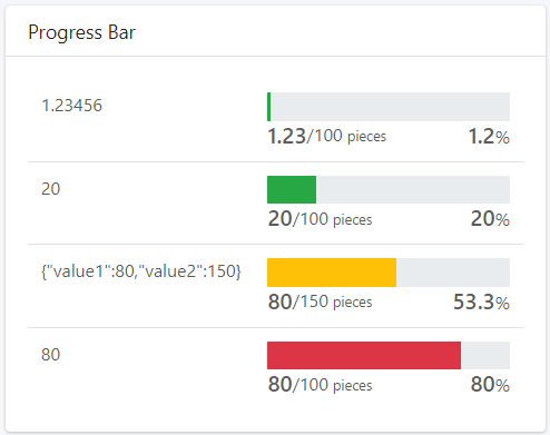
Progress can be displayed as a simple bar (Show Details = false) and in this case the percentage is displayed directly in the bar. This layout fits well when used within lists, as it takes up little vertical space.
.png?sv=2026-02-06&spr=https&st=2026-07-14T10%3A38%3A57Z&se=2026-07-14T10%3A49%3A57Z&sr=c&sp=r&sig=YxneSEMPVBbgJoy4ChVDoc38qdiZjB2KDUdrndrr7Oc%3D)
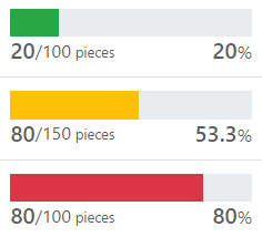
You can define whether to use a single color or to use a color based on thresholds. For example, using the Bad to Good color style, when the value is below the Lower Threshold (default 20%) the bar is red, if it is below the Upper Threshold (default 80%) the bar is orange, otherwise it is green.
.png?sv=2026-02-06&spr=https&st=2026-07-14T10%3A38%3A57Z&se=2026-07-14T10%3A49%3A57Z&sr=c&sp=r&sig=YxneSEMPVBbgJoy4ChVDoc38qdiZjB2KDUdrndrr7Oc%3D)
Optionally, it can be defined whether to display details below the bar, in case the partial and total values are not themselves percentages.
.png?sv=2026-02-06&spr=https&st=2026-07-14T10%3A38%3A57Z&se=2026-07-14T10%3A49%3A57Z&sr=c&sp=r&sig=YxneSEMPVBbgJoy4ChVDoc38qdiZjB2KDUdrndrr7Oc%3D)
Filter Variants
The set of predefined filter variants that can be used to format values.
Progress Bar V2 | Displays a progress bar given a value (0 to 100). Optionally if applied to a composite-part, the partial and total value can be defined. Name: progressBarV2 Input Types: INTEGER, FLOAT, NUMBER, COMPOSITE_PART Output Type: HTML Parameters
|