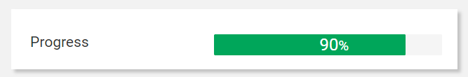
It renders a percentage value as a progress bar with different colors according to the thresholds.
This filter and its variants can be applied to metrics and properties of numeric type, alternatively, it can be applied on a composite-part where the first metric/property is the partial value and the second is the total value, in this case, the filter automatically calculates the percentage and renders the bar.
The filter input values can be:
percentage value: a single value used as a percentage within the bar (85 → 85%).
partial and total: a couple of values used to compute the bar percentage (partial= 80, total=200 → 40%).
Filter Variants
The set of predefined filter variants that can be used to format values.
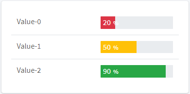
Progress Bar | renders a progress bar which is red < 30%, orange < 70% and green when > 70% Name: progressBar Input Types: INTEGER, FLOAT, NUMBER Output Type: HTML |
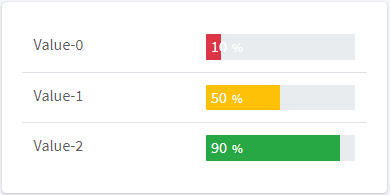
Progress Bar (20-70) | renders a progress bar which is red < 20%, orange < 70% and green when > 70% Name: progressBar_20_70 Input Types: INTEGER, FLOAT, NUMBER Output Type: HTML |
Progress Bar (20-80) | renders a progress bar which is red < 20%, orange < 80% and green when > 80% Name: progressBar_20_80 Input Types: INTEGER, FLOAT, NUMBER Output Type: HTML |
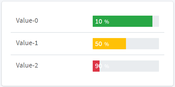
Progress Bar (reverted) | computes the remaining percentage and renders a progress bar which is red < 30%, orange < 70% and green when > 70% Name: progressBar_rev Input Types: INTEGER, FLOAT, NUMBER Output Type: HTML |

Custom Variants
New variants can be defined through the following configuration options.
Option | Description | Sample Value |
|---|---|---|
barClass | The name of the CSS class of the progress-bar | progress-bar-striped |
infoTextKey | The key identifying the localized text describing the progress bar. | ProductionProgress.info |
label | The label displayed above or below the progress bar (optional). | Production progress |
labelPosition | The position of the label (optional). | top, bottom, none (default) |
revert | The flag indicating whether to show the current percentage or the remaining one. | true, false (default) |
showRemaining | The flag indicating whether to display the remaining value into the progress bar. | true, false |
showRemainingInfo | The flag indicating whether to display the remaining value information. | true, false |
threshold1 | The first threshold (default 30) | 30 |
threshold2 | The second threshold (default 70) | 70 |
unit | The displayed measure unit (optional), default is '%'. | Hours |
valueFilter | The name of the adapter used to transform values before displaying them. | SingleDecimalPrecision |
valuePosition | The position of the percentage value (optional). | bottom, on-bar (default) |
Example of defining a custom progress-bar filter variants into the Custom Filters component.
exports.myProgressBar = ProgressBar({ "threshold1": 10, "threshold2": 90 });