Displays the values of multiple metrics in a plain list or table with one column per metric.
Values are ordered by the timestamp in descending order, and when scrolling the list, the oldest values will be loaded automatically.
Template Syntax
Below you can find some examples of how to use the component within a template.
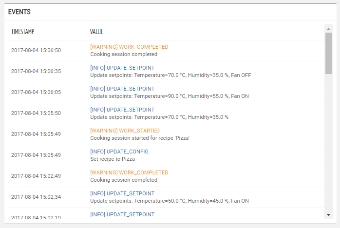
            <multi-metric-list-widget title="Events" mode="LOG">
            <metric name="EventInfo" filter="messageWithSeverity"></metric>
            </multi-metric-list-widget>
Component Reference
Here is a comprehensive list of all the elements and properties that can be used to configure the component.
Multi Metric List <multi-metric-list-widget>
Export Enabled | The boolean flag indicating whether the data export is enabled. Name: exportEnabled Type: BOOLEAN | Optional Default Value: false
|
Period Filter Enabled | The boolean flag indicating whether the embedded period filter is available. Name: filterEnabled Type: BOOLEAN | Optional Default Value: true
|
Title | The title displayed on the top part of the widget box. Name: title Type: STRING | Optional
|
Data | |
Default Loading Period | The default filtering period applied when entering the page. Name: defaultPeriodValue Type: PERIODS | Optional
|
| The <period-field>'s End Variable filtering data by end date. Name: endDateFieldRef Type: STRING | Optional
|
Page Size | The number of results to load when scrolling down the list. Name: pageSize Type: INTEGER | Optional Default Value: 20
|
Period Variable | The id of the page's variable providing the date range filtering period, for instance the id of a <period-filter-field>. Name: periodRef Type: STRING | Optional
|
| The <period-field>'s Start Variable filtering data by start date. Name: startDateFieldRef Type: STRING | Optional
|
Advanced | |
Refresh Interval | The interval to check for updates (e.g. P7D, PT36H). The value is expressed using the ISO 8601 standard for durations. Name: refreshInterval Type: STRING | Optional Default Value: PT30
|
Show Timestamp Column | The boolean flag indicating whether the Timestamp column is visible. Name: showTimestamp Type: BOOLEAN | Optional Default Value: true
|
Rendering | |
Availability | Configure availability based on active features on Digital Plan on Add-ons Name: hasFeature Type: FEATURE (multiple) | Optional
|
Collapse / Expand | The flag indicating whether the widget is collaspible. Name: collapsible Type: BOOLEAN | Optional Default Value: false
|
CSS Class | The name(s) of the CSS class used to customize the widget layout. Name: class Type: STRING | Optional
|
Visibility Condition | The expression that allows you to reduce the visibility of the element. Name: *ngIf Type: STRING | Optional
|
Sub Elements | |
The metric whose label and current value must be rendered as a widget row. | |
Metric <metric>
Filter | The name of the filter used to transform and display values. Name: filter Type: FILTER | Optional
|
Label | The metric alternative label. Name: label Type: STRING | Optional
|
Name | The metric whose value(s) must be loaded by the widget. Name: name Type: METRIC | Required
|
Unit | The unit of measurement to be displayed along the value. Name: unit Type: STRING | Optional
|
Advanced | |
Visibility Condition | The expression that allows you to reduce the visibility of the element. Name: *ngIf Type: STRING | Optional
|
Full Syntax Example
<multi-metric-list-widget
[title]="'Multi Metrics'"
[exportEnabled]="true"
[filterEnabled]="false"
defaultPeriodValue="LAST_30_DAYS"
periodRef="period"
pageSize="123"
startDateFieldRef="fromDate"
endDateFieldRef="toDate"
[showTimestamp]="false"
refreshInterval="abc"
[collapsible]="true"
class="abc"
*ngIf="getUser().organizationId != null"
hasFeature="['feature_a', 'feature_b']">
<metric
name="Temperature"
label="Temperature"
unit="°C"
filter="fooBarFilter"
*ngIf="getUser().organizationId != null"></metric>
</multi-metric-list-widget>