Displays the properties of a partner in a details box.
In case this widget is placed ina Customer dashboard, you can enable the partner assignment.
The Assign button is present only if there is no partner assigned to the customer, and once pressed, the user must enter the partner code that was provided through a different channel (e.g., while signing the technical support contract). In this way, the customer cannot self-assign to the wrong partner.
Template Syntax
Below you can find some examples of how to use the component within a template.
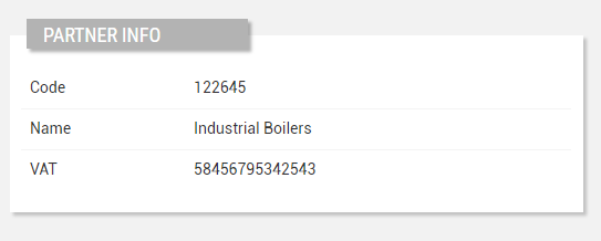
            <partner-details-widget title="Partner Info">
            <property name="name"></property>
            <property name="code"></property>
            <property name="properties.vatNumber"></property>

            <property.....></property>
            </partner-details-widget>
Component Reference
Here is a comprehensive list of all the elements and properties that can be used to configure the component.
Partner Details <partner-details-widget>
Column Span | The number of columns the widget must span its sub-elements (default 1). Name: columns Type: INTEGER | Optional
|
Layout | The layout used to display properties in the widget: TABLE: Displays one column for the label and another for the property value. ALTERNATE_ROWS: Displays a gray row for the label and a white row for the property value. Name: layout Type: ENUM | Optional Values: TABLE, ALTERNATE_ROWS Default Value: TABLE
|
Partner Assignment Enabled | If enabled, the widget allows client users to select and assign a partner by code. Name: partnerAssignmentEnabled Type: BOOLEAN | Optional Default Value: false
|
Title | The title displayed on the top part of the widget box. Name: title Type: STRING | Optional
|
Expandable Details | |
Details Button Icon | The Angular Material icon displayed inside the details button. Name: expandableDetails.expandIcon Type: STRING | Optional
|
Mode | The way the details is opened. Name: expandableDetails.mode Type: ENUM | Optional Values: EMBEDDED, POPUP Default Value: POPUP
|
Popup Title | The title displayed on the top part of the popup. Name: expandableDetails.popupTitle Type: STRING | Optional
|
Template | The name of the template to display. Name: expandableDetails.template Type: STRING | Optional
|
Rendering | |
Availability | Configure availability based on active features on Digital Plan on Add-ons Name: hasFeature Type: FEATURE (multiple) | Optional
|
Collapse / Expand | The flag indicating whether the widget is collaspible. Name: collapsible Type: BOOLEAN | Optional Default Value: false
|
CSS Class | The name(s) of the CSS class used to customize the widget layout. Name: class Type: STRING | Optional
|
Visibility Condition | The expression that allows you to reduce the visibility of the element. Name: *ngIf Type: STRING | Optional
|
Sub Elements | |
The property whose label and current value must be rendered as a widget row. | |
The widget part combining multiple properties. | |
Compose the widget title by using properties. | |
Make the widget clickable by defining an address to browse. | |
Property <property>
Description | The property description. Name: description Type: STRING | Optional
|
Filter | The name of the filter used to transform and display values. Name: filter Type: FILTER | Optional
|
Label | The property alternative label. Name: label Type: STRING | Optional
|
Name | The property whose value must be loaded by the widget. Name: name Type: PROPERTY | Required
|
Show Label | The flag indicated whether the label is visible. Name: showLabel Type: BOOLEAN | Optional Default Value: true
|
Advanced | |
Visibility Condition | The expression that allows you to reduce the visibility of the element. Name: *ngIf Type: STRING | Optional
|
Composite Part <composite-part>
Description | The composite-part description. Name: description Type: STRING | Optional
|
Filter | The filter applied on the composite-part to transform or display its value. Name: filter Type: FILTER | Optional
|
Label | The label displayed by the widget. Name: label Type: STRING | Optional
|
Name | The composite-part name. Name: name Type: STRING | Optional
|
Show Label | The flag indicated whether the label is visible. Name: showLabel Type: BOOLEAN | Optional Default Value: true
|
Advanced | |
Visibility Condition | The expression that allows you to reduce the visibility of the element. Name: *ngIf Type: STRING | Optional
|
Sub Elements | |
The property whose value must be loaded within the composite-part. | |
Property <property>
Name | The property whose value must be loaded by the widget. Name: name Type: PROPERTY | Required
|
Widget Title <widget-title>
Filter | The filter applied on the composite-part to transform or display its value. Name: filter Type: FILTER | Optional
|
Sub Elements | |
The property whose value must be loaded within the composite-part. | |
Property <property>
Filter | The name of the filter used to transform and display values. Name: filter Type: FILTER | Optional
|
Name | The property whose value must be loaded by the widget. Name: name Type: PROPERTY | Required
|
Link <link-element>
Description | The description displayed as link tooltip. Name: description Type: STRING | Optional
|
Icon | The link:https://fonts.google.com/icons?selected=Material+Icons[Google Fonts] icon (e.g. home) or link:https://fontawesome.com/v5[Font Awesome] icon (e.g. fas fa-home) to be displayed before the link label. Name: icon Type: STRING | Optional
|
URL | The URL to browse, '/..' for application relative URL, 'https://....' for external URLs, else it is considered relative to the current page. Name: url Type: STRING | Required
|
Rendering | |
Visibility Condition | The expression that allows you to reduce the visibility of the link. Name: *ngIf Type: STRING | Optional
|
Full Syntax Example
<partner-details-widget
    [title]="'Partner'"
    columns="2"
    layout="TABLE"
    [partnerAssignmentEnabled]="true"
    [expandableDetails]="{
        mode: 'EMBEDDED',
        expandIcon: 'abc',
        template: 'abc',
        popupTitle: 'abc'
    }"
    [collapsible]="true"
    class="my-custom-class"
    *ngIf="getUser().organizationId != null"
    hasFeature="['feature_a', 'feature_b']">
    <property
            name="serialNumber"
            label="Temperature"
            description="abc"
            filter="fooBarFilter"
            [showLabel]="false"
            *ngIf="getUser().organizationId != null"></property>
    <composite-part
            name="abc"
            label="abc"
            description="abc"
            filter="fooBarFilter"
            *ngIf="getUser().organizationId != null"
            [showLabel]="false">
            <property
                        name="serialNumber"></property>
    </composite-part>
    <widget-title
            filter="fooBarFilter">
            <property
                        name="serialNumber"
                        filter="fooBarFilter"></property>
    </widget-title>
    <link-element
            description="Show more details..."
            url="abc"
            icon="star"
            *ngIf="getUser().organizationId != null"></link-element>
</partner-details-widget>