This widget displays metric or statistical data in a compact chart.
With this chart, you can display data from a single metric or statistic without an axis, grid, or legend.
You can select whether to display data by using:
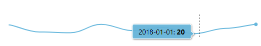
LINE: a single line is used to render data points in the period.
The line is automatically colored by using the threshold severity of the last value.
BARS: for each value, a bar is displayed.
Each bar is colored according to the threshold severity of the value.
PIE: display a pie chart, where each slice represents a value.
Each slice is colored according to the threshold severity of the value.
Template Syntax
Below you can find some examples of how to use the component within a template.
            <micro-chart-widget defaultPeriod="LAST_30_DAYS" layout="LINE">
            <metric name="connectivity_index_percentage"></metric>
            </micro-chart-widget>
Component Reference
Here is a comprehensive list of all the elements and properties that can be used to configure the component.
Micro Chart <micro-chart-widget>
Layout | The way the data are presented, which can be Line, Bars or Pie. Name: layout Type: ENUM | Optional Values: LINE, BARS, PIE Default Value: LINE
|
Title | The title displayed on the top part of the widget box. Name: title Type: STRING | Optional
|
Data | |
Default Loading Period | The default period applied when entering the page. Name: defaultPeriodValue Type: PERIODS | Optional Default Value: LAST_30_DAYS
|
Period Variable | The id of the page's variable providing the date range filtering period, for instance the id of a <period-filter-field>. Name: periodRef Type: STRING | Optional
|
Query | The array of conditions filtering out items. For instance: [query]='[{'property': 'connectionStatus', 'predicate': 'eq', 'value': '1'}]' Predicates: eq, beginsWith, like, notLike, isEmpty, isNotEmpty, gt, gte, lt, lte. Name: query Type: QUERY | Optional Predicates: beginsWith, eq, neq, gt, gte, isEmpty, isNotEmpty, lt, lte, like, notLike
|
Query Variable | The id of the page's <things-filter-field> used for searching. Name: queryFieldRef Type: STRING | Optional
|
Expandable Details | |
Details Button Icon | The Angular Material icon displayed inside the details button. Name: expandableDetails.expandIcon Type: STRING | Optional
|
Mode | The way the details is opened. Name: expandableDetails.mode Type: ENUM | Optional Values: EMBEDDED, POPUP Default Value: POPUP
|
Popup Title | The title displayed on the top part of the popup. Name: expandableDetails.popupTitle Type: STRING | Optional
|
Template | The name of the template to display. Name: expandableDetails.template Type: STRING | Optional
|
Advanced | |
Color | The default color expressed in hexadecimal. Name: color Type: STRING | Optional
|
Max | The maximum value showed on the axis. Name: maxScale Type: INTEGER | Optional
|
Min | The minimum value showed on the axis. Name: minScale Type: INTEGER | Optional
|
Rendering | |
Availability | Configure availability based on active features on Digital Plan on Add-ons Name: hasFeature Type: FEATURE (multiple) | Optional
|
CSS Class | The name(s) of the CSS class used to customize the widget layout. Name: class Type: STRING | Optional
|
Height | The height of the widget (e.g. 250px). Name: height Type: STRING | Optional Default Value: 200px
|
Visibility Condition | The expression that allows you to reduce the visibility of the element. Name: *ngIf Type: STRING | Optional
|
Sub Elements | |
The metrics used to load timeseries data. | |
Metric <metric>
Aggregation | The aggregation to be applied to the daily values of the metric. If missing, the last value of the day is loaded. Name: aggregation Type: ENUM | Optional Values: AVG, DELTA, MIN, MAX
|
Filter | The name of the filter used to transform and display values. Name: filter Type: FILTER | Optional
|
Label | The metric alternative label. Name: label Type: STRING | Optional
|
Name | The metric whose value(s) must be loaded by the widget. Name: name Type: METRIC | Required
|
Unit | The unit of measurement to be displayed along the value. Name: unit Type: STRING | Optional
|
Advanced | |
Visibility Condition | The expression that allows you to reduce the visibility of the element. Name: *ngIf Type: STRING | Optional
|
Full Syntax Example
<micro-chart-widget
[title]="'Micro Chart'"
layout="LINE"
defaultPeriodValue="LAST_30_DAYS"
periodRef="period"
queryFieldRef="query-1"
query="[{property:'prop1', predicate: 'eq', value: 'foo'}, {property:'prop2', predicate: 'in', value: ['bar', 'baz']}]"
[expandableDetails]="{
mode: 'EMBEDDED',
expandIcon: 'abc',
template: 'abc',
popupTitle: 'abc'
}"
color="#007BFF"
minScale="123"
maxScale="123"
height="250px"
class="my-custom-class"
*ngIf="getUser().organizationId != null"
hasFeature="['feature_a', 'feature_b']">
<metric
name="Temperature"
label="Temperature"
unit="°C"
filter="fooBarFilter"
aggregation="AVG"
*ngIf="getUser().organizationId != null"></metric>
</micro-chart-widget>