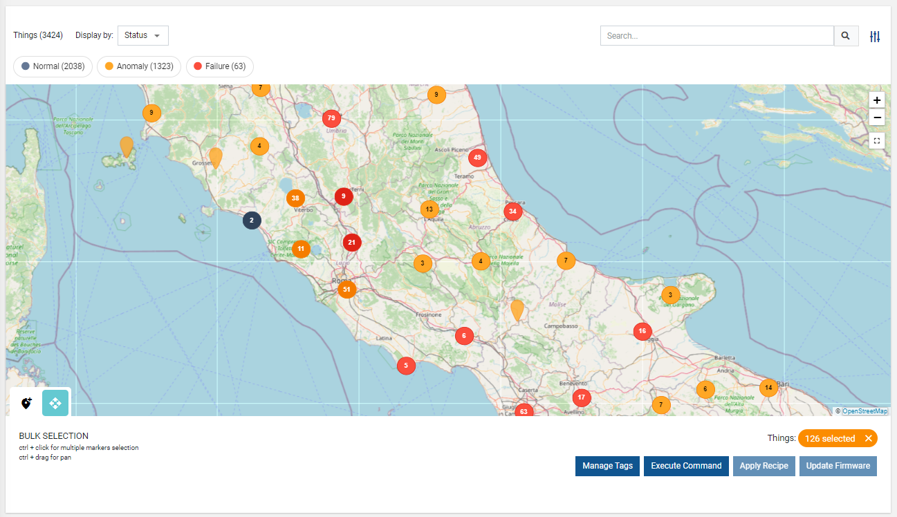
Displays an interactive map with a marker for each geolocated item (thing or location).
Each item is represented by a marker, whose color and style reflect key information such as the operating status, the connection status, the presence of failures, or other relevant information.
This visualization allows users to quickly identify the geographical distribution of products and gain insights into their state at a glance.
Please note that at least one thing or location must specify the GPS coordinates to display at least one marker on the map.
Elements without GPS coordinates are ignored on the map.
Tooltips
When you move over a marker in the map, a tooltip will display the main information of the related object (thing or location).
.png?sv=2026-02-06&spr=https&st=2026-07-21T19%3A44%3A11Z&se=2026-07-21T20%3A01%3A11Z&sr=c&sp=r&sig=n8iIRw86SwNPe%2Bw%2FuhD1SNNWtIZzRV22HG08h3pEq7k%3D)
You can configure the content of the pop-up by adding property sub-elements to the widget.
Each property can be overwritten, defining the label, unit, and filter for value transforming and format.
If you need to combine multiple properties in the same value, you can add composite parts with a specific filter (e.g., connection status with last status update time).
Map Filters
Map markers can be highlighted according to different criteria (e.g., presence of problems).
The map offers these selectable map filters:
Connection Status: highlights markers based on the connection status of each thing.
In the case of locations, it only needs one thing online for the entire location to be marked as online.
Issue: Highlights markers based on the presence of active Events (FAILURE → red, Major Anomalies → orange, Minor Anomalies → yellow, and black for no active issues).

Status: Highlights markers based on the presence of active Alerts (CRITICAL → red, WARNING → orange, and black for no active alerts).

By default, the map displays markers by using the Connection Status filter, and other Map Filters must be manually added to the widget as sub-elements in the template editor.
By clicking on the badges on the map (e.g., Failure (1)), markers belonging to a specific group can be hidden or displayed.
In addition, you can create your own map filters to display markers according to your specific needs.
Map Tools
On the map, you can find additional buttons providing helpful functionalities:
Zoom in/out: allows the DPS user to zoom in and out.
In addition, the mouse wheel can be used to zoom in on a specific point.Fit Content: the visible area is adapted to allow all markers to be included.
Move Markers: if enabled (Move Tool Enabled option), the DPS user can drag markers, and when done, the new GPS coordinates are saved on the referenced object (location or thing).
Bulk Operations
By enabling the widget property "Bulk Controls", the widget allows selecting multiple markers and performing bulk operations, including:
Manage Tags: The DPS user can select/deselect and edit tags to be associated with the selected things.
Execute Command: The DPS user can select a command (with bulk support) and execute it on the selected things.
In case the selection includes several models, for each of them, the DPS user can select a specific command.Update Firmware: The DPS user can select a firmware (with bulk update) and apply it to the selected things.
Apply Recipe: The DPS user can select a recipe and apply it to the selected things.
.png?sv=2026-02-06&spr=https&st=2026-07-21T19%3A44%3A11Z&se=2026-07-21T20%3A01%3A11Z&sr=c&sp=r&sig=n8iIRw86SwNPe%2Bw%2FuhD1SNNWtIZzRV22HG08h3pEq7k%3D)
In case a remote update has been triggered (e.g., command execution, firmware update), it is also possible to select whether to execute the update immediately or schedule it for a specific time.
.png?sv=2026-02-06&spr=https&st=2026-07-21T19%3A44%3A11Z&se=2026-07-21T20%3A01%3A11Z&sr=c&sp=r&sig=n8iIRw86SwNPe%2Bw%2FuhD1SNNWtIZzRV22HG08h3pEq7k%3D)
Layers
You can change the provider of the map layer by using the widget option Map Layer URL. A list of providers can be found on this page.
You can copy the URL from the Plain JavaScript section and paste it into the “Map Layer URL“ widget property..png?sv=2026-02-06&spr=https&st=2026-07-21T19%3A44%3A11Z&se=2026-07-21T20%3A01%3A11Z&sr=c&sp=r&sig=n8iIRw86SwNPe%2Bw%2FuhD1SNNWtIZzRV22HG08h3pEq7k%3D)
Template Syntax
Below you can find some examples of how to use the component within a template.
<map-widget context="THINGS|LOCATION"
            [title]="'Thing Map'"
            [moveElementEnabled]="true"
            [bulkControlsEnabled]="true"
            [queryFieldRef]=""
            [query]="[{..},{..}]"
            maxClusterRadius="30"
            disableClusteringAtZoomLevel="19"
            maxZoomLevel="20"
            mapLayerUrl="https://{s}.tile.openstreetmap.org/{z}/{x}/{y}.png"
            tooltipDetailsFilter=""
            tooltipClass="my-tooltip"
            class="my-map-class">

            <property name="name"></property>
            <property name="serialNumber"></property>

            <composite-part label="Connection Status" filter="connectionStatus">
            <property name="connectionStatus"></property>
            <property name="connectionStatusLastUpdateTimestamp"></property>
            </composite-part>

           	<map-filter name="StatusMapFilter"></map-filter>
		    <map-filter name="IssueMapFilter"></map-filter>
    		<map-filter name="ConnectionStatusMapFilter:{}"></map-filter>

</map-widget>
Component Reference
Here is a comprehensive list of all the elements and properties that can be used to configure the component.
Map <map-widget>
Bulk Controls Enabled | The boolean flag indicating whether bulk selection and buttons (e.g. Tagging, Firmware Update) are enabled on the widget. Name: bulkControlsEnabled Type: BOOLEAN | Optional Default Value: false
|
Context | The type of objects to be loaded within the map. Name: context Type: ENUM | Optional Values: THINGS, LOCATIONS Default Value: THINGS
|
Title | The title displayed on the top part of the widget box. Name: title Type: STRING | Optional
|
Map Layout | |
Cluster Max Radius | The maximum radius that a cluster will cover from the central marker (in pixels). Decreasing will make more, smaller clusters. Name: maxClusterRadius Type: INTEGER | Optional Default Value: 40
|
Clustering Max Zoom Level | The zoom level after which clustering is disabled. Name: disableClusteringAtZoomLevel Type: INTEGER | Optional Default Value: 19
|
Map Layer URL | The URL used to load map layer tiles. You can refer to this page https://leaflet-extras.github.io/leaflet-providers/preview Name: mapLayerUrl Type: STRING | Optional
|
Max Zoom Level | The maximum zoom level of the map. Name: maxZoomLevel Type: INTEGER | Optional Default Value: 19
|
Data | |
Query | The array of conditions filtering out items. For instance: [query]='[{'property': 'connectionStatus', 'predicate': 'eq', 'value': '1'}]' Predicates: eq, beginsWith, like, notLike, isEmpty, isNotEmpty, gt, gte, lt, lte. Name: query Type: QUERY | Optional Predicates: beginsWith, eq, neq, gt, gte, isEmpty, isNotEmpty, lt, lte, like, notLike
|
Query Variable | The id of the page's <things-filter-field> used for searching. Name: queryFieldRef Type: STRING | Optional
|
Advanced | |
Move Tool Enabled | The boolean flag indicating whether the element move tool is enabled. Name: moveElementEnabled Type: BOOLEAN | Optional Default Value: false
|
Refresh Interval | The map refresh interval in milliseconds. Name: refreshInterval Type: STRING | Optional Default Value: 300000
|
Show Hierarchy Enabled | The boolean flag indicating whether the show thing hierarchy is enabled. Name: showHierarchyEnabled Type: BOOLEAN | Optional Default Value: false
|
Show Root Things Only | Forces loading of root things only. Name: showRootThings Type: BOOLEAN | Optional Default Value: false
|
Tooltip Details Filter | The name of the filter you can use to customize the marker tooltip. Name: tooltipDetailsFilter Type: FILTER | Optional
|
Rendering | |
Availability | Configure availability based on active features on Digital Plan on Add-ons Name: hasFeature Type: FEATURE (multiple) | Optional
|
CSS Class | The name(s) of the CSS class used to customize the widget layout. Name: class Type: STRING | Optional
|
Tooltip CSS Class | The name(s) of the CSS class used to customize the marker tooltip. Name: tooltipClass Type: STRING | Optional
|
Visibility Condition | The expression that allows you to reduce the visibility of the element. Name: *ngIf Type: STRING | Optional
|
Sub Elements | |
The property whose label and value must be displayed within the marker tooltip. | |
The composite part whose label and value must be displayed within the marker tooltip. | |
This element allows defining map markers filtering tools. | |
Property <property>
Description | The property description. Name: description Type: STRING | Optional
|
Filter | The name of the filter used to transform and display values. Name: filter Type: FILTER | Optional
|
Label | The property alternative label. Name: label Type: STRING | Optional
|
Name | The property whose value must be loaded by the widget. Name: name Type: PROPERTY | Required
|
Advanced | |
Visibility Condition | The expression that allows you to reduce the visibility of the element. Name: *ngIf Type: STRING | Optional
|
Composite Part <composite-part>
Description | The composite-part description. Name: description Type: STRING | Optional
|
Filter | The filter applied on the composite-part to transform or display its value. Name: filter Type: FILTER | Optional
|
Label | The label displayed by the widget. Name: label Type: STRING | Optional
|
Name | The composite-part name. Name: name Type: STRING | Optional
|
Advanced | |
Visibility Condition | The expression that allows you to reduce the visibility of the element. Name: *ngIf Type: STRING | Optional
|
Sub Elements | |
The property whose value must be loaded within the composite-part. | |
Property <property>
Name | The property whose value must be loaded by the widget. Name: name Type: PROPERTY | Required
|
Map Filter <map-filter>
Filter | The filter used to highlight map markers according to a property value, connection status or health status. Name: name Type: FILTER | Optional
|
Label | The optional map filter label; if missing, the default name is used. Name: config.label Type: STRING | Optional
|
Full Syntax Example
<map-widget
    [title]="'Map'"
    context="THINGS"
    [bulkControlsEnabled]="true"
    mapLayerUrl="https://{s}.tile.openstreetmap.org/{z}/{x}/{y}.png"
    maxZoomLevel="10"
    maxClusterRadius="123"
    disableClusteringAtZoomLevel="123"
    query="[{property:'prop1', predicate: 'eq', value: 'foo'}, {property:'prop2', predicate: 'in', value: ['bar', 'baz']}]"
    queryFieldRef="query-1"
    [moveElementEnabled]="true"
    [showHierarchyEnabled]="true"
    tooltipDetailsFilter="dateFormat"
    refreshInterval="abc"
    [showRootThings]="true"
    tooltipClass="abc"
    class="abc"
    *ngIf="getUser().organizationId != null"
    hasFeature="['feature_a', 'feature_b']">
    <property
            name="serialNumber"
            label="Temperature"
            description="abc"
            filter="fooBarFilter"
            *ngIf="getUser().organizationId != null"></property>
    <composite-part
            name="abc"
            label="abc"
            description="abc"
            filter="fooBarFilter"
            *ngIf="getUser().organizationId != null">
            <property
                        name="serialNumber"></property>
    </composite-part>
    <map-filter
            name="fooBarFilter"
            [config]="{
                label: 'Online/Offline'
            }"></map-filter>
</map-widget>