A widget that displays the level of a stackable quantity in a shaped tank.
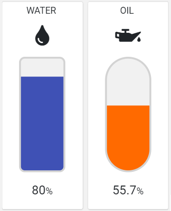
The widget requires specifying the metric providing the level percentage (0% - 100%), optionally you can display the title, icon, and percentage value, and also according to other configuration properties, you can change colors and tank shape.
Template Syntax
Below you can find some examples of how to use the component within a template.
            <level-indicator-widget [config]="{icon: 'fas fa-oil-can', tankShape: 'PILL'}">
            <metric name="Oil Level"></metric>
            </level-indicator-widget>
Component Reference
Here is a comprehensive list of all the elements and properties that can be used to configure the component.
Level Indicator <level-indicator-widget>
Empty Color | The color used as background for the empty tank part. Name: config.emptyColor Type: STRING | Optional Default Value: #F1F1F1
|
Fill Color | The color used as background by the level bar. Name: config.fillColor Type: STRING | Optional Default Value: #FF6A00
|
Icon | The name of the link:https://fontawesome.com/v5/search[Font Awesome] icon. Name: config.icon Type: STRING | Optional
|
Show Percentage | Indicates whether the percentage value must be displayed below the level indicator. Name: config.showPercentage Type: BOOLEAN | Optional Default Value: true
|
Stroke Color | The color used as tank stroke. Name: config.strokeColor Type: STRING | Optional Default Value: #D3D3D3
|
Tank Height | The height in px of the tank. Name: config.tankHeight Type: INTEGER | Optional Default Value: 250
|
Tank Shape | The shape of the tank overlaid on the level bar. Name: config.tankShape Type: ENUM | Optional Values: ROUNDED_RECT, PILL Default Value: ROUNDED_RECT
|
Tank Width | The Width in px of the tank. Name: config.tankWidth Type: INTEGER | Optional Default Value: 94
|
Title | The title displayed on the top part of the widget box. Name: title Type: STRING | Optional
|
Rendering | |
Availability | Configure availability based on active features on Digital Plan on Add-ons Name: hasFeature Type: FEATURE (multiple) | Optional
|
CSS Class | The name(s) of the CSS class used to customize the widget layout. Name: class Type: STRING | Optional
|
Visibility Condition | The expression that allows you to reduce the visibility of the element. Name: *ngIf Type: STRING | Optional
|
Sub Elements | |
The metric used by the widget to display the level. | |
Metric <metric>
Filter | The name of the filter used to transform and display values. Name: filter Type: FILTER | Optional
|
Label | The metric alternative label. Name: label Type: STRING | Optional
|
Name | The metric whose value(s) must be loaded by the widget. Name: name Type: METRIC | Required
|
Unit | The unit of measurement to be displayed along the value. Name: unit Type: STRING | Optional
|
Advanced | |
Visibility Condition | The expression that allows you to reduce the visibility of the element. Name: *ngIf Type: STRING | Optional
|
Full Syntax Example
<level-indicator-widget
[title]="'Level Indicator'"
[config]="{
emptyColor: '#007BFF',
fillColor: '#007BFF',
showPercentage: false,
tankShape: 'ROUNDED_RECT',
tankHeight: 123,
tankWidth: 123,
strokeColor: '#007BFF',
icon: 'fas fa-thermometer-quarter'
}"
class="my-custom-class"
*ngIf="getUser().organizationId != null"
hasFeature="['feature_a', 'feature_b']">
<metric
name="Temperature"
label="Temperature"
filter="fooBarFilter"
unit="°C"
*ngIf="getUser().organizationId != null"></metric>
</level-indicator-widget>