Displays a button that the user can click to navigate to another page.
You can put this element directly in the grid area as an independent button, once clicked the referenced URL is navigated.
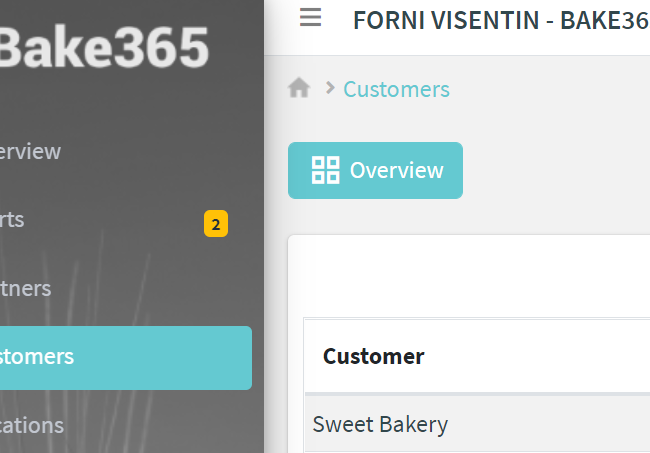
The URL you want to navigate is an application URL, which can be relative to the current navigated page (e.g. consumption), or absolute (e.g. /main/statistics)
In the alternative, you can put the link-element in a widget, doing so the widget will display it at its bottom, or depending on the widget, the entire widget will be clickable (e.g. gauges).
.png?sv=2026-02-06&spr=https&st=2026-07-17T14%3A11%3A59Z&se=2026-07-17T14%3A22%3A59Z&sr=c&sp=r&sig=e1jfSemoKURfQxCo6NJwbEWNHyg0o93KP%2Bd8i7PUZWg%3D)
Template Syntax
Below you can find some examples of how to use the component within a template.
            /* standalone button */
            <link-element url="/overview" label="Overview" description="Go to the overview page"></link-element>


            /* embedded button */
            <thing-details-widget title="Info">

            <property name="serialNumber"></property>
            <property name="thingDefinition.name" label="Model Name"></property>

            <link-element url="consumption" description="Displays the thing consumption"></link-element>

            </thing-details-widget>
Component Reference
Here is a comprehensive list of all the elements and properties that can be used to configure the component.
Link Element <link-element>
Description | The description of the widget. Name: description Type: STRING | Optional
|
Icon | The link:https://fonts.google.com/icons?selected=Material+Icons[Google Fonts] icon (e.g. home) or link:https://fontawesome.com/v5[Font Awesome] icon (e.g. fas fa-home) to be displayed before the link label. Name: icon Type: STRING | Optional
|
Label | The alternative label displayed by the widget. Name: label Type: STRING | Optional
|
URL | The URL to browse, '/...' for application relative URL, 'https://....' for external URLs, else it is considered relative to the current page. Name: url Type: STRING | Required
|
Rendering | |
Availability | Configure availability based on active features on Digital Plan on Add-ons Name: hasFeature Type: FEATURE (multiple) | Optional
|
CSS Class | The name(s) of the CSS class used to customize the widget layout. Name: class Type: STRING | Optional
|
Visibility Condition | The expression that allows you to reduce the visibility of the element. Name: *ngIf Type: STRING | Optional
|
Full Syntax Example
<link-element
    label="Temperature"
    url="abc"
    icon="star"
    description="abc"
    class="my-custom-class"
    *ngIf="getUser().organizationId != null"
    hasFeature="['feature_a', 'feature_b']"></link-element>