Displays multiple widgets into a single frame.
With this widget you can include inside the same frame multiple components (widgets, controls), arranging them in multiple rows.
The included components will be displayed without a frame and will be displayed according to how the rows inside the composite widget have been defined.
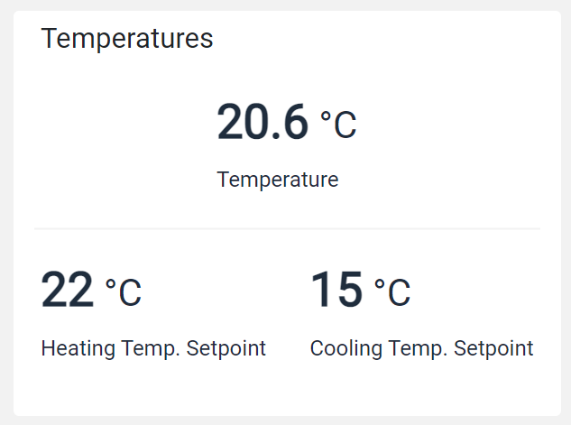
For example, below you can see a single box containing three gauges on two rows.
The Template Editor allows you to add the Composite widget and edit its content in the same way you are editing the main template.
Template Syntax
Below you can find some examples of how to use the component within a template.
            <composite-widget>

            <div class="d-flex justify-content-around">

            <gauge-widget [iconName]="'fa-clock-o'" backgroundColorClass="bg-white" [hideLastUpdate]="true" measureUnitPosition="METRIC_VALUE_RIGHT">
            <metric name="Temperature" filter="singleDecimalFormat"></metric>
            </gauge-widget>

            </div>

            <div class="d-flex justify-content-around">

            <gauge-widget [iconName]="'fa-clock-o'" backgroundColorClass="bg-white" [hideLastUpdate]="true" measureUnitPosition="METRIC_VALUE_RIGHT">
            <metric name="TempSetpoint"></metric>
            </gauge-widget>

            <gauge-widget [iconName]="'fa-clock-o'" backgroundColorClass="bg-white" [hideLastUpdate]="true" measureUnitPosition="METRIC_VALUE_RIGHT">
            <metric name="Power" filter="singleDecimalFormat"></metric>
            </gauge-widget>

            </div>

            </composite-widget>
Component Reference
Here is a comprehensive list of all the elements and properties that can be used to configure the component.
Configuration Parameters <configuration-parameters-widget>
Confirm Message | The confirm messagge displayed in the confirm dialog. Name: confirmDialogMessage Type: STRING | Optional
|
Feedback Timeout | The number of seconds after that the widget shows an error in case no feedback has been received. Name: timeout Type: INTEGER | Optional
|
Request Confirmation | The flag prompting the user to confirm the update execution. Name: confirmDialog Type: BOOLEAN | Optional Default Value: false
|
Title | The title displayed on the top part of the widget box. Name: title Type: STRING | Optional
|
Update Button Label | The label displayed within the widget update button. Name: buttonLabel Type: STRING | Optional Default Value: Update
|
Update Policy | The update policy in case of multiple parameters. Name: updatePolicy Type: ENUM | Optional Values: FULL, LAZY
|
Rendering | |
Availability | Configure availability based on active features on Digital Plan on Add-ons Name: hasFeature Type: FEATURE (multiple) | Optional
|
CSS Class | The name(s) of the CSS class used to customize the widget layout. Name: class Type: STRING | Optional
|
Visibility Condition | The expression that allows you to reduce the visibility of the element. Name: *ngIf Type: STRING | Optional
|
Sub Elements | |
The sub-element referencing a thing configuration parameter. | |
Configuration Parameter <configuration-parameter>
Label | The configuration parameter alternative displayed label. Name: label Type: STRING | Optional
|
Name | The configuration parameter whose value must be set. Name: name Type: CONFIGURATION_PARAMETER | Optional
|
Placeholder | The text input placeholder. Name: placeholder Type: STRING | Optional
|
Full Syntax Example
<configuration-parameters-widget
    [title]="'Configuration Parameters'"
    buttonLabel="abc"
    timeout="120"
    updatePolicy="FULL"
    [confirmDialog]="true"
    confirmDialogMessage="abc"
    class="my-custom-class"
    *ngIf="getUser().organizationId != null"
    hasFeature="['feature_a', 'feature_b']">
    <configuration-parameter
            name="paramName"
            label="abc"
            placeholder="abc"></configuration-parameter>
</configuration-parameters-widget>