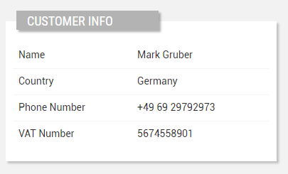
Displays the properties of a customer in a details box.
Template Syntax
Below you can find some examples of how to use the component within a template.
            <customer-details-widget title="Customer Info">
            <property name="name"></property>
            <property name="country"></property>
            <property name="properties.vatNumber"></property>
            .....
            </customer-details-widget>
Component Reference
Here is a comprehensive list of all the elements and properties that can be used to configure the component.
Customer Details <customer-details-widget>
Column Span | The number of columns the widget must span its sub-elements (default 1). Name: columns Type: INTEGER | Optional
|
Layout | The layout used to display properties in the widget: TABLE: Displays one column for the label and another for the property value. ALTERNATE_ROWS: Displays a gray row for the label and a white row for the property value. Name: layout Type: ENUM | Optional Values: TABLE, ALTERNATE_ROWS Default Value: TABLE
|
Title | The title displayed on the top part of the widget box. Name: title Type: STRING | Optional
|
Expandable Details | |
Details Button Icon | The Angular Material icon displayed inside the details button. Name: expandableDetails.expandIcon Type: STRING | Optional
|
Mode | The way the details is opened. Name: expandableDetails.mode Type: ENUM | Optional Values: EMBEDDED, POPUP Default Value: POPUP
|
Popup Title | The title displayed on the top part of the popup. Name: expandableDetails.popupTitle Type: STRING | Optional
|
Template | The name of the template to display. Name: expandableDetails.template Type: STRING | Optional
|
Rendering | |
Availability | Configure availability based on active features on Digital Plan on Add-ons Name: hasFeature Type: FEATURE (multiple) | Optional
|
Collapse / Expand | The flag indicating whether the widget is collaspible. Name: collapsible Type: BOOLEAN | Optional Default Value: false
|
CSS Class | The name(s) of the CSS class used to customize the widget layout. Name: class Type: STRING | Optional
|
Visibility Condition | The expression that allows you to reduce the visibility of the element. Name: *ngIf Type: STRING | Optional
|
Sub Elements | |
The property whose label and current value must be rendered as a widget row. | |
The widget part combining multiple properties. | |
Compose the widget title by using properties. | |
Make the widget clickable by defining an address to browse. | |
Property <property>
Description | The property description. Name: description Type: STRING | Optional
|
Filter | The name of the filter used to transform and display values. Name: filter Type: FILTER | Optional
|
Label | The property alternative label. Name: label Type: STRING | Optional
|
Name | The property whose value must be loaded by the widget. Name: name Type: PROPERTY | Required
|
Show Label | The flag indicated whether the label is visible. Name: showLabel Type: BOOLEAN | Optional Default Value: true
|
Advanced | |
Visibility Condition | The expression that allows you to reduce the visibility of the element. Name: *ngIf Type: STRING | Optional
|
Composite Part <composite-part>
Description | The composite-part description. Name: description Type: STRING | Optional
|
Filter | The filter applied on the composite-part to transform or display its value. Name: filter Type: FILTER | Optional
|
Label | The label displayed by the widget. Name: label Type: STRING | Optional
|
Name | The composite-part name. Name: name Type: STRING | Optional
|
Show Label | The flag indicated whether the label is visible. Name: showLabel Type: BOOLEAN | Optional Default Value: true
|
Advanced | |
Visibility Condition | The expression that allows you to reduce the visibility of the element. Name: *ngIf Type: STRING | Optional
|
Sub Elements | |
The property whose value must be loaded within the composite-part. | |
Property <property>
Name | The property whose value must be loaded by the widget. Name: name Type: PROPERTY | Required
|
Widget Title <widget-title>
Filter | The filter applied on the composite-part to transform or display its value. Name: filter Type: FILTER | Optional
|
Sub Elements | |
The property whose value must be loaded within the composite-part. | |
Property <property>
Filter | The name of the filter used to transform and display values. Name: filter Type: FILTER | Optional
|
Name | The property whose value must be loaded by the widget. Name: name Type: PROPERTY | Required
|
Link <link-element>
Description | The description displayed as link tooltip. Name: description Type: STRING | Optional
|
Icon | The link:https://fonts.google.com/icons?selected=Material+Icons[Google Fonts] icon (e.g. home) or link:https://fontawesome.com/v5[Font Awesome] icon (e.g. fas fa-home) to be displayed before the link label. Name: icon Type: STRING | Optional
|
URL | The URL to browse, '/..' for application relative URL, 'https://....' for external URLs, else it is considered relative to the current page. Name: url Type: STRING | Required
|
Rendering | |
Visibility Condition | The expression that allows you to reduce the visibility of the link. Name: *ngIf Type: STRING | Optional
|
Full Syntax Example
<customer-details-widget
    [title]="'Customer'"
    columns="2"
    layout="TABLE"
    [expandableDetails]="{
        mode: 'EMBEDDED',
        expandIcon: 'abc',
        template: 'abc',
        popupTitle: 'abc'
    }"
    [collapsible]="true"
    class="my-custom-class"
    *ngIf="getUser().organizationId != null"
    hasFeature="['feature_a', 'feature_b']">
    <property
            name="serialNumber"
            label="Temperature"
            description="abc"
            filter="fooBarFilter"
            [showLabel]="false"
            *ngIf="getUser().organizationId != null"></property>
    <composite-part
            name="abc"
            label="abc"
            description="abc"
            filter="fooBarFilter"
            *ngIf="getUser().organizationId != null"
            [showLabel]="false">
            <property
                        name="serialNumber"></property>
    </composite-part>
    <widget-title
            filter="fooBarFilter">
            <property
                        name="serialNumber"
                        filter="fooBarFilter"></property>
    </widget-title>
    <link-element
            description="Show more details..."
            url="abc"
            icon="star"
            *ngIf="getUser().organizationId != null"></link-element>
</customer-details-widget>
