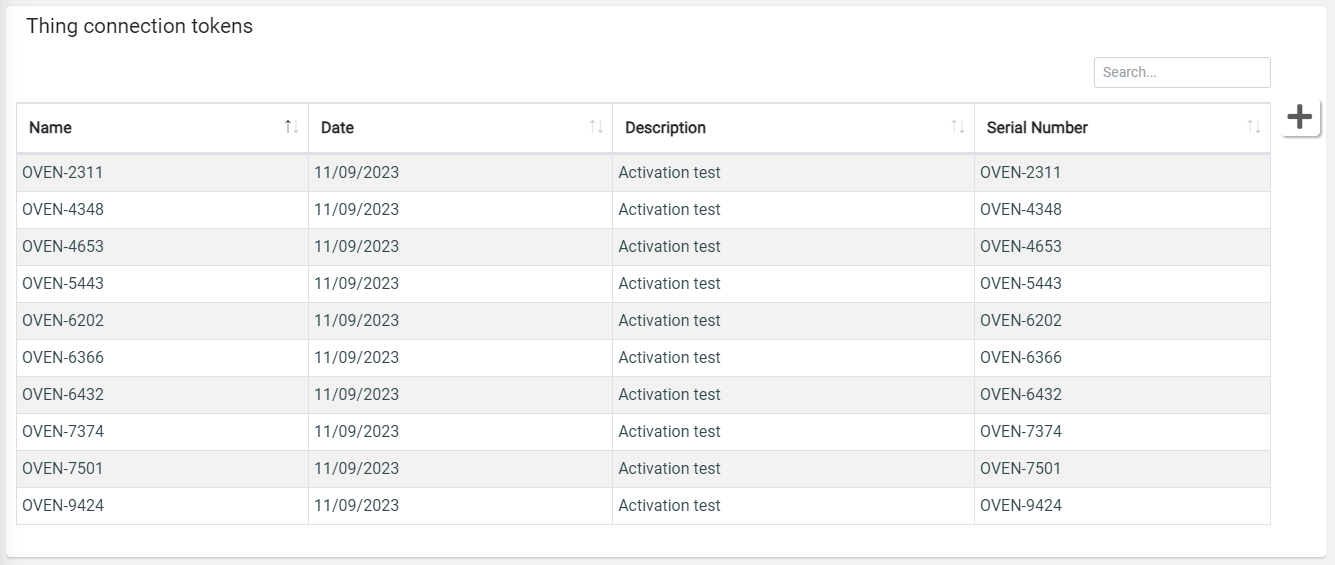
Manage connection tokens used by thing activation.
You can edit an existing connection token (only if not assigned to a thing) by clicking on a row in the connection token list. In case you want to register new connection tokens, you can click the plus button on the right.
You can register a single connection token, or multiple through a CSV file.
A Connection Token is described by the following information:
Token: the unique token identifier (e.g. serial number, any other unique code).
Username: the unique username used to open the cloud communication channel, generally the MAC address, the product Serial Number, the SIM ICCID, any other unique code.
Password: the password used to open the cloud communication channel (at last 8 characters, one upper, one lower char, and a digit).
Asset Id: the identifier of the asset used to map the product within the cloud.
Optional information:
Path: the optional path used to map multiple products under the same gateway.
Serial Number: if specified, during the product activation, the system verifies that the provided connection token is associated with the provided serial number.
This is an example of CSV which can be used for bulk registration.
token,username,password,assetId,serialNumber
                            AA-BB-CC,BO-123,Pgnjtjghj4,BO-123,BO-123
The connection-token information may depend on the selected IoT Connector.
This widget can be visible and used only by users having the following permissions:
READ_THING_CONNECTION_TOKENS
WRITE_THING_CONNECTION_TOKENS
Template Syntax
Below you can find some examples of how to use the component within a template.
            <div class="d-flex flex-wrap components-row">
            <connection-tokens-widget class="flex-fill" [title]="'Connection Tokens'"></connection-tokens-widget>
            </div>
Component Reference
Here is a comprehensive list of all the elements and properties that can be used to configure the component.
Connection Tokens <connection-tokens-widget>
Title | The title displayed on the top part of the widget box. Name: title Type: STRING | Optional
|
Rendering | |
Availability | Configure availability based on active features on Digital Plan on Add-ons Name: hasFeature Type: FEATURE (multiple) | Optional
|
CSS Class | The name(s) of the CSS class used to customize the widget layout. Name: class Type: STRING | Optional
|
Visibility Condition | The expression that allows you to reduce the visibility of the element. Name: *ngIf Type: STRING | Optional
|
Full Syntax Example
<connection-tokens-widget
    [title]="'Connection Tokens'"
    class="my-custom-class"
    *ngIf="getUser().organizationId != null"
    hasFeature="['feature_a', 'feature_b']">
</connection-tokens-widget>
