Displays multiple widgets into a single frame.
With this widget you can include inside the same frame multiple components (widgets, controls), arranging them in multiple rows.
The included components will be displayed without a frame and will be displayed according to how the rows inside the composite widget have been defined.
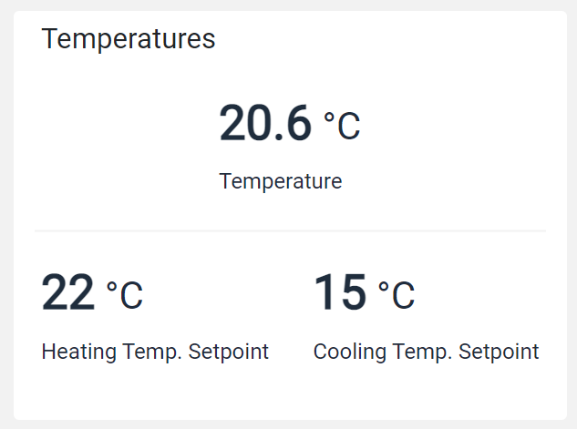
For example, below you can see a single box containing three gauges on two rows.
The Template Editor allows you to add the Composite widget and edit its content in the same way you are editing the main template.
Template Syntax
Below you can find some examples of how to use the component within a template.
            <composite-widget>

            <div class="d-flex justify-content-around">

            <gauge-widget [iconName]="'fa-clock-o'" backgroundColorClass="bg-white" [hideLastUpdate]="true" measureUnitPosition="METRIC_VALUE_RIGHT">
            <metric name="Temperature" filter="singleDecimalFormat"></metric>
            </gauge-widget>

            </div>

            <div class="d-flex justify-content-around">

            <gauge-widget [iconName]="'fa-clock-o'" backgroundColorClass="bg-white" [hideLastUpdate]="true" measureUnitPosition="METRIC_VALUE_RIGHT">
            <metric name="TempSetpoint"></metric>
            </gauge-widget>

            <gauge-widget [iconName]="'fa-clock-o'" backgroundColorClass="bg-white" [hideLastUpdate]="true" measureUnitPosition="METRIC_VALUE_RIGHT">
            <metric name="Power" filter="singleDecimalFormat"></metric>
            </gauge-widget>

            </div>

            </composite-widget>
Component Reference
Here is a comprehensive list of all the elements and properties that can be used to configure the component.
Composite <composite-widget>
Title | The title displayed on the top part of the widget box. Name: title Type: STRING | Optional
|
Expandable Details | |
Details Button Icon | The Angular Material icon displayed inside the details button. Name: expandableDetails.expandIcon Type: STRING | Optional
|
Mode | The way the details is opened. Name: expandableDetails.mode Type: ENUM | Optional Values: EMBEDDED, POPUP Default Value: POPUP
|
Popup Title | The title displayed on the top part of the popup. Name: expandableDetails.popupTitle Type: STRING | Optional
|
Template | The name of the template to display. Name: expandableDetails.template Type: STRING | Optional
|
Rendering | |
Availability | Configure availability based on active features on Digital Plan on Add-ons Name: hasFeature Type: FEATURE (multiple) | Optional
|
CSS Class | The name(s) of the CSS class used to customize the widget layout. Name: class Type: STRING | Optional
|
Visibility Condition | The expression that allows you to reduce the visibility of the element. Name: *ngIf Type: STRING | Optional
|
Sub Elements | |
Make the widget clickable by defining an address to browse. | |
Link <link-element>
Description | The description displayed as link tooltip. Name: description Type: STRING | Optional
|
Icon | The link:https://fonts.google.com/icons?selected=Material+Icons[Google Fonts] icon (e.g. home) or link:https://fontawesome.com/v5[Font Awesome] icon (e.g. fas fa-home) to be displayed before the link label. Name: icon Type: STRING | Optional
|
URL | The URL to browse, '/..' for application relative URL, 'https://....' for external URLs, else it is considered relative to the current page. Name: url Type: STRING | Required
|
Rendering | |
Visibility Condition | The expression that allows you to reduce the visibility of the link. Name: *ngIf Type: STRING | Optional
|
Full Syntax Example
<composite-widget
    [title]="'Composite'"
    [expandableDetails]="{
        mode: 'EMBEDDED',
        expandIcon: 'abc',
        template: 'abc',
        popupTitle: 'abc'
    }"
    class="my-custom-class"
    *ngIf="getUser().organizationId != null"
    hasFeature="['feature_a', 'feature_b']">
    <link-element
            description="Show more details..."
            url="abc"
            icon="star"
            *ngIf="getUser().organizationId != null"></link-element>
</composite-widget>