This widget allows displaying some buttons triggering commands on the remote Thing.
When a button is pressed, the server will run the command to the remote Thing by sending all the parameters configured within the Command Definition.
If the feedback has been enabled the button will be highlighted in green or in red for a while depending on whether the command execution succeeds or fails.
Template Syntax
Below you can find some examples of how to use the component within a template.
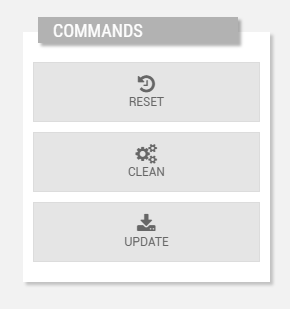
            <commands-widget title="Commands" class="vertical-buttons">
            <command name="Reset"></command>
            <command name="Clean"></command>
            <command name="Update"></command>
            </commands-widget>
Component Reference
Here is a comprehensive list of all the elements and properties that can be used to configure the component.
Commands <commands-widget>
Feedback Enabled | The flag indicating whether to enable the execution feedback. Name: enableFeedback Type: BOOLEAN | Optional Default Value: false
|
Feedback Timeout | The number of seconds after that the widget shows an error in case no feedback has been received. Name: timeout Type: INTEGER | Optional
|
Title | The title displayed on the top part of the widget box. Name: title Type: STRING | Optional
|
Rendering | |
Availability | Configure availability based on active features on Digital Plan on Add-ons Name: hasFeature Type: FEATURE (multiple) | Optional
|
CSS Class | The name(s) of the CSS class used to customize the widget layout. Name: class Type: STRING | Optional
|
Visibility Condition | The expression that allows you to reduce the visibility of the element. Name: *ngIf Type: STRING | Optional
|
Sub Elements | |
The sub-element referencing a thing command. | |
Command <command>
Confirm Execution | The flag prompting the user to confirm the command execution. Name: confirmExecution Type: BOOLEAN | Optional
|
Name | The thing-definition command to invoke. Name: name Type: COMMAND | Optional
|
Off Color | The colore of the button when the status is OFF. Name: offStatus.color Type: STRING | Optional
|
Off Icon | The icon displayed within the button when the status is OFF (eg. fa-power-on). Name: offStatus.icon Type: STRING | Optional
|
Off Label | The label displayed within the button when the status is OFF (eg. TURN ON). Name: offStatus.label Type: STRING | Optional
|
On Color | The colore of the button when the status is ON. Name: onStatus.color Type: STRING | Optional
|
On Icon | The icon displayed within the button when the status is ON (eg. fa-power-off). Name: onStatus.icon Type: STRING | Optional
|
On Label | The label displayed within the button when the status is ON (eg. TURN OFF). Name: onStatus.label Type: STRING | Optional
|
Running Color | The colore of the button when the status is RUNNING. Name: runningStatus.color Type: STRING | Optional
|
Running Icon | The icon displayed within the button when the status is RUNNING (eg. fa-running). Name: runningStatus.icon Type: STRING | Optional
|
Running Label | The label displayed within the button when the status is RUNNING (eg. HEATING). Name: runningStatus.label Type: STRING | Optional
|
Full Syntax Example
<commands-widget
    [title]="'Commands'"
    [enableFeedback]="true"
    timeout="120"
    class="my-custom-class"
    *ngIf="getUser().organizationId != null"
    hasFeature="['feature_a', 'feature_b']">
    <command
            name="commandName"
            [onStatus]="{
                icon: 'power-off',
                label: 'TURN OFF',
                color: '#DC3545'
            }"
            [offStatus]="{
                label: 'TURN ON',
                icon: 'fa-start',
                color: '#28A745'
            }"
            [runningStatus]="{
                label: 'HEATING',
                color: '#007bff',
                icon: 'fa-running'
            }"
            [confirmExecution]="true"></command>
</commands-widget>