Displays a calendar with alerts, actions, and other relevant events by day.
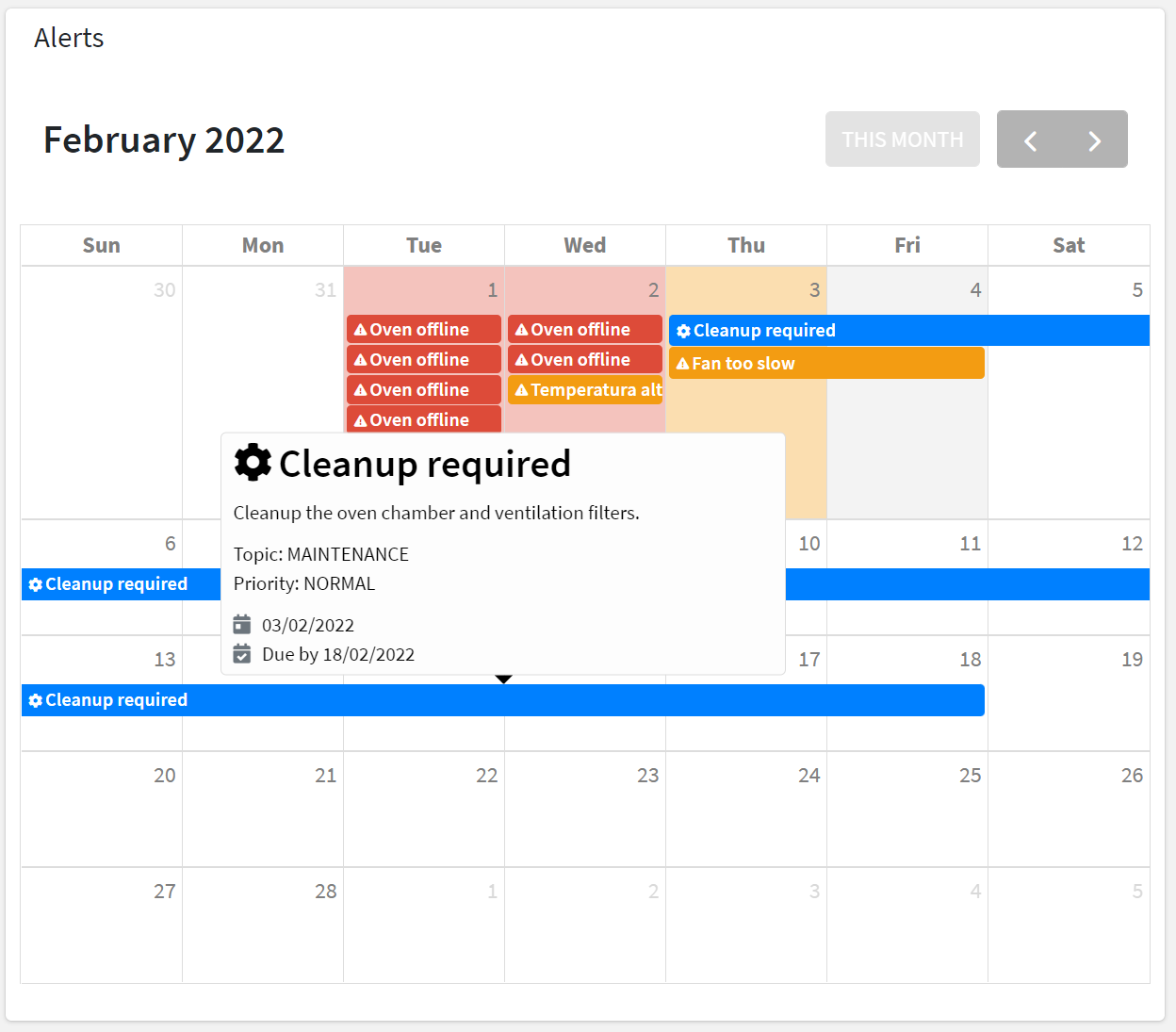
For each loaded element (e.g. Alerts, Actions), an event is added to the calendar according to the severity or priority, activation date, and end or due date.
When moving on the events with the cursor a tooltip will display additional information (e.g. description).
For an alert-based event, the information tooltip displays:
the title and description.
the severity (e.g. CRITICAL) and the category (e.g. ANOMALY).
the status (ACTIVE or CLEARED).
the time the alert was triggered and the duration.
For an action-based event, the information tooltip displays:
the title and description.
the priority (e.g. HIGH) and the topic (e.g. MAINTENANCE).
the action status (TODO, DONE, REJECTED).
the time the action was registered.
the due date by which the action must be completed.
the user who has completed or rejected the action.
Template Syntax
Below you can find some examples of how to use the component within a template.
Example 1
Calendar displaying alerts and actions.
<calendar-widget [title]="'Alerts and Actions'"></calendar-widget>
Example 2
Calendar displaying actions only.
        <calendar-widget [title]="'Actions'"
        [config]="{showAlerts:false}">

        </calendar-widget>
Component Reference
Here is a comprehensive list of all the elements and properties that can be used to configure the component.
Calendar <calendar-widget>
Show Actions | The flag indicating whether Actions must be displayed into the calendar. Name: config.showActions Type: BOOLEAN | Optional Default Value: true
|
Show Alerts | The flag indicating whether Alerts must be displayed into the calendar. Name: config.showAlerts Type: BOOLEAN | Optional Default Value: true
|
Show Work Sessions | The flag indicating whether Work Sessions must be displayed into the calendar. Name: config.showWorkSessions Type: BOOLEAN | Optional Default Value: false
|
Title | The title displayed on the top part of the widget box. Name: title Type: STRING | Optional
|
Rendering | |
Availability | Configure availability based on active features on Digital Plan on Add-ons Name: hasFeature Type: FEATURE (multiple) | Optional
|
CSS Class | The name(s) of the CSS class used to customize the widget layout. Name: class Type: STRING | Optional
|
Visibility Condition | The expression that allows you to reduce the visibility of the element. Name: *ngIf Type: STRING | Optional
|
Work Sessions | |
Description Property | The Work Session property to be used as the event description in the calendar. Name: config.wsDescriptionProperty Type: PROPERTY | Optional
|
Failure Statuses | The comma-separated list of states to be considered as FAILURE for the calendar event. Name: config.failureStatuses Type: STRING | Optional
|
Status Property | The Work Session property to be used as the event status in the calendar. Name: config.wsStatusProperty Type: PROPERTY | Optional
|
Title Property | The Work Session property to be used as the event title in the calendar.. Name: config.wsTitleProperty Type: PROPERTY | Optional Default Value: title
|
Full Syntax Example
<calendar-widget
    [title]="'Calendar'"
    [config]="{
        wsStatusProperty: 'propName',
        showActions: false,
        showWorkSessions: true,
        wsTitleProperty: 'propName',
        wsDescriptionProperty: 'propName',
        failureStatuses: 'abc',
        showAlerts: false
    }"
    class="my-custom-class"
    *ngIf="getUser().organizationId != null"
    hasFeature="['feature_a', 'feature_b']"></calendar-widget>