Displays metric or statistic data through columns in a bar chart.
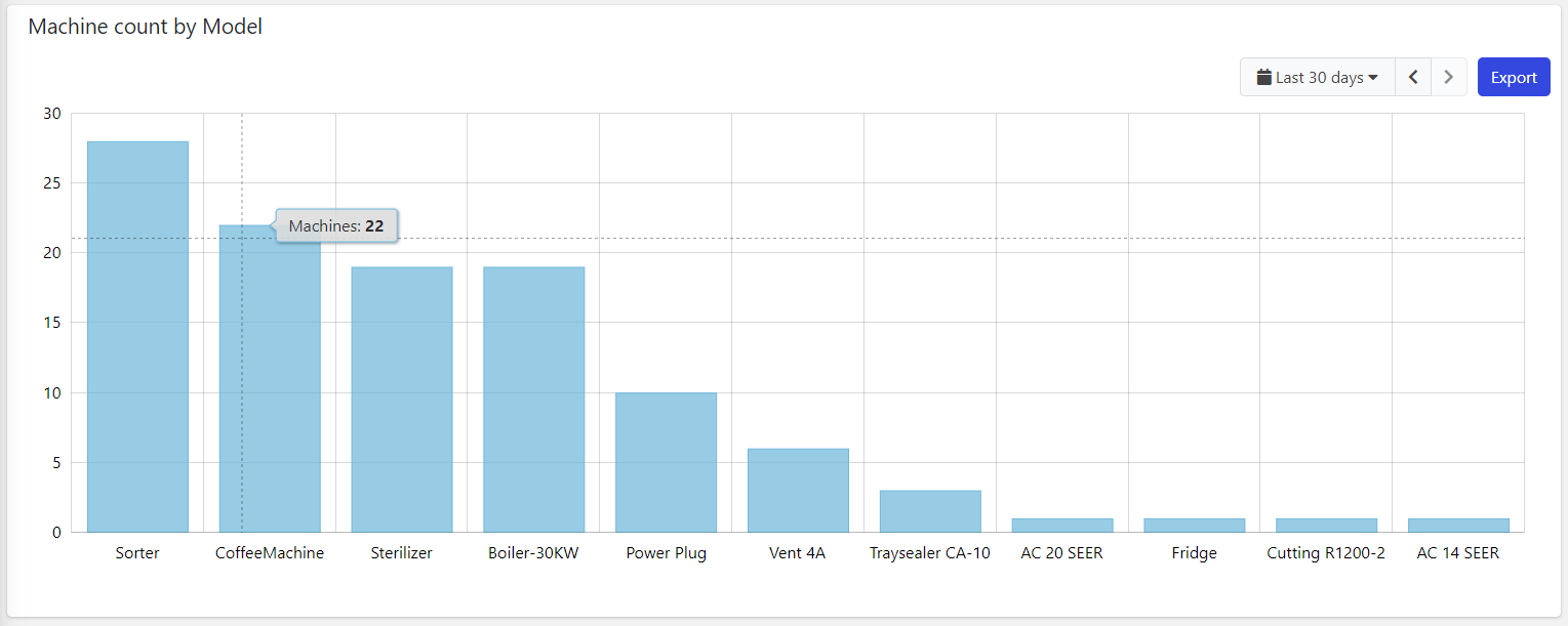
This chart uses a category-based X-axis, so you must use this widget to load aggregated data, for instance, the count of machines grouped by model name.
Pareto Line
When displaying event statistics, for instance, the count or sum of elapsed time from each event, it is possible to display the Pareto Line on the bars sorted by decreasing value.
For example, the image below displays the total time spent by the machine for each fault event type.
The Pareto Line enables the DPS user (e.g., technician, operations manager) to focus on the events that generate the most downtime.
.png?sv=2026-02-06&spr=https&st=2026-07-17T15%3A27%3A45Z&se=2026-07-17T15%3A44%3A45Z&sr=c&sp=r&sig=jT6YiY4pGlZVkWXnkfT6Q9dfXslsZNLJ6hMARqvzq4s%3D)
In this case, the first two event types allocate 79% of the total failure time.
So it will be sufficient to try to solve these two problems to increase the machine's uptime, even noticeably (80-20 rule).
The other events, those after 79%, are currently less important.
To configure the Pareto Line, you must:
In the Statistics, select the option Sorting as descending.
On the Bar Chart, enable the option, Show Pareto Line.
Multiple Things Charting
The Bar Chart can also be placed within the Location or Custom details, and display the data aggregated on the underlying objects.
For instance, in a customer details page, you can display the count of failures over a period aggregated by product.
.png?sv=2026-02-06&spr=https&st=2026-07-17T15%3A27%3A45Z&se=2026-07-17T15%3A44%3A45Z&sr=c&sp=r&sig=jT6YiY4pGlZVkWXnkfT6Q9dfXslsZNLJ6hMARqvzq4s%3D)
Optionally, you can change the set of things the chart is working on by coupling it with a Search Field available on the same page.
Template Syntax
Below you can find some examples of how to use the component within a template.
        <bar-chart-widget-v2 title="Alert Count">
        <statistic resource="alert" aggregation="COUNT" groupBy="MONTH"></statistic>
        </bar-chart-widget-v2>
Component Reference
Here is a comprehensive list of all the elements and properties that can be used to configure the component.
Bar Chart <bar-chart-widget-v2>
Show Pareto Line | Compute the cumulative total and display it through a line overlaid on the columns. Name: config.showParetoLine Type: BOOLEAN | Optional Default Value: false
|
Title | The title displayed on the top part of the widget box. Name: title Type: STRING | Optional
|
Controls | |
Enabled Periods | The list of periods which can be selected from the embedded period filter. Name: config.enabledPeriods Type: PERIODS (multiple) | Optional
|
Export Enabled | The boolean flag indicating whether the data export is enabled. Name: config.exportEnabled Type: BOOLEAN | Optional Default Value: true
|
Period Filter Enabled | The boolean flag indicating whether the embedded period filter is available. Name: config.filterEnabled Type: BOOLEAN | Optional Default Value: true
|
Labels | |
Category Name Max Length | The maximum length used to truncate category names. Name: config.categoryNameMaxLength Type: INTEGER | Optional Default Value: 25
|
Empty Message | The blank message to be displayed in the widget in case no item was found. To manage translations, you can define a label and use the key as the value of the property. Name: config.emptyMessage Type: STRING | Optional
|
Show Category Labels | Show category under each single bar. Name: config.showBarCategories Type: BOOLEAN | Optional Default Value: true
|
X-Axis Label | The label to be displayed under the X-axis. Name: config.xAxisLabel Type: STRING | Optional
|
Y-Axis Label | The label to be displayed on the left of the Y-axis. Name: config.yAxisLabel Type: STRING | Optional
|
Data | |
Default Loading Period | The default filtering period applied when entering the page. Name: config.defaultPeriod Type: PERIODS | Optional Default Value: LAST_7_DAYS
|
Period Variable | The id of the page's variable providing the date range filtering period, for instance the id of a <period-filter-field>. Name: inputs.period Type: STRING | Optional
|
Query Variable | The id of the page's <things-filter-field> used for searching. Name: inputs.query Type: STRING | Optional
|
Advanced | |
Mode | The mode used to display the chart. Name: config.mode Type: ENUM | Optional Values: WIDE, MICRO Default Value: WIDE
|
Show Bars Horizontally | The flag indicating whether to display the bars horizontally. Name: config.rotate Type: BOOLEAN | Optional Default Value: false
|
Rendering | |
Availability | Configure availability based on active features on Digital Plan on Add-ons Name: hasFeature Type: FEATURE (multiple) | Optional
|
Collapse / Expand | The flag indicating whether the widget is collaspible. Name: collapsible Type: BOOLEAN | Optional Default Value: false
|
CSS Class | The name(s) of the CSS class used to customize the widget layout. Name: class Type: STRING | Optional
|
Height | The height of the widget (e.g. 250px). Name: config.height Type: STRING | Optional
|
Visibility Condition | The expression that allows you to reduce the visibility of the element. Name: *ngIf Type: STRING | Optional
|
Width | The width of the widget (e.g. 500px). Name: config.width Type: STRING | Optional
|
Sub Elements | |
The statistic whose values must be rendered as chart columns. | |
The metric whose values must be aggregated and rendered as chart columns. | |
The aggregated value to be displayed over the Bar Chart. | |
Statistic <statistic>
Aggregation | The function used to aggregate data. Name: aggregation Type: ENUM | Optional Values: AVG, COUNT, MAX, MIN, SUM, LAST
|
Averaged By | The count used to average the statistic results (e.g. Average alert count by thing). Name: averagedBy Type: ENUM | Optional Values: thingCount
|
| The order used to display categories by value in the chart. Name: config.categoryOrder Type: ENUM | Optional Values: ASC, DESC
|
Color | The color used to render columns. Name: config.color Type: STRING | Optional
|
Group By | The property used to group results. For instance: customer.country. In the case where the underlying objects are temporally distributed you can also aggregate by HOUR, DAY, MONTH and YEAR. Name: groupBy Type: GROUP_BY | Optional
|
Label | The alternative label displayed by the widget. Name: label Type: STRING | Optional
|
Property | The object property whose values must be aggregated. Name: property Type: PROPERTY | Optional
|
Resource | The resource from which to retrieve the items to be used to calculate the statistic. Name: resource Type: ENUM | Required Values: ACTION, ALERT, EVENT, CUSTOMER, LOCATION, PARTNER, THING, USER, WORK_SESSION Default Value:
|
Sorting | The sort direction used to order categories by value (default none). Name: sortDirection Type: ENUM | Optional Values: ASC, DESC
|
Status | Define whether to include events/alerts that are still active, or have been activated in a period. Name: activationType Type: ENUM | Optional Values: ACTIVE, ACTIVATED
|
Unit | The unit of measurement to be displayed along the value. Name: config.unit Type: STRING | Optional
|
Value Filter | The name of the filter used to transform and display values. Name: filter Type: FILTER | Optional
|
Data | |
Max Result Count | The number of maximum returned results (default all results are returned). Name: limit Type: INTEGER | Optional
|
Query | The array of conditions filtering out items. For instance: [query]='[{'property': 'connectionStatus', 'predicate': 'eq', 'value': '1'}]' Predicates: eq, beginsWith, like, notLike, isEmpty, isNotEmpty, gt, gte, lt, lte. Name: query Type: QUERY | Optional Predicates: beginsWith, eq, neq, gt, gte, isEmpty, isNotEmpty, lt, lte, like, notLike
|
Metric <metric>
Aggregation | The aggregation applied on the metric values. Name: config.aggregation Type: ENUM | Optional Values: AVG, DELTA, MAX, MIN, SUM Default Value: AVG
|
Category Order | The order used to display categories by value in the chart. Name: config.categoryOrder Type: ENUM | Optional Values: ASC, DESC
|
Color | The color used to render columns. Name: config.color Type: STRING | Optional
|
Group By | The group by applied on the metric values. Name: config.groupBy Type: ENUM | Optional Values: DAY_OF_MONTH, HOUR_OF_DAY
|
Label | The alternative label displayed by the widget. Name: label Type: STRING | Optional
|
Name | The metric whose value(s) must be loaded by the widget. Name: name Type: METRIC | Required
|
Unit | The unit of measurement to be displayed along the value. Name: unit Type: STRING | Optional
|
Value Filter | The name of the filter used to transform and display values. Name: filter Type: FILTER | Optional
|
Aggregated Value <property>
Aggregation | The aggregation type. Name: config.aggregation Type: ENUM | Optional Values: AVG, MAX, MIN, SUM Default Value: SUM
|
Filter | The name of the filter used to transform and display values. Name: filter Type: FILTER | Optional
|
Label | The label displayed for the aggregated value. Name: label Type: STRING | Optional
|
Unit | The unit of measurement to be displayed along the value. Name: config.unit Type: STRING | Optional
|
Full Syntax Example
<bar-chart-widget-v2
[title]="'Bar Chart'"
[config]="{
mode: 'WIDE',
defaultPeriod: 'LAST_30_DAYS',
yAxisLabel: 'Count',
filterEnabled: false,
showBarCategories: false,
width: '500px',
showParetoLine: true,
enabledPeriods: ['TODAY', 'YESTERDAY'],
categoryNameMaxLength: 123,
height: '250px',
emptyMessage: 'No customer found',
xAxisLabel: 'Alerts by type',
rotate: true,
exportEnabled: false
}"
[inputs]="{
period: 'period',
query: 'query-1'
}"
class="my-custom-class"
*ngIf="getUser().organizationId != null"
[collapsible]="true"
hasFeature="['feature_a', 'feature_b']">
<statistic
label="Temperature"
resource="ACTION"
activationType="ACTIVE"
aggregation="AVG"
groupBy="customer.name"
property="propName"
sortDirection="ASC"
averagedBy="thingCount"
filter="fooBarFilter"
[config]="{
unit: '°C',
categoryOrder: 'ASC',
color: '#007BFF'
}"
query="[{property:'prop1', predicate: 'eq', value: 'foo'}, {property:'prop2', predicate: 'in', value: ['bar', 'baz']}]"
limit="123"></statistic>
<metric
name="Temperature"
label="Temperature"
[config]="{
groupBy: 'DAY_OF_MONTH',
aggregation: 'AVG',
color: '#007BFF',
categoryOrder: 'ASC'
}"
filter="fooBarFilter"
unit="°C"></metric>
<property
label="Temperature"
[config]="{
aggregation: 'AVG',
unit: '°C'
}"
filter="fooBarFilter"></property>
</bar-chart-widget-v2>