This list widget displays the actions (upcoming and historical) visible by the user and navigation context.
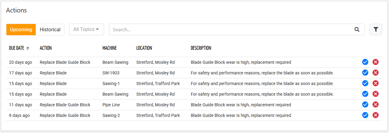
The DPS user can switch between Upcoming and Historical actions.
Upcoming: The list of actions that must be performed by someone.
Historical: The list of actions that someone has marked as done or discarded.
The widget automatically displays the actions considering the navigation context and the User Type of the DPS user.
When an action is marked as DONE, it is immediately moved to the historical ones.
The add button can be used to manually create an action by selecting from the list of action definitions, or alternatively, an uncoded action can be created.
By clicking the 3-dots icon, it is possible to export all the actions in the list.
Action Details
Clicking on a row opens a dialog box that provides access to further details about the action.
The action details is structured in the following sections:
Header: It includes the action name, description, and a breadcrumb that provides the context of the action.
The breadcrumb tokens can be clicked to quickly jump to related objects (e.g., Customer, Location, Thing).Details: The due date by which the action must be completed, and the number of days the action is active for.
Reason: The condition that activates the action.
For instance, for a wear action, the wear status is displayed.Execution History: The list of actions of the same type already executed on the same machine.
Spare Parts: The list of spare parts (if any) involved in the action will also include the direct purchase button.
Technical Description: The rich text provided advanced information on the action (if defined).
Notes and Attachments: The picture taken by the user who executes the action, a text note, and the discard reason or the issue encountered by the technician during execution.
.png?sv=2026-02-06&spr=https&st=2026-07-17T13%3A34%3A16Z&se=2026-07-17T13%3A51%3A16Z&sr=c&sp=r&sig=coe6krG3kpT8qmOL03qvDEd8vqrM8mCYcM9T2PY%2B%2FhE%3D)
Directly from the details dialog, upcoming actions can be marked as:
Done: the action has been performed without problems.
Done with Issue: the action has been performed on the problem.
In this case, it is mandatory to provide a note or select an Issue Type, if configured.Discarded: the action has not been performed.
In this case, it is possible to provide a note or select a Discard Reason, if configured.
The requirement for the discard reason depends on the Action Definition.
In all cases, a confirmation dialog appears, and in case of spare-parts must be replaced, a double check to proceed is requested.
.png?sv=2026-02-06&spr=https&st=2026-07-17T13%3A34%3A16Z&se=2026-07-17T13%3A51%3A16Z&sr=c&sp=r&sig=coe6krG3kpT8qmOL03qvDEd8vqrM8mCYcM9T2PY%2B%2FhE%3D "image(550).png")
Add Actions Manually
In some cases, actions cannot be automatically activated, but it is up to a DPS user to create them.
By pressing the Add Action button, the DPS user can create an action by choosing it from a list of Action Definitions with User Reported configured.
.png?sv=2026-02-06&spr=https&st=2026-07-17T13%3A34%3A16Z&se=2026-07-17T13%3A51%3A16Z&sr=c&sp=r&sig=coe6krG3kpT8qmOL03qvDEd8vqrM8mCYcM9T2PY%2B%2FhE%3D)
In case the action the user wishes to register is not present, it is possible to create an uncodified action, with which no Action Definition is associated.
In this case, the user will be asked to provide the name and description of the action to be registered..png?sv=2026-02-06&spr=https&st=2026-07-17T13%3A34%3A16Z&se=2026-07-17T13%3A51%3A16Z&sr=c&sp=r&sig=coe6krG3kpT8qmOL03qvDEd8vqrM8mCYcM9T2PY%2B%2FhE%3D)
The action can be recorded in TODO status if the addition is made from the UPCOMING list; the action is immediately historicized.
Work Orders Section
In case the user is a Service user (organization or partner) with the READ_WORK_ORDER and WRITE_WORK_ORDER permissions, when in the context of a thing, the widget displays a box where it is possible to manage the work order for the current thing.

Clicking on Work Order, the widget switches to the selected work order details.
For more details, you can refer to the Work Order Management article.
Template Syntax
Below you can find some examples of how to use the component within a template.
<action-list-widget-v2 [title]="'Actions'" [status]="['TODO']" class="flex-fill">
        <property name="dueTimestamp" label="Due Date" filter="millisToDateOrShortPeriod"></property>
        <property name="actionDefinition.name" label="Action"></property>
        <property name="thing.name" label="Machine"></property>
        <property name="location.name" label="Location"></property>
        <property name="actionDefinition.description" label="Description"></property>
        </action-list-widget-v2>
Component Reference
Here is a comprehensive list of all the elements and properties that can be used to configure the component.
Action List <action-list-widget-v2>
Title | The title displayed on the top part of the widget box. Name: title Type: STRING | Optional
|
Data | |
Query | The array of conditions filtering out items. For instance: [query]='[{'property': 'connectionStatus', 'predicate': 'eq', 'value': '1'}]' Predicates: eq, beginsWith, like, notLike, isEmpty, isNotEmpty, gt, gte, lt, lte. Name: query Type: QUERY | Optional Predicates: beginsWith, eq, neq, gt, gte, isEmpty, isNotEmpty, lt, lte, like, notLike
|
Query Variable | The id of the page's <things-filter-field> used for searching. Name: queryFieldRef Type: STRING | Optional
|
Advanced | |
Action Status | Name: status Type: ENUM | Optional Values: ALL, UPCOMING, HISTORICAL Default Value: ALL
|
Controls Enabled | The boolean flag indicating whether controls (e.g. Search, Export) are enabled on the widget. Name: controlsEnabled Type: BOOLEAN | Optional Default Value: true
|
Empty Message | The blank message to be displayed in the widget in case no item was found. To manage translations, you can define a label and use the key as the value of the property. Name: emptyMessage Type: STRING | Optional
|
Rendering | |
Availability | Configure availability based on active features on Digital Plan on Add-ons Name: hasFeature Type: FEATURE (multiple) | Optional
|
CSS Class | The name(s) of the CSS class used to customize the widget layout. Name: class Type: STRING | Optional
|
Visibility Condition | The expression that allows you to reduce the visibility of the element. Name: *ngIf Type: STRING | Optional
|
Sub Elements | |
The property whose label and current value must be rendered as a widget row. | |
This field provides the generic search input, which can be customized by defining the search inputs. | |
Property <property>
Description | The property description. Name: description Type: STRING | Optional
|
Filter | The name of the filter used to transform and display values. Name: filter Type: FILTER | Optional
|
Label | The property alternative label. Name: label Type: STRING | Optional
|
Name | The property whose value must be loaded by the widget. Name: name Type: PROPERTY | Required
|
Advanced | |
Column CSS Class | The name(s) of the column CSS class used to customize the table column. Name: columnClass Type: COLUMN_CSS | Optional
|
Show Header | The flag indicated whether the header is visible. Name: showHeader Type: BOOLEAN | Optional Default Value: true
|
Visibility Condition | The expression that allows you to reduce the visibility of the element. Name: *ngIf Type: STRING | Optional
|
Search Field <search-field>
Label | The field label. Name: label Type: STRING | Optional
|
Sub Elements | |
The sub-element used to customize the search UI. | |
The sub-element allowing to select specific things one-to-one. | |
Search Input <search-input>
Input Type | The type of input to be displayed as part of the search field. Name: type Type: ENUM | Required Values: ADVANCED, KEY, PROPERTY, CLEAR
|
Name | The property for which to show the search field inline. It can only be used for input of type PROPERTY. Name: property Type: PROPERTY | Required
|
Selection Input <selection-input>
Sub Elements | |
The property to be displayed as table column in the selection dialog. | |
Property <property>
Description | The property description. Name: description Type: STRING | Optional
|
Filter | The name of the filter used to transform and display values. Name: filter Type: FILTER | Optional
|
Label | The property alternative label. Name: label Type: STRING | Optional
|
Name | The property whose value must be loaded by the widget. Name: name Type: PROPERTY | Required
|
Advanced | |
Column CSS Class | The name(s) of the column CSS class used to customize the table column. Name: columnClass Type: COLUMN_CSS | Optional
|
Show Header | The flag indicated whether the header is visible. Name: showHeader Type: BOOLEAN | Optional Default Value: true
|
Visibility Condition | The expression that allows you to reduce the visibility of the element. Name: *ngIf Type: STRING | Optional
|
Full Syntax Example
<action-list-widget-v2
    [title]="'Actions'"
    queryFieldRef="query-1"
    query="[{property:'prop1', predicate: 'eq', value: 'foo'}, {property:'prop2', predicate: 'in', value: ['bar', 'baz']}]"
    [controlsEnabled]="false"
    emptyMessage="No customer found"
    status="ALL"
    class="my-custom-class"
    *ngIf="getUser().organizationId != null"
    hasFeature="['feature_a', 'feature_b']">
    <property
            name="serialNumber"
            label="Temperature"
            description="abc"
            filter="dateFormat"
            *ngIf="getUser().organizationId != null"
            [showHeader]="false"
            columnClass="my-column-custom-class"></property>
    <search-field
            label="abc">
            <search-input
                        type="ADVANCED"
                        property="propName"></search-input>
            <selection-input>
                        <property
                                        name="propName"
                                        label="abc"
                                        description="abc"
                                        filter="dateFormat"
                                        *ngIf="abc"
                                        [showHeader]="false"
                                        columnClass="my-column-custom-class"></property>
            </selection-input>
    </search-field>
</action-list-widget-v2>
Migrating from the old widget
In case you are still using the old action widget (without history), you can easily migrate to the new one by changing the tag name in the template.
action-list-widget → action-list-widget-v2