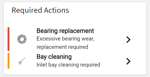
Displays the list of actions grouped by action type, and visible by the user and navigation context.
Template Syntax
Below you can find some examples of how to use the component within a template.
            <action-group-list-widget [title]="'Actions'">

            </action-group-list-widget>
Component Reference
Here is a comprehensive list of all the elements and properties that can be used to configure the component.
Action Group List <action-group-list-widget>
Status | The statuses of the actions to load. Name: status Type: ENUM (multiple) | Optional Values: TODO, DISCARDED, DONE
|
Title | The title displayed on the top part of the widget box. Name: title Type: STRING | Optional
|
Topic | The topics of the actions to load. Name: topic Type: STRING | Optional
|
Type | The types of the actions to load. Name: type Type: STRING (multiple) | Optional
|
Rendering | |
CSS Class | The name(s) of the CSS class used to customize the widget layout. Name: class Type: STRING | Optional
|
Visibility Condition | The expression that allows you to reduce the visibility of the element. Name: *ngIf Type: STRING | Optional
|
Full Syntax Example
<action-group-list-widget
    [title]="'Action Groups'"
    status="['TODO', 'DISCARDED']"
    topic="abc"
    type="['AAA', 'BBB']"
    class="my-custom-class"
    *ngIf="getUser().organizationId != null">
</action-group-list-widget>