View the list of historical work sessions, taking into account the things in the navigation context
The list supports pagination, and items can be searched and sorted based on properties.
The list shows one column for each property or composite part defined in the template.
Each value can be displayed through filters (e.g., Date Times for the Duration column).
Below the list, you can interact with the pagination control (default 20 items at a time).
This is automatically hidden if there are fewer items than the number of items to be loaded per page (configurable with the “Page Size” option).
Entering the page, the list is sorted by the first column ascending, but optionally, you can refine it through the “Initial Sorting“ widget property.
Details Navigation
Clicking on a row opens the work-session details pop-up. Optionally, the work-session details can be opened in a full page (see Details Mode option).
The header of the work-session details popup contains the work-session name, description, and a breadcrumb that provides the context of the work-session, and whose tokens can be clicked to quickly jump to related objects (e.g., Customer, Location, Thing).
The work-session details body is generated through a template specified within the work-session definition page. If not specified, clicking on the row produces no effect.
On the work-session list rows, you can also click directly on specific information to jump to the work-session-related objects:
Customer Name / Code → Customer details page
Location name → Location details page
Thing Name / Serial Number → Thing details page
In all other cases, the work-session details pop-up/page is opened.
When you open the details on a page, you can use the forward and backward buttons at the top right to quickly jump to the next or previous work session for the same thing.

Search for Historical Work Sessions
On the top right part of the widget, a search control bar allows filtering historical work sessions by a text key.
.png?sv=2022-11-02&spr=https&st=2025-09-24T10%3A04%3A37Z&se=2025-09-24T10%3A21%3A37Z&sr=c&sp=r&sig=bxvTswLtS7VAovEfykE7M%2B9ffdYharj36YNEsoDTUbQ%3D?sv=2026-02-06&spr=https&st=2026-07-14T05%3A49%3A32Z&se=2026-07-14T06%3A06%3A32Z&sr=c&sp=r&sig=gFhYnSHCkg4pw1fNAK9eLPXxGHupf8gt%2BlpkeC01Kxo%3D)
Optionally, by pressing the Advanced Search icon, a dedicated panel allows the DPS user to specify multiple conditions based on properties.
.png?sv=2026-02-06&spr=https&st=2026-07-14T05%3A49%3A32Z&se=2026-07-14T06%3A06%3A32Z&sr=c&sp=r&sig=gFhYnSHCkg4pw1fNAK9eLPXxGHupf8gt%2BlpkeC01Kxo%3D)
The provided inputs are preserved during navigation, also across pages in case the same widget “Id” is used.
Optionally, by using the “Query“ property, a set of conditions for pre-filtering work sessions can be defined in the template (e.g., failures only).
In the template, you can specify the “Search Fields“ used to filter work sessions by text key.
In case the “Query Variable“ property has been defined (the list is filtered from a Search Field placed on the page), the search control bar is automatically hidden and thus not visible to the user.
The advanced search allows filtering work sessions by:
Text Key: text that is searched in the name, title, and description of each work session.
Customer: a customer can be selected, in the case of a user belonging to an organization or partner.
Period: the time period used to filter work sessions by start timestamp.
Type: type of work session, choosing one or more definitions.
Topic: one of the topics associated with work sessions (e.g., Maintenance).
By clicking the Export button, all historical work sessions that meet the search criteria can be downloaded as a CSV file.
User Reported Work Sessions
DPS users can manually register work sessions by clicking the 3-dots icon and the “Add Work Session” action..png?sv=2026-02-06&spr=https&st=2026-07-14T05%3A49%3A32Z&se=2026-07-14T06%3A06%3A32Z&sr=c&sp=r&sig=gFhYnSHCkg4pw1fNAK9eLPXxGHupf8gt%2BlpkeC01Kxo%3D)
A pop-up requests the user to select the work session to create, provide some additional information, and a CSV file with the metric values to store.
.png?sv=2026-02-06&spr=https&st=2026-07-14T05%3A49%3A32Z&se=2026-07-14T06%3A06%3A32Z&sr=c&sp=r&sig=gFhYnSHCkg4pw1fNAK9eLPXxGHupf8gt%2BlpkeC01Kxo%3D)
This feature allows the DPS user to create a work session by providing data collected, for example, when the machine was offline.
Upon import confirmation, the work session is created as historical, the metric data is imported, the monitored metrics are updated, and any post-computations are performed.
To register a work session, the user must have the WRITE_WORK_SESSION permission.
Reports
In case work session reports have been configured, by selecting a work session, you can download the generated report directly from the widget.
If you select multiple work sessions, a ZIP archive will be downloaded.

Template Syntax
Below you can find some examples of how to use the component within a template.
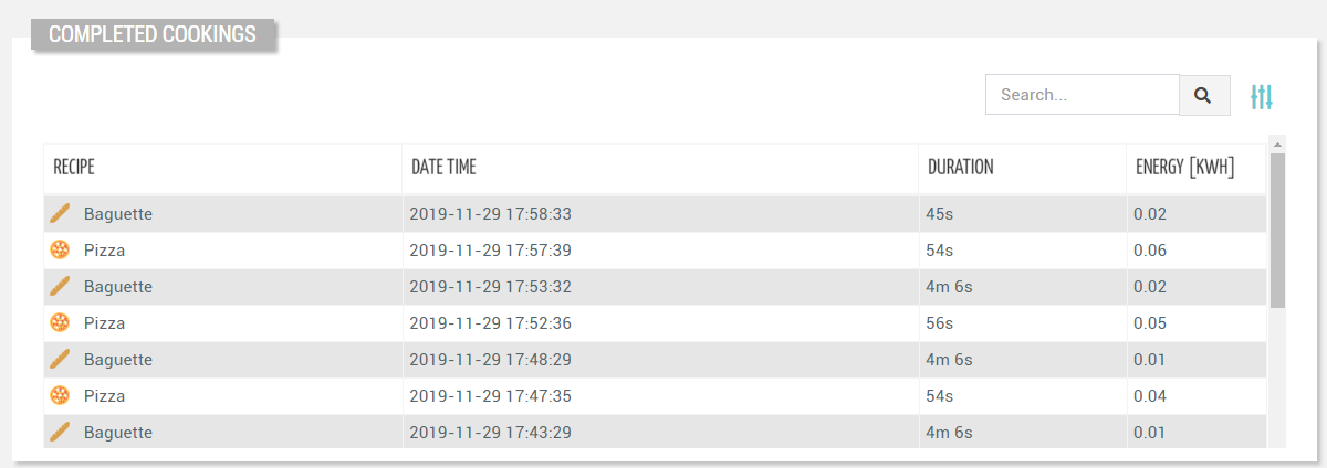
<historical-work-session-list-widget-v2 [title]="'Completed Cookings'">
    <property name="name"></property>
    <property name="date"></property>
    <property name="duration"></property>
    <property name="metrics.Recipe Energy.CURRENT" label="Energy [kWh]" filter="divBy1000_2dec"></property>
</historical-work-session-list-widget-v2>
Component Reference
Here is a comprehensive list of all the elements and properties that can be used to configure the component.
Historical Work Session List <historical-work-session-list-widget-v2>
Bulk Controls Enabled | The boolean flag indicating whether bulk selection and buttons (e.g. Tagging, Firmware Update) are enabled on the widget. Name: bulkControlsEnabled Type: BOOLEAN | Optional Default Value: false
|
| The expected behaviour when a row is clicked. Name: clickOnRowBehaviour Type: ENUM | Optional Values: OPEN_DETAILS, OPEN_CONTEXT_OBJECT
|
Details Mode | The way the details page is opened when the details icon is clicked. If non the details icon is not present. Name: detailsMode Type: ENUM | Optional Values: PAGE, POPUP, NONE Default Value: POPUP
|
Title | The title displayed on the top part of the widget box. Name: title Type: STRING | Optional
|
Data | |
Page Size | The number of items to load on each page. Name: pageSize Type: INTEGER | Optional Default Value: 50
|
Period Variable | The id of the page's variable providing the date range filtering period, for instance the id of a <period-filter-field>. Name: periodRef Type: STRING | Optional
|
Query | The array of conditions filtering out items. For instance: [query]='[{'property': 'connectionStatus', 'predicate': 'eq', 'value': '1'}]' Predicates: eq, beginsWith, like, notLike, isEmpty, isNotEmpty, gt, gte, lt, lte. Name: query Type: QUERY | Optional Predicates: beginsWith, eq, neq, gt, gte, isEmpty, isNotEmpty, lt, lte, like, notLike
|
Query Variable | The id of the page's <things-filter-field> used for searching. Name: queryFieldRef Type: STRING | Optional
|
Advanced | |
Empty Message | The blank message to be displayed in the widget in case no item was found. To manage translations, you can define a label and use the key as the value of the property. Name: emptyMessage Type: STRING | Optional
|
Id | The id of the widget. Name: id Type: STRING | Optional
|
Rendering | |
Availability | Configure availability based on active features on Digital Plan on Add-ons Name: hasFeature Type: FEATURE (multiple) | Optional
|
CSS Class | The name(s) of the CSS class used to customize the widget layout. Name: class Type: STRING | Optional
|
Visibility Condition | The expression that allows you to reduce the visibility of the element. Name: *ngIf Type: STRING | Optional
|
Sub Elements | |
The property whose value must be displayed within the work session detail row. | |
The composite part whose value must be displayed within the work session detail row. | |
Property <property>
Description | The property description. Name: description Type: STRING | Optional
|
Filter | The name of the filter used to transform and display values. Name: filter Type: FILTER | Optional
|
Label | The property alternative label. Name: label Type: STRING | Optional
|
Name | The property whose value must be loaded by the widget. Name: name Type: PROPERTY | Required
|
Advanced | |
Column CSS Class | The name(s) of the column CSS class used to customize the table column. Name: columnClass Type: COLUMN_CSS | Optional
|
Display Mode | The way the column is displayed. Name: displayMode Type: ENUM | Optional Values: VISIBLE, INITIALLY_HIDDEN, ALWAYS_HIDDEN Default Value: VISIBLE
|
Include in Export | The boolean flag indicating whether the property value should be included in the export even when not visible within the page. Name: includeInExport Type: BOOLEAN | Optional Default Value: false
|
Show Header | The flag indicated whether the header is visible. Name: showHeader Type: BOOLEAN | Optional Default Value: true
|
Visibility Condition | The expression that allows you to reduce the visibility of the element. Name: *ngIf Type: STRING | Optional
|
Composite Part <composite-part>
Description | The composite-part description. Name: description Type: STRING | Optional
|
Filter | The filter applied on the composite-part to transform or display its value. Name: filter Type: FILTER | Optional
|
Label | The label displayed by the widget. Name: label Type: STRING | Optional
|
Name | The composite-part name. Name: name Type: STRING | Optional
|
Advanced | |
Column CSS Class | The name(s) of the column CSS class used to customize the table column. Name: columnClass Type: COLUMN_CSS | Optional
|
Display Mode | The way the column is displayed. Name: displayMode Type: ENUM | Optional Values: VISIBLE, INITIALLY_HIDDEN, ALWAYS_HIDDEN Default Value: VISIBLE
|
Show Header | The flag indicated whether the header is visible. Name: showHeader Type: BOOLEAN | Optional Default Value: true
|
Visibility Condition | The expression that allows you to reduce the visibility of the element. Name: *ngIf Type: STRING | Optional
|
Sub Elements | |
The property whose value must be loaded within the composite-part. | |
Property <property>
Name | The property whose value must be loaded by the widget. Name: name Type: PROPERTY | Required
|
Full Syntax Example
<historical-work-session-list-widget-v2
    [title]="'Historical Work Sessions'"
    detailsMode="PAGE"
    clickOnRowBehaviour="OPEN_DETAILS"
    [bulkControlsEnabled]="true"
    periodRef="abc"
    query="[{property:'prop1', predicate: 'eq', value: 'foo'}, {property:'prop2', predicate: 'in', value: ['bar', 'baz']}]"
    queryFieldRef="abc"
    pageSize="123"
    id="abc"
    emptyMessage="abc"
    class="my-custom-class"
    *ngIf="getUser().organizationId != null"
    hasFeature="['feature_a', 'feature_b']">
    <property
            name="serialNumber"
            label="Temperature"
            description="abc"
            filter="fooBarFilter"
            *ngIf="getUser().organizationId != null"
            [showHeader]="false"
            columnClass="my-column-custom-class"
            displayMode="VISIBLE"
            [includeInExport]="true"></property>
    <composite-part
            name="abc"
            label="abc"
            description="abc"
            filter="fooBarFilter"
            *ngIf="getUser().organizationId != null"
            [showHeader]="false"
            columnClass="my-column-custom-class"
            displayMode="VISIBLE">
            <property
                        name="serialNumber"></property>
    </composite-part>
</historical-work-session-list-widget-v2>