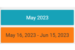
Displays the reference period of the page data in a box.
Template Syntax
Below you can find some examples of how to use the component within a template.
Component Reference
Here is a comprehensive list of all the elements and properties that can be used to configure the component.
Period Details <period-details-widget>
Default Loading Period | The default period displayed when entering the page. Name: config.defaultPeriod Type: PERIODS | Optional
|
Period Variable | The id of the page's variable providing the date range filtering period, for instance the id of a <period-filter-field>. Name: inputs.period Type: STRING | Optional
|
Title | The title displayed on the top part of the widget box. Name: title Type: STRING | Optional
|
Rendering | |
Availability | Configure availability based on active features on Digital Plan on Add-ons Name: hasFeature Type: FEATURE (multiple) | Optional
|
Background Class | Name: config.bgClass Type: STRING | Optional Default Value: bg-info
|
CSS Class | The name(s) of the CSS class used to customize the widget layout. Name: class Type: STRING | Optional
|
Visibility Condition | The expression that allows you to reduce the visibility of the element. Name: *ngIf Type: STRING | Optional
|
Full Syntax Example
<period-details-widget
    [title]="'Period'"
    [config]="{
        defaultPeriod: 'LAST_30_DAYS',
        bgClass: 'abc'
    }"
    [inputs]="{
        period: 'period'
    }"
    class="my-custom-class"
    *ngIf="getUser().organizationId != null"
    hasFeature="['feature_a', 'feature_b']"></period-details-widget>