This widget displays the list of locations visible to the user and that are relative to the navigation context.
The list supports pagination, and items can be searched and sorted based on properties.
The list shows one column for each property or composite part defined in the template.
Optionally, you can add location metrics, but they are computed for the current page only, so it is not possible to sort or search by their values.
Each value can be displayed through filters.
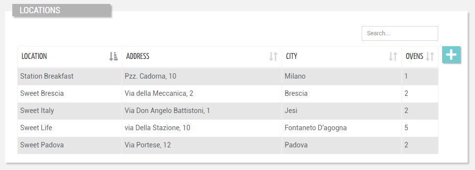
Below the list, you can interact with the pagination control (default 20 items at a time).
This is automatically hidden if there are fewer items than the number of items to be loaded per page (configurable with the “Page Size” option).
Entering the page, the list is sorted by the first column ascending, but optionally, you can refine it through the “Initial Sorting“ widget property.
This widget requires the READ_LOCATION user’s permission.
Accordion Template
You can specify the “Accordion Template” which is rendered into the accordion when a row is expanded, and whose content is generated using the location as input context.
Search for Locations
On the top right part of the widget, a search control bar allows filtering locations by a text key.
.png?sv=2026-02-06&spr=https&st=2026-07-20T04%3A51%3A48Z&se=2026-07-20T05%3A07%3A48Z&sr=c&sp=r&sig=D6CbsiyVJxBZfJHP5AvL8hmWWYSlif%2FAPwwWySCJb98%3D)
Optionally, by pressing the Advanced Search icon, a dedicated panel allows the DPS user to specify multiple conditions based on location properties.
The provided input is preserved during navigation, also across pages in case the same widget “Id” is used.
Optionally, by using the “Query“ property, a set of conditions for pre-filtering items can be defined in the template.
In the template, you can specify the “Search Fields“ used to filter things by text key.
In case the “Query Variable“ property has been defined (the list is filtered from a Search Field placed in the page), the search control bar is automatically hidden and thus not visible to the user.
Create a new Location
If the widget is placed in the Customer details page and the widget option “Actions Enabled“ is selected, by pressing the “Add Location“ button, the DPS user can manually create a new location under the current customer.
This requires the WRITE_CUSTOMER user’s permission.
.png?sv=2022-11-02&spr=https&st=2025-09-24T09%3A52%3A58Z&se=2025-09-24T10%3A09%3A58Z&sr=c&sp=r&sig=sQyGaHdBbSSYRv61ohFyVcxeyBmxYO36bpLa%2Bk4pM9I%3D?sv=2026-02-06&spr=https&st=2026-07-20T04%3A51%3A48Z&se=2026-07-20T05%3A07%3A48Z&sr=c&sp=r&sig=D6CbsiyVJxBZfJHP5AvL8hmWWYSlif%2FAPwwWySCJb98%3D)
Template Syntax
Below you can find some examples of how to use the component within a template.
            <location-list-widget-v2>
            <property [name]="'name'"></property>
            <property [name]="'properties.address'" [label]="'Address'"></property>
            <property [name]="'properties.city'" [label]="'City'"></property>
            <property [name]="'properties.thingCount'"></property>
            </location-list-widget-v2>
Component Reference
Here is a comprehensive list of all the elements and properties that can be used to configure the component.
Location List <location-list-widget-v2>
Actions Enabled | The boolean flag indicating whether actions (e.g. Add button) are enabled on the widget. Name: enableActions Type: BOOLEAN | Optional Default Value: true
|
Controls Enabled | The boolean flag indicating whether controls (e.g. Search, Export) are enabled on the widget. Name: controlsEnabled Type: BOOLEAN | Optional Default Value: true
|
Title | The title displayed on the top part of the widget box. Name: title Type: STRING | Optional
|
Data | |
Initial Sorting | The array of property names and criteria to use for sorting (e.g. ['name','asc','serialNumber','desc']). Name: sort Type: SORT_PROPERTIES | Optional
|
Page Size | The number of items to load on each page. Name: pageSize Type: INTEGER | Optional Default Value: 50
|
Query | The array of conditions filtering out items. For instance: [query]='[{'property': 'connectionStatus', 'predicate': 'eq', 'value': '1'}]' Predicates: eq, beginsWith, like, notLike, isEmpty, isNotEmpty, gt, gte, lt, lte. Name: query Type: QUERY | Optional Predicates: beginsWith, eq, neq, gt, gte, isEmpty, isNotEmpty, lt, lte, like, notLike
|
Search Fields | The array of fields used to filter out the objects when searching by a generic key. For instance: [searchFields]='['name', 'serialNumber', 'customer.name', 'customer.code']' Name: searchFields Type: PROPERTY (multiple) | Optional
|
Advanced | |
Accordion Template | The name of the template to show when expanding the accordion for a list row. Name: accordionTemplate Type: STRING | Optional
|
Block Column Span | The number of columns on which to span the properties displayed in each list block (default 1). Name: blockColumns Type: INTEGER | Optional Default Value: 1
|
Details Path | The optional path that identifies the details page to be opened when a row is clicked. Name: detailsPath Type: STRING | Optional
|
Empty Message | The blank message to be displayed in the widget in case no item was found. To manage translations, you can define a label and use the key as the value of the property. Name: emptyMessage Type: STRING | Optional
|
Rendering | |
Availability | Configure availability based on active features on Digital Plan on Add-ons Name: hasFeature Type: FEATURE (multiple) | Optional
|
CSS Class | The name(s) of the CSS class used to customize the widget layout. Name: class Type: STRING | Optional
|
Visibility Condition | The expression that allows you to reduce the visibility of the element. Name: *ngIf Type: STRING | Optional
|
Sub Elements | |
The property whose label and current value must be rendered as a widget row. | |
The widget part combining multiple properties. | |
Property <property>
Description | The property description. Name: description Type: STRING | Optional
|
Filter | The name of the filter used to transform and display values. Name: filter Type: FILTER | Optional
|
Label | The property alternative label. Name: label Type: STRING | Optional
|
Name | The property whose value must be loaded by the widget. Name: name Type: PROPERTY | Required
|
Advanced | |
Column CSS Class | The name(s) of the column CSS class used to customize the table column. Name: columnClass Type: COLUMN_CSS | Optional
|
Details Page Path | The optional path that identifies the details page to be opened when a column value is clicked. Name: detailsPath Type: STRING | Optional
|
Show Header | The flag indicated whether the header is visible. Name: showHeader Type: BOOLEAN | Optional Default Value: true
|
Visibility Condition | The expression that allows you to reduce the visibility of the element. Name: *ngIf Type: STRING | Optional
|
Composite Part <composite-part>
Description | The composite-part description. Name: description Type: STRING | Optional
|
Filter | The filter applied on the composite-part to transform or display its value. Name: filter Type: FILTER | Optional
|
Label | The label displayed by the widget. Name: label Type: STRING | Optional
|
Name | The composite-part name. Name: name Type: STRING | Optional
|
Sorting Criteria | The comma seprated list of property names and criteria to use for sorting the list column associated to this composite-part (e.g. properties.p1,ASC,properties.p2,DESC). Name: sortingCriteria Type: STRING | Optional
|
Advanced | |
Column CSS Class | The name(s) of the column CSS class used to customize the table column. Name: columnClass Type: COLUMN_CSS | Optional
|
Details Page Path | The optional path that identifies the details page to be opened when a column value is clicked. Name: detailsPath Type: STRING | Optional
|
Show Header | The flag indicated whether the header is visible. Name: showHeader Type: BOOLEAN | Optional Default Value: true
|
Visibility Condition | The expression that allows you to reduce the visibility of the element. Name: *ngIf Type: STRING | Optional
|
Sub Elements | |
The metric whose value must be loaded within the composite-part. | |
The property whose value must be loaded within the composite-part. | |
Metric <metric>
Name | The metric whose value(s) must be loaded by the widget. Name: name Type: METRIC | Required
|
Property <property>
Name | The property whose value must be loaded by the widget. Name: name Type: PROPERTY | Required
|
Full Syntax Example
<location-list-widget-v2
    [title]="'Locations'"
    pageSize="100"
    sort="['name','asc','serialNumber','desc']"
    [enableActions]="false"
    [controlsEnabled]="false"
    searchFields="['prop1', 'prop2']"
    query="[{property:'prop1', predicate: 'eq', value: 'foo'}, {property:'prop2', predicate: 'in', value: ['bar', 'baz']}]"
    blockColumns="2"
    emptyMessage="No customer found"
    accordionTemplate="thing-grid"
    detailsPath="customer-productivity"
    class="my-custom-class"
    *ngIf="getUser().organizationId != null"
    hasFeature="['feature_a', 'feature_b']">
    <property
            name="serialNumber"
            label="Temperature"
            description="abc"
            filter="fooBarFilter"
            *ngIf="getUser().organizationId != null"
            [showHeader]="false"
            columnClass="my-column-custom-class"
            detailsPath="abc"></property>
    <composite-part
            name="abc"
            label="abc"
            description="abc"
            filter="fooBarFilter"
            sortingCriteria="properties.p1,ASC,properties.p2,DESC"
            *ngIf="getUser().organizationId != null"
            [showHeader]="false"
            columnClass="my-column-custom-class"
            detailsPath="abc">
            <metric
                        name="Temperature"></metric>
            <property
                        name="serialNumber"></property>
    </composite-part>
</location-list-widget-v2>