Provides a global add button in the page.
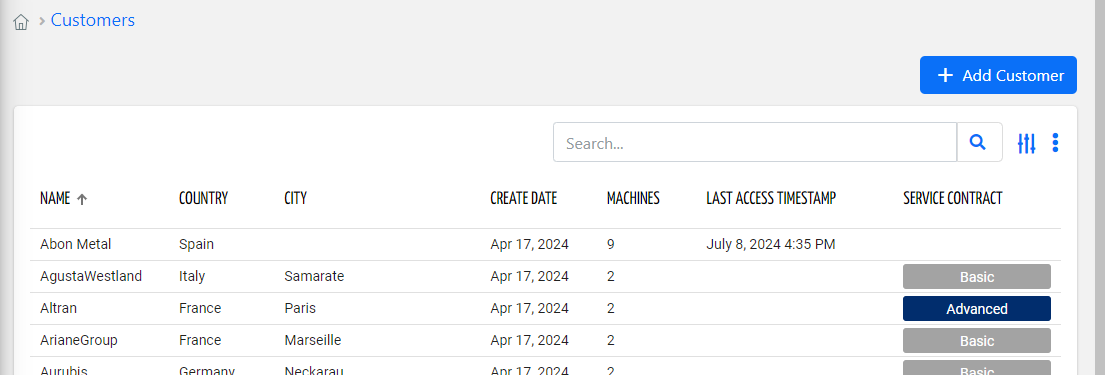
In the presence of this component, the standard buttons embedded into other page widgets (e.g. Customer List) are discarded.
By using the "floating-rounded-button" CSS class, for mobile app you can display a button floating on the list bottom.
.png?sv=2026-02-06&spr=https&st=2026-07-17T15%3A55%3A03Z&se=2026-07-17T16%3A06%3A03Z&sr=c&sp=r&sig=V%2FtYDpp4nMonsL7ExBMlj0GH3OApAGKCsoCNePu3zjw%3D "image(522).png")
Template Syntax
Below you can find some examples of how to use the component within a template.
<!-- Add thing button -->
            <add-button icon="add" label="Add Thing" resource="THING"></add-button>

            <!-- Add customer button floating on the page bottom for mobile apps -->
            <add-button icon="add" class="floating-rounded-button" label="" resource="CUSTOMER" *ngIf="isMobile()"></add-button>
Component Reference
Here is a comprehensive list of all the elements and properties that can be used to configure the component.
Add Button <add-button>
Icon | The Angular Material icon displayed inside the add button (e.g. add). Name: icon Type: STRING | Optional
|
Label | The label displayed inside the add button. Name: label Type: STRING | Optional
|
Resource | The resource on which to create the new object. Name: resource Type: ENUM | Required Values: THING, LOCATION, CUSTOMER, PARTNER, TAG Default Value: THING
|
Tooltip | The tooltip displayed over the add button. Name: tooltip Type: STRING | Optional
|
Rendering | |
Availability | Configure availability based on active features on Digital Plan on Add-ons Name: hasFeature Type: FEATURE (multiple) | Optional
|
CSS Class | The name(s) of the CSS class used to customize the widget layout. Name: class Type: STRING | Optional
|
Visibility Condition | The expression that allows you to reduce the visibility of the element. Name: *ngIf Type: STRING | Optional
|
Full Syntax Example
<add-button
    resource="THING"
    label="abc"
    tooltip="abc"
    icon="fas fa-thermometer"
    class="my-custom-class"
    *ngIf="getUser().organizationId != null"
    hasFeature="['feature_a', 'feature_b']"></add-button>